| Home | Search | Site index | About | Contact |
The dtl Van Krimpen project dates back to the autumn of 1986, when Frank E. Blokland, the founder of the Dutch Type Library, first met Jan van Krimpen’s son Huib van Krimpen (1917–2002) at the ATypI conference in Basel. It was there in Switzerland that the plan arose to publish facsimiles of all JvK type drawings.
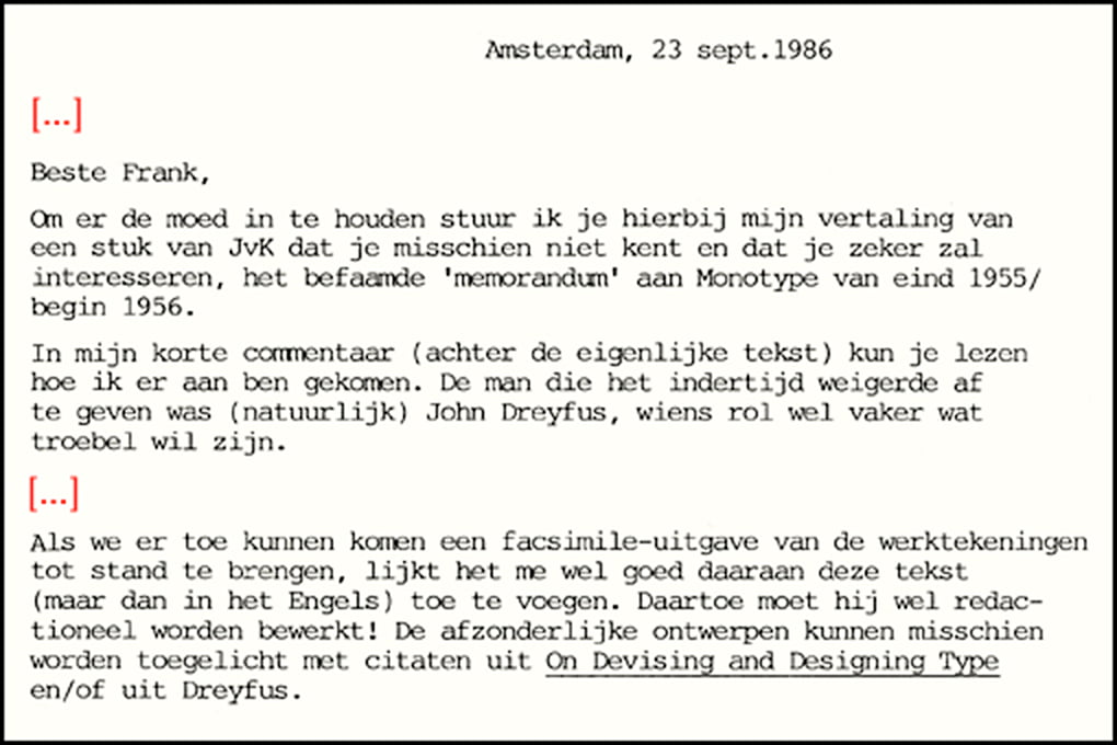
On September 23, 1986, shortly after the conference, Huib van Krimpen sent an extensive letter to Blokland together with the Dutch translation he made of his father’s Memorandum to Monotype from late 1955/ early 1956. The idea was to use the original English version of the Memorandum with the facsimiles along with quotations from On Designing and Devising Type (New York: The Typophiles, 1957). The Berthold type foundry then considered producing Romulus and Spectrum for its phototypesetting machine, and Huib van Krimpen proposed in the letter in question to typeset the Memorandum in one of these two new versions.![]()
![]()
At the start of the project it was unclear what happened to a number of JvK’s drawings. There was even doubt that some of these still existed. For example, the location of the Sheldon drawings was unknown. Huib van Krimpen traced it from Monotype to Oxford and from Oxford to Heemstede, where JvK had its seat. It eventually became clear that the Sheldon drawings remained in the University Library of Amsterdam.
Huib van Krimpen knew that the nine drawings for Haarlemmer were owned by Monotype and in England in a drawer somewhere. After a visit to Monotype, he brought them back to the Netherlands at the end of the eighties. Not much later the Haarlemmer drawings were purchased by Blokland and used by him as the basis for the digital version of the typeface.![]()
![]()
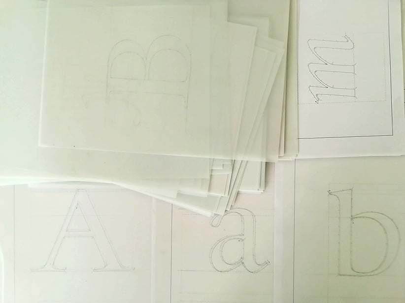
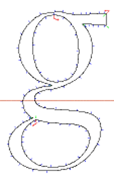
Working drawings on polyester film of dtl Sheldon for hand digitization in ikarus format![]()
In the following years Huib van Krimpen and Blokland maintained close contact, but the publication with the facsimiles of the drawings has not (so far) seen the light of day. In 1996 the Dutch Type Library published the Dutch translation of the Memorandum. This publication was set in dtl Haarlemmer, which production was enthusiastically supported by Huib van Krimpen, who was also very positive about the result. Later, Huib van Krimpen personally granted the Dutch Type Library the rights for the (still ongoing) production of the digital Sheldon revival.![]()
Jan van Krimpen (1892–1958) is the most famous Dutch type designer of the first half of the twentieth century. His typefaces are admired all over the world for their beauty and quality. The following quote from Stanley Morison can be used to describe the philosophy behind JvK’s typefaces: ‘The history of calligraphy and typography is mainly a matter of tracing variations caused by cultural, linguistic, nationalistic and economic factors.’
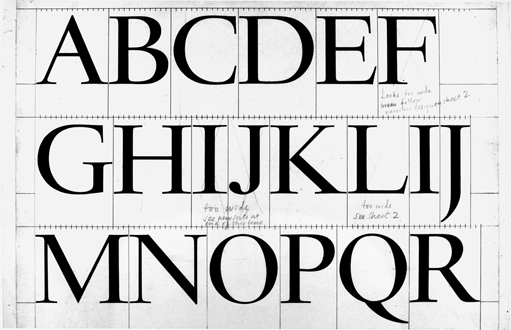
A close look at JvK’s type drawings reveals the differences between the designs and the punches that Paul Helmuth Rädisch cut. Many of the working drawings produced at Monotype also show deviations from the originals. For example, the drawings for Romulus show a more neo-classical approach, even a little Baskerville-esque, than the final Monotype version. There are also signfiicant differences in weight and contrast between the original drawings and the hot-metal versions.
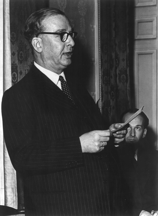
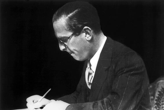
Jan van Krimpen
The collection of drawings for Haarlemmer consists of nine sheets, which are generally about 35 by 45 centimeters in size. The height of the capitals is about 73 millimeters. Most JvK type drawings are made in a similar format, with the exception of the designs for Spectrum.
One of nine design drawings for Haarlemmer by Jan van Krimpen (dtl collection)

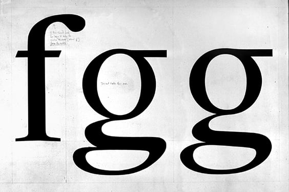
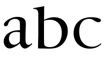
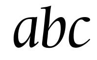
There are three ‘optical’ variants of dtl Romulus

In the context of the dtl Van Krimpen Project the Dutch Type Library produces digital versions of Haarlemmer, Romulus en Sheldon.
Design drawing for Sheldon
dtl Sheldon is currently in development
Search | Site index | Contact | Terms of use | Trademarks | Acknowledgements
Last update: 23 Juni 2026. Copyright © Dutch Type Library, 1998–2026. All rights reserved
dtl Headquarters | Zwaenenstede 49 | 5221 kc ’s-Hertogenbosch | The Netherlands
dtl Studio | Daliënwaerd 71 | 5221 ke ’s-Hertogenbosch | The Netherlands
phone: +31 (0)73 614 95 36 | fax: +31 (0)73 613 98 23 | e-mail: info@dutchtypelibrary.com
![]()
![]()
![]()