see dtl’s ExquisiteFonts website!
Jan van Krimpen was commissioned in 1938 by the Haarlem-based Association for Printing and Book Arts to design a typeface for a newly planned Statenbijbel (State Bible). Van Krimpen’s freedom in the design was significantly restricted by a lack of financial resources. John Dreyfus wrote about this in The Work of Jan van Krimpen, A record in honour of his sixtieth birthday (Haarlem / Utrecht, 1952): ‘The type was designed to work on an existing Monotype keybar layout in order to keep down costs of production.’![]()
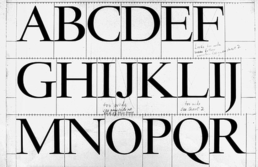
Design drawing by JvK for the capitals of Haarlemmer (dtl collection)![]()
The layout of a Monotype keyboard could differ for each typeface and was determined by the arrangement of the matrix case. A matrix case consisted of fifteen or, in special cases, sixteen so-called unit rows. Each unit row provided space for seventeen letters. The Monotype unit system was based on dividing the typographic square into eighteen units. The widest letters, such as the capitals M and W, occupied eighteen units, while the narrowest letters, such as the lowercase i and l, were placed on five or six units. The letters in a row of the matrix case each occupied the same number of units.![]()
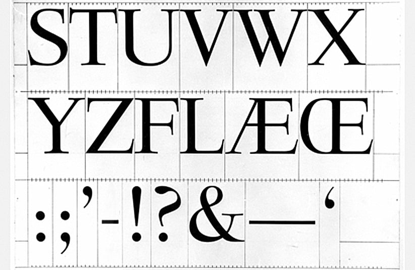
Design drawing by JvK for the capitals of Haarlemmer (dtl collection)![]()
The production of Monotype Haarlemmer was never completed. ‘The first trial sheets of Haarlemmer were pulled in June 1938. Further work on the design was done at the Monotype works in England during the early months of the war, but all plans for the Staten Bijbel were abandoned after the invasion of Holland,’ wrote John Dreyfus in The Work of Jan van Krimpen.![]()
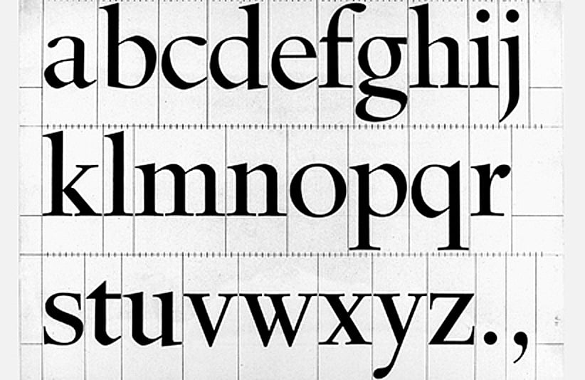
Design drawing by JvK for the lowercase of Haarlemmer (dtl collection)![]()
Given the (matrix-case-imposed) limitations of Monotype Haarlemmer, there initially seemed to be little reason for a digital revival of the typeface. Nevertheless, there were good reasons to revive it. The fact that the Monotype version was not successful did not mean that the typeface lacked qualities, as Walter Tracy noted in Letters of Credit (London, 1986): ‘Certainly the narrow h, n, u and rather wide o and c were out of proportion and needed revision; and if the italic lowercase could have been a little narrower it would have seemed to gain weight and would have harmonised better with the roman. The design would then have become an effective book type.’![]()
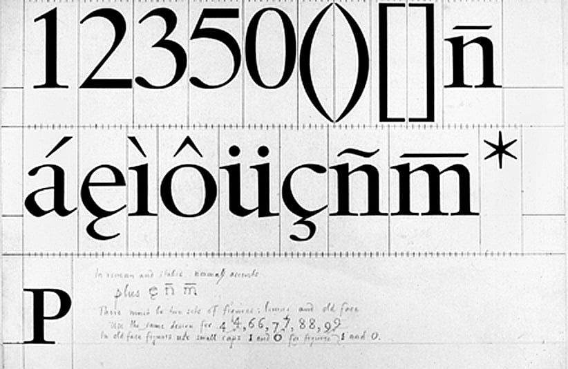
Design drawing by JvK for tabular figures and accents of Haarlemmer (dtl collection)![]()
In addition, the limitations of the Monotype system are no longer relevant today, and in a digital version the stroke weight—and thus the width of the letters—can be adjusted freely.![]()
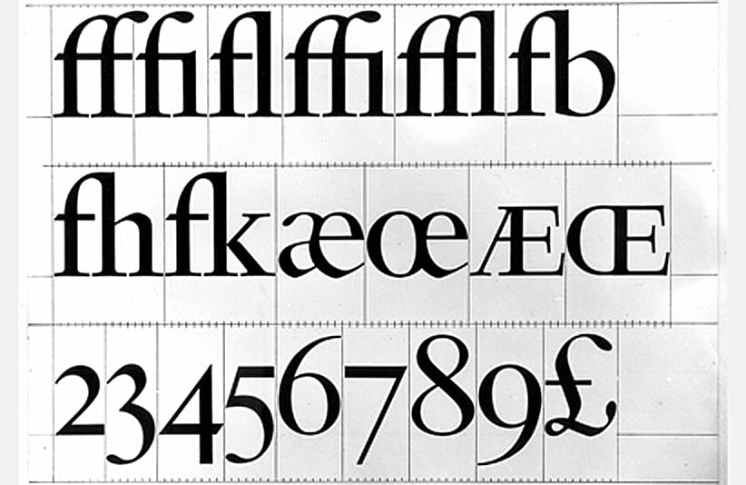
Design drawing by JvK for medieval numerals and ligatures of Haarlemmer (dtl collection)![]()
In the production of dtl Haarlemmer, the original design drawings by Jan van Krimpen were used as the starting point. The Monotype version was of insufficient quality to serve as a basis. As mentioned, there was no reason whatsoever to retain the limitations of the unit system. The drawings were not digitized linearly; instead, the design was interpreted, resulting in a typeface that corresponds as closely as possible to Van Krimpen’s original concept. This approach is somewhat comparable to the way in which Van Krimpen’s foundry typefaces were produced.![]()
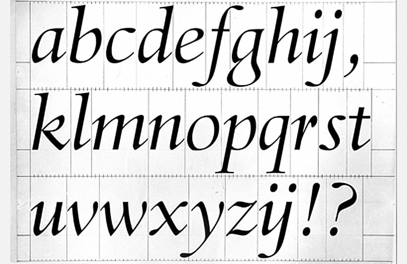
Design drawing by JvK for the italic of Haarlemmer (dtl collection)![]()
The typeface dating from 1938, which due to technical limitations and the outbreak of the Second World War was never properly completed, now demonstrates its convincing qualities in digital form.

Search | Site index | Contact | Terms of use | Trademarks | Acknowledgements
Last update: 23 June 2026. Copyright © Dutch Type Library, 1998–2026. All rights reserved
dtl Headquarters | Zwaenenstede 49 | 5221 kc ’s-Hertogenbosch | The Netherlands
dtl Studio | Daliënwaerd 71 | 5221 ke ’s-Hertogenbosch | The Netherlands
phone: +31 (0)73 614 95 36 | fax: +31 (0)73 613 98 23 | e-mail: info@dutchtypelibrary.com
![]()
![]()
![]()