see dtl’s ExquisiteFonts website!
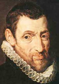
Christophe Plantin
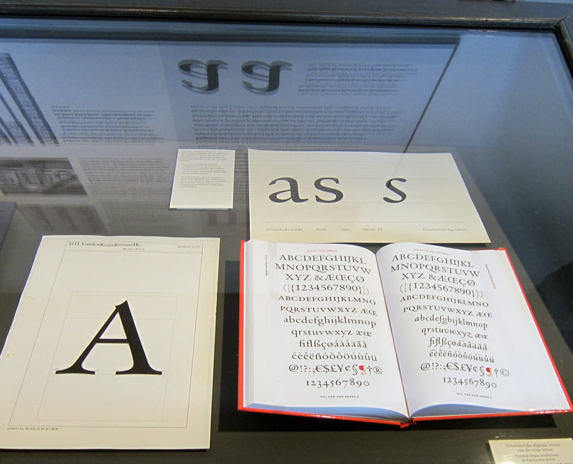
Showcase with dtl VandenKeere in the type foundry of Museum Plantin-Moretus![]()
Hendrik van den Keere was born in Ghent about 1540. He is also known by the name Henry du Tour, which he himself preferred. Dr. Hendrik D.L. Vervliet describes Van den Keere in Sixteenth-century Printing Types of the Low Countries (Amsterdam, 1968) as the best Renaissance punchcutter in the Netherlands: ‘He is the link between the French school that dominated the 16th century and the Dutch who led Europe a century later.’![]()
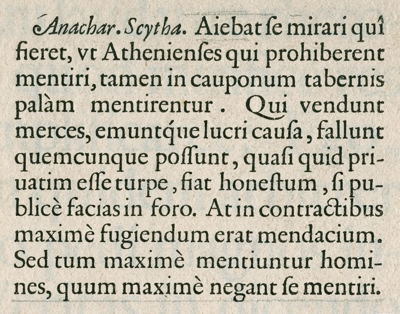
The Parangonne Romaine in Plantin’s Folio Specimen from ca. 1585![]()
Van den Keere cut type for Christophe Plantin (1514–1589) from 1568 onwards. From 1570 until his death in 1580 he was even the exclusive supplier of typefaces to the renowned Antwerp printer.![]()
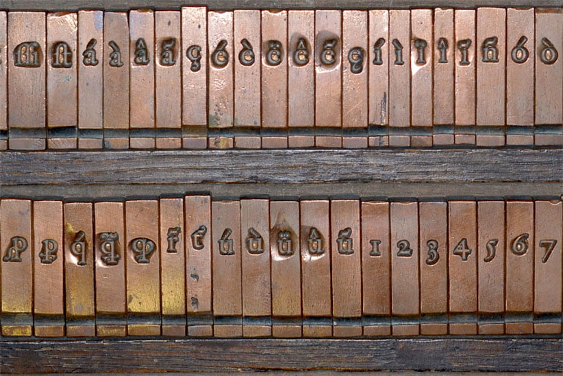
Matrices of Van den Keere’s ‘Reale Romaine’![]()
The Parangonne Romaine (called ‘Reale Romaine’ by Plantin), which Van den Keere cut in 1575 and was first applied by Plantin in 1576, formed the model for the roman of dtl VandenKeere. ‘This is one of the truly outstanding designs originating in the Low Countries’, says Vervliet about the source model in Sixteenth-Century Printing Types […]. Van den Keere’s widow assured Plantin in 1581 that he possessed the only strikes of this roman, according to the 1960 inventory of punches and matrices in the Museum Plantin-Moretus.![]()
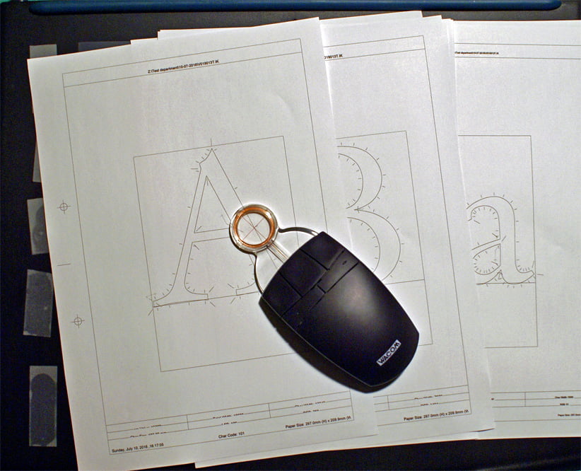
ikarus contours with Wacom lens cursor![]()
As far as we know, Van den Keere did not cut italics. Therefore a design by François Guyot (ca.1505–1570) has been used for the italics of dtl VandenKeere. Guyot was a French punchcutter who was registered as a resident of Antwerp in 1539. From 1558 until his death he delivered letters to Plantin. Guyot’s typefaces were in high demand and were used throughout much of Europe and as far as Asia and America.![]()
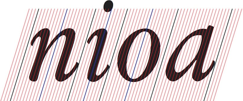
dtl VandenKeere Italic on historical patterning (intrinsic unitization)![]()
The basis for the digital italics was Guyot’s Ascendonica Cursive from circa 1557. To enable a good combination of the italic with the roman, shape, weight, and contrast were adapted. For the capitals of the dtl VandenKeere italics, Guyot's designs were not used, but italicized and subsequently carefully adjusted variants of the capitals of the Parangonne Romaine. Separate versions have been made for a number of fonts from dtl VandenKeere for display and text sizes.![]()
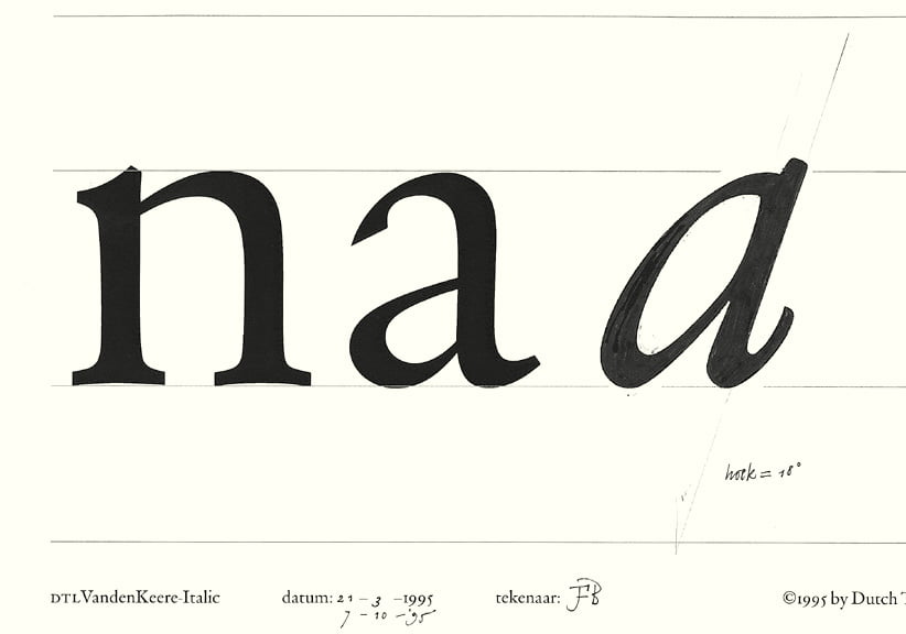
Drawing for the italic lowercase a next to the ikarus digitization of the roman![]()
In the illustrious Museum Plantin-Moretus, dtl VandenKeere has been used as a house-style typeface since the mid-1990s. One will find it applied throughout the mpm.![]()
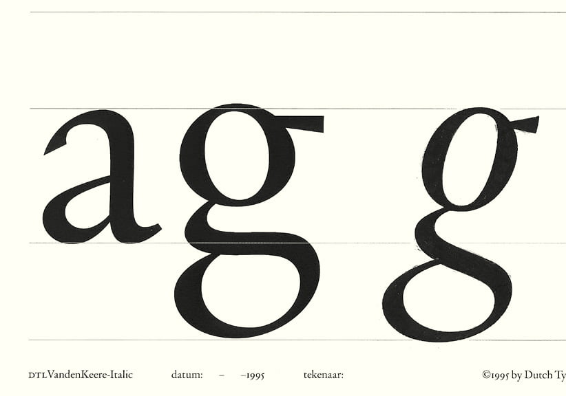
Drawing for the italic lowercase g next to the ikarus digitization of the roman![]()
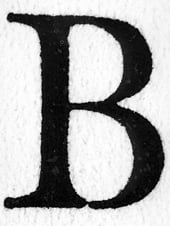
Enlargement of the capital B of Van den Keere’s Parangonne Romaine
Search | Site index | Contact | Terms of use | Trademarks | Acknowledgements
Last update: 15 June 2026. Copyright © Dutch Type Library, 1998–2026. All rights reserved
dtl Headquarters | Zwaenenstede 49 | 5221 kc ’s-Hertogenbosch | The Netherlands
dtl Studio | Daliënwaerd 71 | 5221 ke ’s-Hertogenbosch | The Netherlands
phone: +31 (0)73 614 95 36 | fax: +31 (0)73 613 98 23 | e-mail: info@dutchtypelibrary.com
![]()
![]()
![]()