see dtl’s ExquisiteFonts website!
Gerard Unger
Like Jan van Krimpen in the first half of the twentieth century, Gerard Unger (1942–2018) preferred type designers and font manufacturers to invest their energy in developing new typefaces rather than producing revivals. This does not mean that he was not interested in the work of his predecessors. On the contrary, for dtl Paradox he studied French typefaces from the seventeenth and eighteenth centuries, including work by Pierre-Simon Fournier, Francois-Ambroise Didot, and Philippe Grandjean.
The latter was the punchcutter of the Romain du Roi, a typeface commissioned by Louis xiv in the first half of the eighteenth century, the right of use of which lay exclusively with the French royal printing house.
The Romain du Roi was the result of an attempt to standardize type design led by a committee appointed by the Académie des Scienses. The letters were drawn on graphic paper with a compass and ruler on the basis of supposed ideal proportions. The Romain du Roi has characteristics that can be traced back to the fllexible pointed pen, but sometimes seems to have been made with a broad nib, the end of which was held parallel to the writing line, as the calligrapher Nicolas Jarry wrote letters more than a century earlier.
![]()

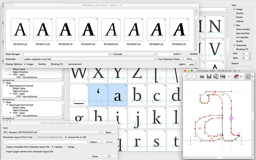
Checking the font data of dtl Paradox in dtl OTMaster![]()
Especially the Romain du Roi has contributed to the characteristic features of dtl Paradox, in particular to the roman. The relatively small top of the lowercase a and the way the weight continues at the top and bottom of the bowls of the b, d, p, and q is reminiscent of Grandjean’s model. The italic of dtl Paradox is more interrupted than Grandjean’s italic and more closely related to the ‘italiques’ in the tradition of Fournier le jeune, which were in vogue in the second half of the eighteenth century. This ‘italics’ were characterized by their interrupted construction.
![]()

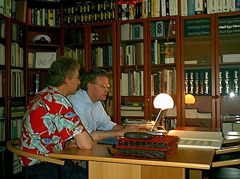
Unger and Blokland discuss the development of dtl Paradox at dtl hq on July 1, 2001
dtl Paradox is, of course, not a revival but a typical ‘Ungerian’ type design. Quirky and twenty-first century, but also interspersed with delicate French refinements from the eighteenth century. Striking are the ‘rejuvenations’ or concave curves in the stems and serifs, elements that are completely absent in Unger’s Swift, for example.
dtl Paradox is the ‘transition’ in Unger’s œuvre, with the aforementioned Swift representing the ‘old style’.
The apparent contradiction, which is a paradox, is explained by Unger in his 1997 classic Terwijl je leest (‘While you Read’) as follows: ‘I like mass communication. That is why I am so attached to convention and do not want to unleash experimentation on readers at all costs, but let it merge with conventional features. In the Paradox they are included in a familiar image, but still visible.’
Search | Site index | Contact | Terms of use | Trademarks | Acknowledgements
Last update: 14 January 2025. Copyright © Dutch Type Library, 1998–2025. All rights reserved
dtl Headquarters | Zwaenenstede 49 | 5221 kc ’s-Hertogenbosch | The Netherlands
dtl Studio | Daliënwaerd 71 | 5221 ke ’s-Hertogenbosch | The Netherlands
phone: +31 (0)73 614 95 36 | fax: +31 (0)73 613 98 23 | e-mail: info@dutchtypelibrary.com