see dtl’s ExquisiteFonts website!
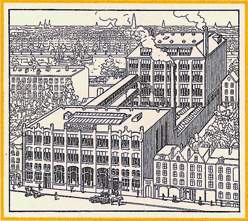
Over the course of time, Lettergieterij Amsterdam (Amsterdam Type Foundry, see image above) brought different versions of Nobel onto the market. la was affiliated with Intertype, the English manufacturer of line-casting machines. Full versions of Nobel were published for the Intertype hot-metal caster. The end of the lead era resulted in a decline in the typeface’s popularity.
Andrea Fuchs and Fred Smeijers completed their work on the digital version of Nobel in 1993. The reason for the development of dtl Nobel was the need of both type designers for a version for current digital technology. Fuchs and Smeijers conducted extensive historical research for the production of the digital Nobel. They wondered which of the versions of Nobel that appeared over time should serve as a starting point. Furthermore, to what extent should they be guided by the working drawings and/or by the final printing in type specimens? ‘In addition, the letterforms differ considerably in the various font sizes. Which point size should you then take as a starting point?', Fuchs and Smeijers wonder about dtl Nobel in a brochure published in 1993.![]()
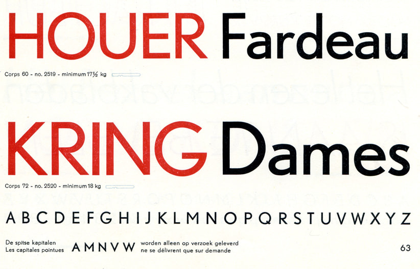
Detail from a type specimen of the Amsterdam Type Foundry![]()
When developing the digital Nobel, Fuchs and Smeijers interpreted the acute angles as one of the indispensable characteristics of the type and introduced them for all styles. Both acute angles and horizontal ends can be found in the historical variants of Nobel. Looking back at the constructivist period in the history of Dutch typography, the two recognized that acute angles on letters such as A and V usually stand out clearly, have an almost abstract effect, and give them an expressive expression.![]()
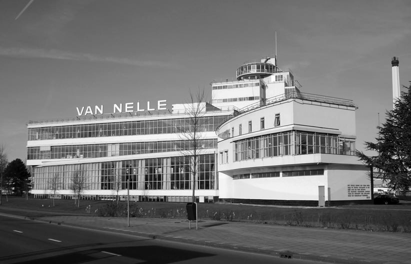
Van Nelle factory (1929) by the architects Brinkman and Van der Vlugt (foto: F. Eveleens, cc by 3.0)![]()
In The Letter as Work of Art (De Letter als Kunstwerk, Amsterdam, 1951) architect Dr. G. Knuttel compares the Nobel typeface with the world-famous Van Nelle factory (1929) by the architects Jan Brinkman and Leen van der Vlugt: 'The relationship with the Nobel, in pursuit and execution, is urged here. The basic concept of abstract art, the aesthetic effect derived solely from the proportions, from the tension between the formal elements constructing the work of art, found application in both in a practical way, i.e., not for the work of art as such.’
Search | Site index | Contact | Terms of use | Trademarks | Acknowledgements
Last update: 15 June 2026. Copyright © Dutch Type Library, 1998–2026. All rights reserved
dtl Headquarters | Zwaenenstede 49 | 5221 kc ’s-Hertogenbosch | The Netherlands
dtl Studio | Daliënwaerd 71 | 5221 ke ’s-Hertogenbosch | The Netherlands
phone: +31 (0)73 614 95 36 | fax: +31 (0)73 613 98 23 | e-mail: info@dutchtypelibrary.com
![]()
![]()
![]()