see dtl’s ExquisiteFonts website!
Elmo while working on dtl Dorian![]()
Elmo van Slingerland (Rotterdam, 1964) is a well-known name in the world of type designers and calligraphers. His extraordinary ‘hand’ was formed at the Royal Academy of Art (kabk) in The Hague and through workshops with master calligraphers such as Claude Mediavilla and Jovica Veljovic. His work can be found in Museum Meermanno Westreenianum in The Hague and his calligraphy was on display at the sixth international exhibition of contemporary calligraphy in Bruges, among other places. The dtl Dorian typeface is clearly characterized by details that stem from Van Slingerland’s calligraphic mastery.![]()
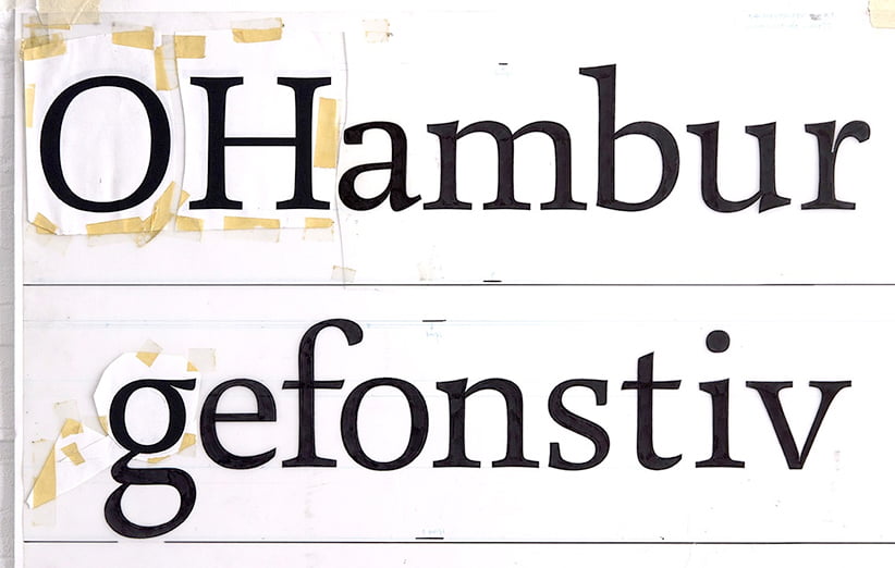
First sketches for dtl Dorian Regular from 1991![]()
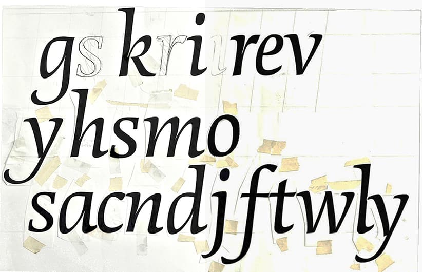
First sketches for dtl Dorian Regular Italic from 1991![]()
Van Slingerland made initial design sketches for dtl Dorian as a student at the kabk, where he graduated cum laude. The design was further developed and elaborated on behalf of and in collaboration with the Dutch Type Library. In 1996 a series of fonts were ready for use. dtl Dorian was first officially applied in the 1997 Christmas Edition Graphic Netherlands of the kvgo. Additionally, it became the house-style letter of, among others, the Amsterdam Historical Museum.![]()
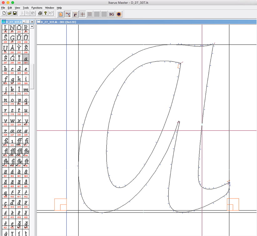
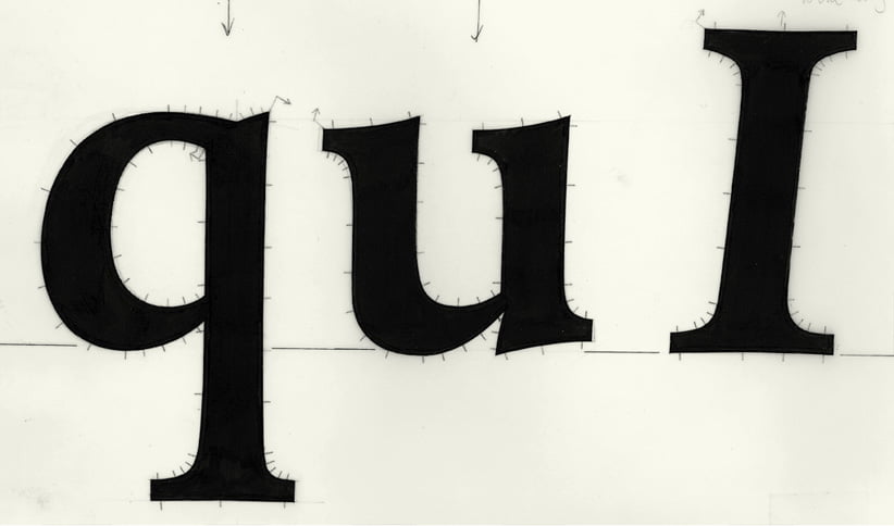
Manual digitization of dtl Dorian Regular Italic in ikarus formaat![]()
dtl Dorian has been designed with the aim of a typeface that lends itself well to use in all point sizes, whereby the details do not become obtrusive in texts, but manifest themselves more emphatically when used for display purposes. The relatively low contrast (thick-thin difference) in particular makes the font very suitable for use on small sizes. Due to the extensive range of weights/styles, with old-style and tabular figures and special delicate tabular figures for small caps for each weight, dtl Dorian meets every typographical requirement.![]()
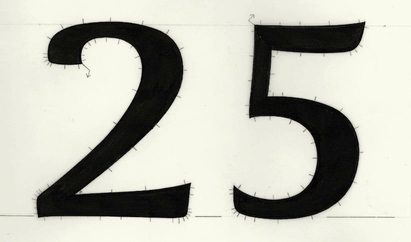
Tabular figures of dtl Dorian, marked for manual digitization in the ikarus format![]()
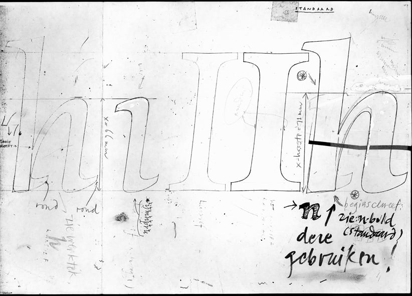
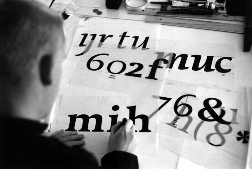
Working-drawing templates for dtl Dorian Italic![]()
Bold variant of dtl Dorian with ikarus marking![]()
The name of the typeface refers to the book The Picture of Dorian Gray by the Irish poet and playwright Oscar Wilde (1854–1900), which Van Slingerland read when he was working on his typeface. The main character in Wilde’s book has a dazzlingly beautiful appearance. Looking at his image, this Dorian sighs: ‘Those who find beautiful meanings in beautiful things are the cultivated.’ dtl Dorian reflects typographical beauty for anyone who wants to see it.
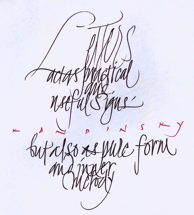
Scribble by Elmo on a a4 paper made on a working day at dtl
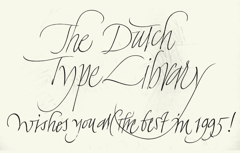
Design for a New-Year’s greeting from the Dutch Type Library

Elmo van Slingerland
Search | Site index | Contact | Terms of use | Trademarks | Acknowledgements
Last update: 15 June 2026. Copyright © Dutch Type Library, 1998–2026. All rights reserved
dtl Headquarters | Zwaenenstede 49 | 5221 kc ’s-Hertogenbosch | The Netherlands
dtl Studio | Daliënwaerd 71 | 5221 ke ’s-Hertogenbosch | The Netherlands
phone: +31 (0)73 614 95 36 | fax: +31 (0)73 613 98 23 | e-mail: info@dutchtypelibrary.com
![]()
![]()
![]()