see dtl’s ExquisiteFonts website!
Argo
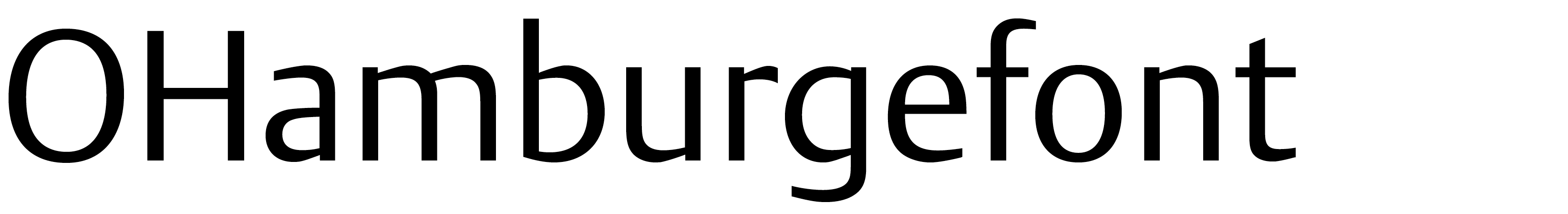
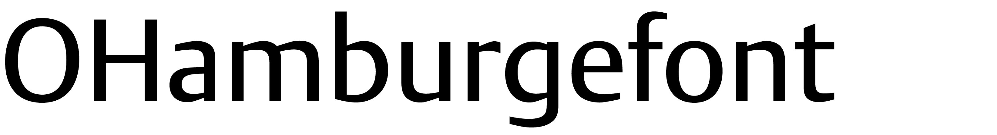
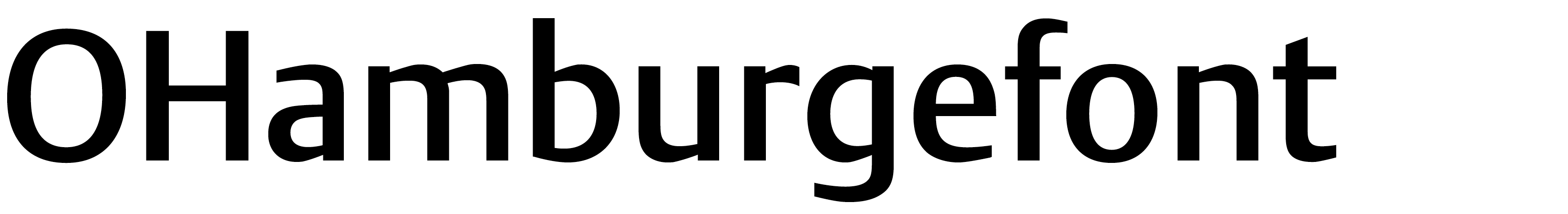
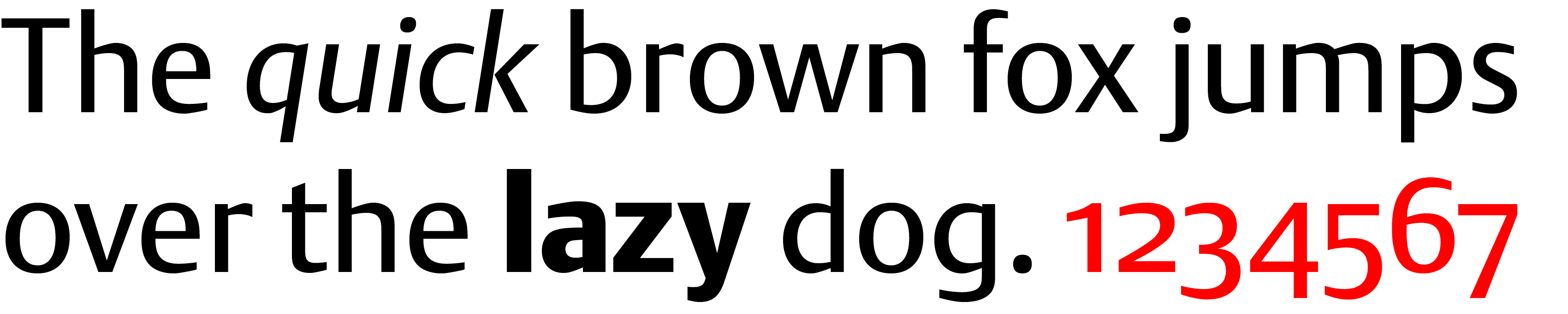
Compared to dtl Argo, many sans serifs look monotonous. To understand the quintessence of Gerard Unger’s typeface, the sans-serif principle must first be explained.
Elementary for a sans serif is the small difference between thick and thin, i.e., a low contrast. An average serif font, on the other hand, has a high contrast. This large difference between thick and thin in serif type is believed to increase legibility. The contrast is represented in the serifs. Serifs have the pleasant side effect of reinforcing lines; they more or less form rails. The high contrast and related serifs make serifed type a good choice for longer texts.
![]()
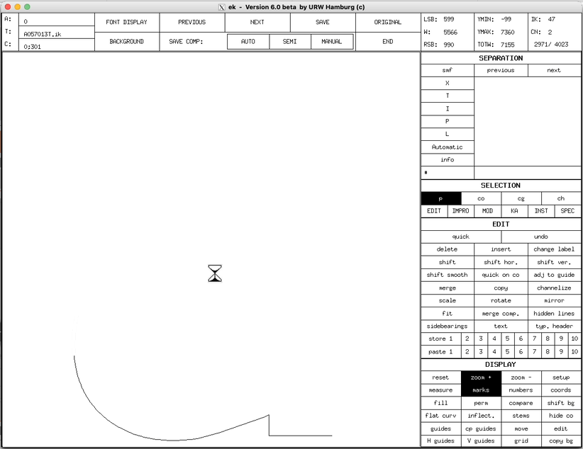
Digitization of the lowercase /a of dtl Argo Regular in ikarus format![]()
As the contrast in a letter is lowered, the serifs must be adjusted accordingly. In the case of extremely low contrast, the need for serifs becomes small, as they get (more or less) the thickness of the stems. A letter with such serifs is called a slab serif or Egyptian. When these serifs are removed, a sans-serif is the result.
![]()
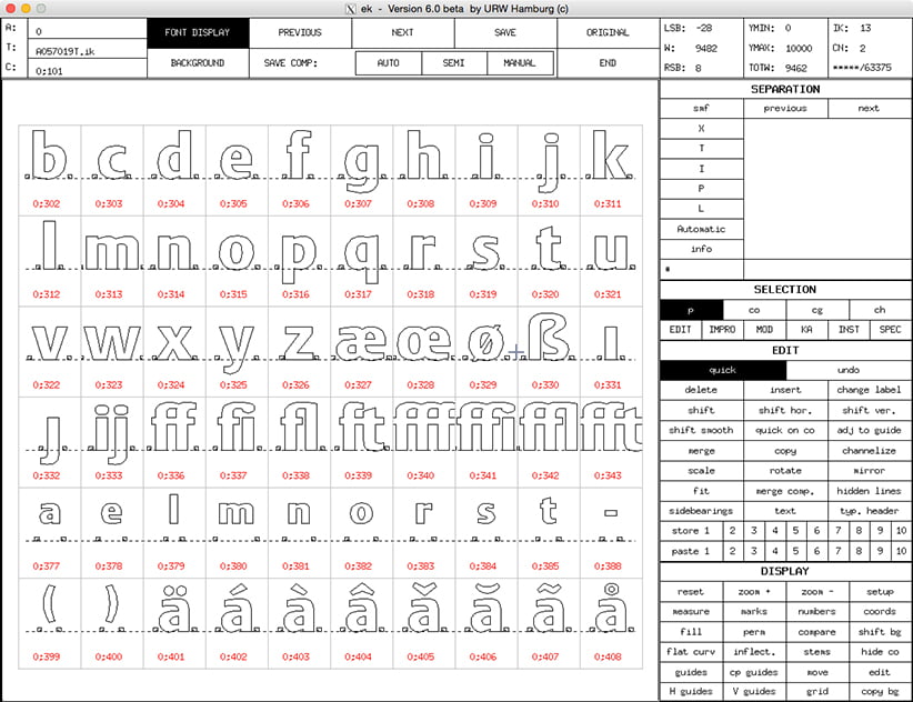
Overview of dtl Argo Black in ikarus format![]()
Letters with the lowest possible contrast still show a difference between thick and thin. This contrast is necessary to make letters optically the same thickness, which is different from measurably the same thickness.
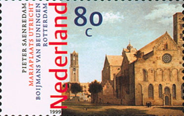
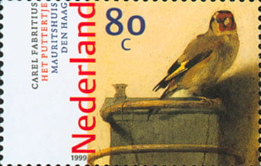
Stamps, designed in 1999 by Piet Gerards and lettered with dtl Argo
Unger has designed a sans-serif with dtl Argo, the contrast of which is considerably higher than that of, for example, Gill Sans, Helvetica, or Frutiger. This explains why Unger’s design is less monotonous than its predecessors.
![]()
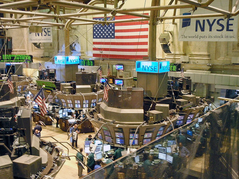
One of the first lighthouse customers for dtl Argo was the New York Stock Exchange![]()
By definition, dtl Argo belongs to the category of sans serifs, but when viewed closely, its contrast falls between serifed type and sans serifs. dtl Argo can be classified in a group that, for example, also includes Hermann Zapf’s Optima. Letters belonging to this group of type are suitable for display purposes as well as body text.
Search | Site index | Contact | Terms of use | Trademarks | Acknowledgements
Last update: 15 June 2026. Copyright © Dutch Type Library, 1998–2026. All rights reserved
dtl Headquarters | Zwaenenstede 49 | 5221 kc ’s-Hertogenbosch | The Netherlands
dtl Studio | Daliënwaerd 71 | 5221 ke ’s-Hertogenbosch | The Netherlands
phone: +31 (0)73 614 95 36 | fax: +31 (0)73 613 98 23 | e-mail: info@dutchtypelibrary.com
![]()
![]()
![]()