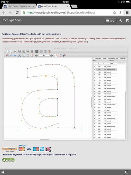
On the Origin of Patterning
[Posted: Tuesday December 7, 2021]
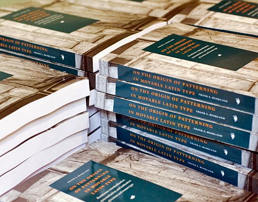
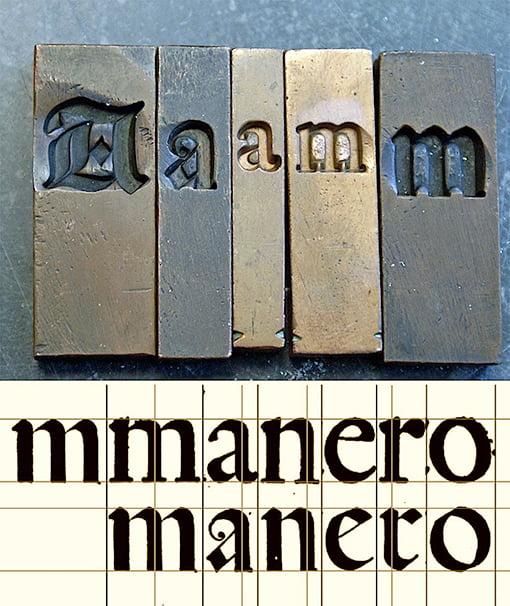
A little over five years ago, On the Origin of Patterning in Movable Latin Type: Renaissance Standardisation, Systematisation, and Unitisation of Textura and Roman Type was published. This dissertation is the result of PhD research at Leiden University by dtl’s founder Frank E. Blokland, which lasted a total of almost ten years. This research was conducted to test the hypothesis that Gutenberg and his colleagues developed a standardized and unitized system for producing textura type. In addition, this advanced system was extrapolated to the production of (morphologically related) roman type in Renaissance Italy. For this, humanist handwriting was in principle cast with intrinsically predetermined standardized proportions.![]()
![]()
This ongoing research aims to prove that the technical constraints of Renaissance font production had a direct impact on the proportions of movable type, and, to some extent, ultimately determined the conditioning that formed the basis of our perception of type and typography. More than 300 printed copies of the dissertation have been sold to date, for example through Lulu’s on-demand print service. An English summary (pdf) can be found on the repository of Leiden University.
More information about the research can be found on the LetterModel website.
Available only from dtl –again
[Posted: Tuesday January 12, 2021]
For almost 30 years urw and dtl worked closely together, mainly in the development of the dtl tools for professional font production. Both companies share a long history: for example, urw and dtl presented together at Cebit in the early 1990s and later organized special conferences on type and related technology in the Netherlands and Germany. Moreover, urw was also the only type company in the world that was allowed to distribute the exclusive typefaces from the Dutch Type Library.
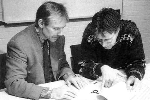
Despite the intensive collaboration, both companies have always remained completely independent. The cooperation was above all based on the friendship and mutual interests of the respective owners. In the photo above, Peter Rosenfeld, then the type manager at urw and later co-owner, and dtl’s founder Frank E. Blokland in 1991 discuss type.
Today urw no longer exists as an independent company following the acquisition of its font library by one of the major players in the type business. Consequently, dtl fonts can –again after 30 years– only be obtained directly from the Dutch Type Library. Former urw customers can therefore contact the Dutch Type Library for support for dtl fonts purchased in the past.![]()
![]()
The development of the dtl font tools is continued by the small team of experts involved from the start. The versed programmers on the team have been working on ikarus-based applications for three decades or more. The first edition of dtl FoundryMaster and version 8.6 of dtl OTMaster will be released soon.
Rosart Project Website
[Posted: Thursday December 3, 2020]
Recently the highly informative and richly illuminated new website for the prestigious Rosart Project was launched. This project, on the subject of the 18th-century punchcutter Jacques-François Rosart, originated in the Expert class Type design (EcTd) 2014–2015 course at the Plantin Institute of Typography under the roof of the illustrious Plantin-Moretus Museum in Antwerp. The website describes the processes involved and shows the results of an intensive typographic adventure of the talented EcTd laureates Walda Verbaenen, Michel Paré and Lukas Schneider.
The EcTd course is led by Dr. Frank E. Blokland, who initiated the investigation into Rosart’s types.![]()
![]()
As stated on the website, the Rosart project required hundreds of hours of in-depth research, painstaking drawing, discussion, testing and refinement. This ultimately resulted in a vast array of cutting-edge digital revivals –arguably the largest and most comprehensive collection of fonts to date, based on the work of a single punchcutter. To this end, the historical type foundry artifacts in the collection of Museum Plantin-Moretus and the Noord-Hollands Archief in Haarlem, where the Enschedé Collection is housed, have been carefully examined and translated into digital fonts.
The Dutch Type Library is proud to participate in this project: more information can be found here.
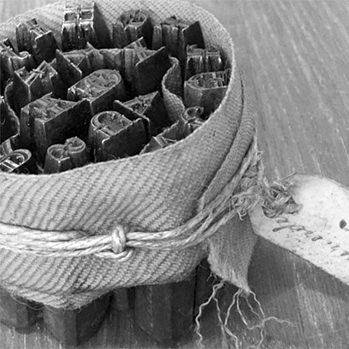
dtl [Gros] Canon Project
[Posted: Monday April 20, 2020]
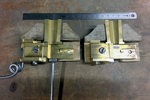
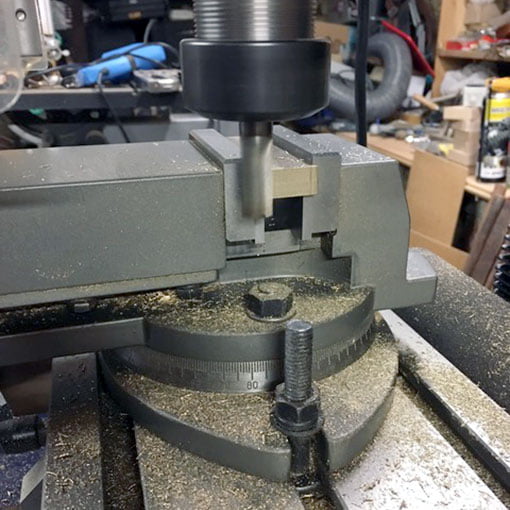
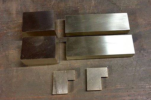
dtl’s [Gros] Canon Project continues with the reproduction of the Giet Instrument 48 by expert Hugh Macfarlane. The ‘gi48’ (photo above) is probably the oldest surviving type mould dating from around the second half of the 16th century. It is part of the illustrious collection of Renaissance type-foundry material in the Museum Plantin-Moretus, Antwerp.
The gi48 replica will be equipped with movable registers, while the original has fixed ones. The work on the mould is progressing well: the guides are now finished and will be pinned to the carriage after the machine marks are polished out. The registers will need a slot machined into them, so they can be adjusted.![]()
![]()
The first part of the dtl [Gros] Canon Project included the digitization of three types by the Flemish Renaissance punchcutter Hendrik van den Keere (ca.1540–1580): Gros Canon Flamande (textura type, 1571), Gros Canon Romain (roman type, 1573), and Canon d’Espaigne (rotunda type, 1574). The latter is almost ready for release, which will complete then the first part of the project.
The reproduction of the historical type mould is the second part of the project, along with master punchcutter Stan Nelson crafting a small number of punches (based on dtl’s aforementioned digital revivals) and striking related matrices. The matrices will be adapted by Nelson to the constraints of the mould.![]()
![]()
The goal is to use the gi48 replica for casting the type from the matrices, and to distribute the foundry type to the customers who have bought one of the three digital revivals of dtl’s [Gros] Canon Project.
Reflections on Type and
Typography [Related Matters]
[Posted: Wednesday January 15, 2020]
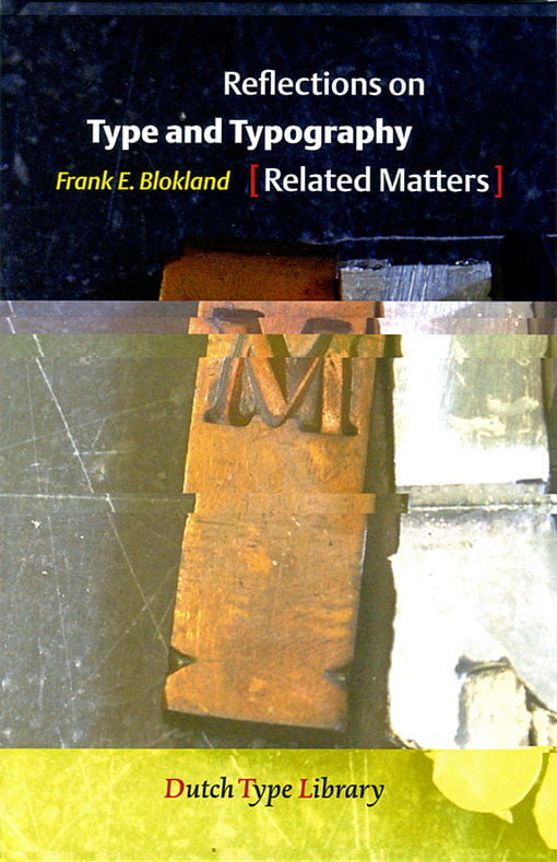
A booklet by dtl’s founder Dr. Frank E. Blokland that was written with the Typography Summer School 2019 at the University of Antwerp in mind. On this course the value of research for typography was investigated and discussed. The five keywords of the course were: ‘Perception’, ‘Convention’, ‘Legibility’, ‘Technology’, and ‘History’. These subjects are largely covered in this concise publication. Reflections on Type and Typography [Related Matters] is meant as basis for further discussion and was used as such at the summer school.
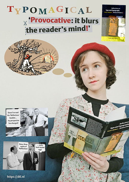
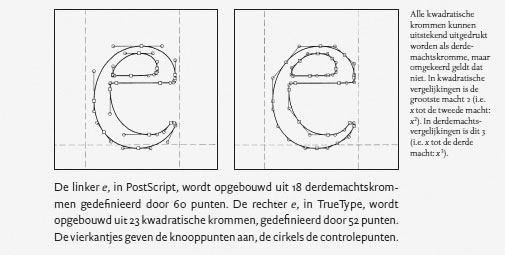
Perhaps some will consider the booklet’s content (slightly) heretical, or even that it befogs the readers’ minds. After all, it contains statements such as: ‘However, one can apply legibility research on type in use today, but it is very unlikely that Jenson and Griffo in particular did any legibility research before they developed their archetypal models for roman type.’ And: ‘Instead, type designers seem to rely purely on the eye, but, […], what they see is the result of conditioning. One can simply conclude that conditioning is based on conventions, and conditioning preserves conventions. Thus the snake bites its own tail; to rely on the eye, one has to be trained to look at type in a certain way.’ And so on…![]()
![]()
In the last two, somewhat more personal, chapters of the booklet Blokland reflects on the more recent changes in the type business, which he joined in the early 1980s. For example, in the Licensing Exclusivity chapter, he explains that the production of high-quality fonts requires a major investment of efforts and resources. In these volatile times it sometimes looks like not everyone in the graphic-design métier is fully aware of this. After all, not all fonts are for ‘free’, quality comes at a price, and paying for a product or service is the foundation of the profession of the graphic designer.
One of the two of promotional posters in a1 format for the booklet, with the young Eleonora Auguste (who holds her father's ‘provocative’ publication in her hands) in the lead, is shown at the top. The booklet costs €12.50 and is available via dtl’s online bookshop. It is also available as free downloadable pdf.
New responsive website
[Posted: Wednesday 16 October 2019]
The blending of the new responsive website and this vintage website is taking shape now. The new website functions nicely on mobile phones and tablets too. The html5-code of the desktop editions will validate perfectly and the same is the case for the xhtml code applied in the mobile-phone and tablet editions.
The website in front of you dates back from 1998. Originally it was setup as the equivalent of the a4 paper size, but it was extended in vertical direction when computer monitors became larger and, consequently, their resolution enhanced. After all, the versatile framework of the website was specifically developed to be easily adapted to the inevitable ongoing innovation of computer technology.
The next step, a couple of years later, was adding a column to the left. The ‘triptych’ was eventually completed by adding another column to the right. Also the navigation changed and improved over time.![]()
![]()
For the extension in vertical and horizontal directions, frames were used. In the course of time in general frames became less preferred by website developers; however, we consider it perfectly fine still. Although technically the frame-based structure becomes quite complex sometimes, we will continue to maintain the ‘triptych’ for another decade or so, if only because it contains a wealth of information on type and its development.
After all, the Dutch Type Library is the oldest digital type foundry in the Low Countries, celebrating its 30th anniversary in 2020!
Gerard Unger commemorated
[Posted: Friday 1 February 2019]
On the evening of Wednesday 23 January 2019 a special event to commemorate Gerard Unger took place in Amsterdam. It was a well-attended session, in which the multiple qualities of Gerard were illuminated. The talks and presentations were in Dutch, except for the Skype session with Erik Spiekermann. A video with a live-streaming recording was posted on YouTube a day later.
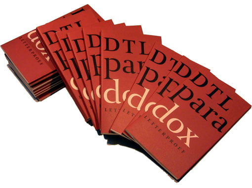
As former colleague, but above all as publisher of two of Gerard’s typefaces: dtl Argo (1992) and dtl Paradox (2000), Frank E. Blokland was the closing speaker. The main focus in his brief presentation was on the origin, design, and production of dtl Argo, which was expanded by the dtl Studio with two additional weights/styles and small caps in the course of time, and for which Frank personally made the Cyrillic and Greek versions roughly eight years ago. For those who do not understand Dutch, a summary in English of Frank’s talk is available.![]()
![]()
Especially for the evening in Pakhuis de Zwijger an A1-sized poster based on a marker sketch (a5) that Gerard made for dtl around 1992. The poster was nicely printed for the Dutch Type Library by Lenoirschuring in Amsterdam in the week prior to the event. Every attendee received a free copy in a cardboard tube. The poster is available via dtl’s online bookshop and costs €10
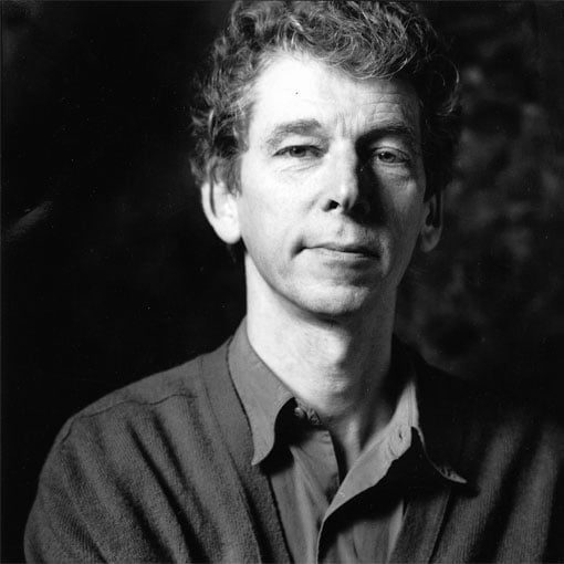
Gerard Unger 1942–2018
[Posted: Monday 26 November 2018]
On the 23rd of November Gerard Unger passed away. Gerard was an incredibly prolific and successful designer, whose typefaces were and are in use all over the world: in numerous newspapers, on all forms of signage, for corporate identities, et cetera. This success does not come as a surprise, knowing that Gerard had a unique, highly recognizable hand, which will remain to stand out like the idioms of famous precursors as, for example, Jenson, Griffo, Garamont, Granjon, Fleischmann, Van Krimpen, to name a few.
Also his publications on type and typography have reached a worldwide audience and have been translated in many different languages.![]()
![]()
The professional cooperation between Gerard and the Dutch Type Library dates from 1991, when dtl started to work together with urw in Hamburg. The production of dtl Argo began when Gerard was working for Hell still, but it was continued for urw. Eventually the sanse serif ended up at the Dutch Type Library.
Roughly eight years later dtl Paradox was taken into production. Gerard was investigating the work of especially François-Ambroise Didot and his punchcutter Louis Vafflard back then. Although the design of Paradox obviously contains 18th-century characteristics, Gerard’s extremely recognizable idiom is clearly visible everywhere. Hence, Paradox is not a revival –if only because Gerard, in line with, for example, Jan van Krimpen, did not like revivals at all. A booklet on Paradox, for which Frank E. Blokland wrote the introductory text, was published by dtl in 2002.
Gerard will be missed dearly by all who knew him as friend, colleague, and tutor.
New: Dutch edition of
The Elements of Typographic Style
[Posted: Monday 1 October 2018]
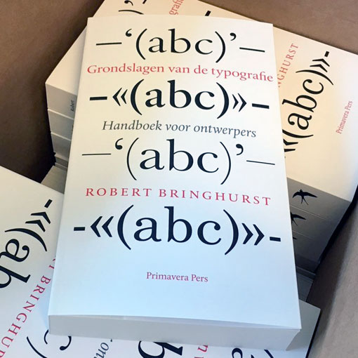
The production took quite some years, if only because it is a highly complex book to translate, but finally the Dutch translation of Robert Bringhurst’s worldwide bestseller The Elements of Typographic Style has become available. Literally translated the title Grondslagen van de typografie, means ‘The basics of typography’.
In the course of time Bringhurst’s bestseller has proven to be indispensable for professional graphic designers and typographers, as well as for anyone else who is interested in type and typography. The renowned German type designer Hermann Zapf described the book as ‘a must for everybody in the graphic arts’ and concluded that ‘all desktop typographers should study this book… I wish to see this book become the Typographer’s Bible.’ It has.![]()
![]()
The Dutch edition was designed by Titus Schulz, who selected dtl Albertina for the body text and cover and combined this with dtl Documenta Sans for the (extensive) captions. The book contains two forewords: one by Martin Majoor and one by dtl’s founder Frank E. Blokland.
New font-tools website
[Posted: Wednesday 5 September 2018]
In anticipation of new dtl/urw software releases this autumn, an updated version of our font-tools website was launched recently. The site contains information on dtl OTMaster, FoundryMaster, CompareMaster, and LetterModeller. Not mentioned on the site yet, but actually planned to be released around the end of this year, is GPOSMaster, which is the successor of dtl KernMaster. Besides the option to auto-kern OpenType cff and ttf fonts, it includes an advanced environment for editing the kern.fea files that it produces or that have been produced with another tool.![]()
![]()
The dtl/urw font tools are siblings of the very first font-production tool that made the digitization of resolution-independent contours possible back in the 1970s: the ikarus system. The ikarus file structure was developed with the handling of large amounts of font data in mind. Hence, it was highly suitable for batch-processing, which was controlled via unix scripts since the mid-1980s. The dtl/urw font tools have the ikarus technology under the hood still and their history is described on the site.
The new website also contains a forum, a link to the legacy website, and even entertainment: ‘Technical Trivial Facts’!
Festschrift zum 550. Todestag
Johannes Gutenbergs
[Posted: Friday 6 July 2018]
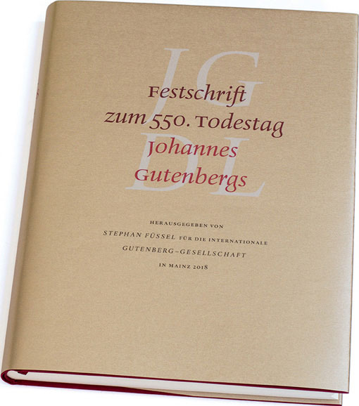
On Saturday 23 June 2018 the Festschrift zum 550. Todestag Johannes Gutenbergs was presented at the town hall of the city of Mainz. This beautiful commemorative publication is a tribute to… Johannes Gensfleisch zur Laden zum Gutenberg, who died in 1468. The book is designed by the famous typographer Ralf de Jong, who is professor at the Folkwang Universität der Künste in Essen and well know for the books Detailtypografie (2002) and Schriftwechsel (2008).![]()
![]()
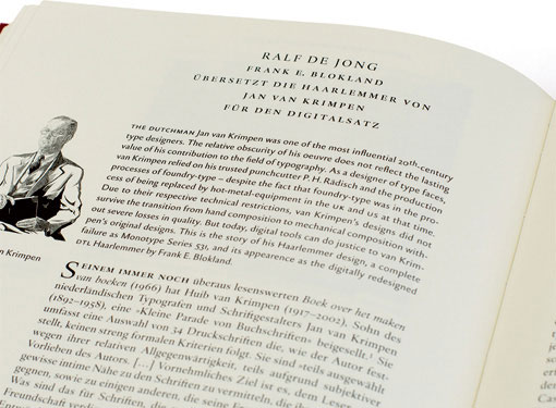
The ‘Festschrift’ is excellently typeset in dtl Haarlemmer (including the sans-serif variant). It contains an extensive article by De Jong on this typeface, Jan van Krimpen, and Frank E. Blokland. In 1995 Blokland started the design of dtl Haarlemmer and the first fonts were presented at the Van Krimpen exhibition that took place at the Museum Meermanno that year. At the request of Museum Boijmans Van Beuningen, which used dtl Haarlemmer for three corporate identity for roughly a decade, he added a completely new sans serif a couple of years later. This low-contrast variant was especially meant for the texts on the walls, similar to the use of dtl Documenta Sans at the Municipal Museum The Hague around that time.![]()
![]()
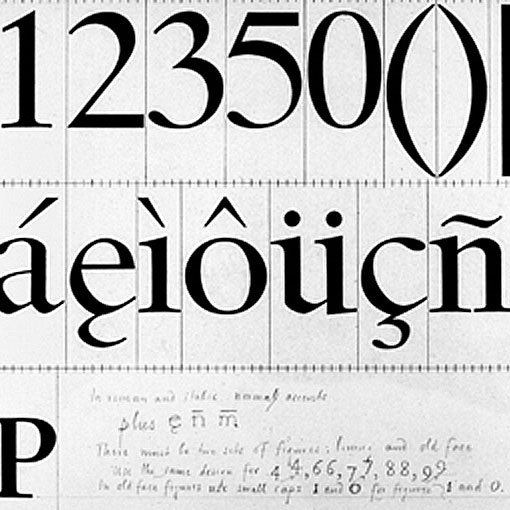
The basis for the digital Haarlemmer was the set of Jan van Krimpen’s nine original drawings from 1938, which were purchased by the Dutch Type Library in 1992.
Type-design fundamentals
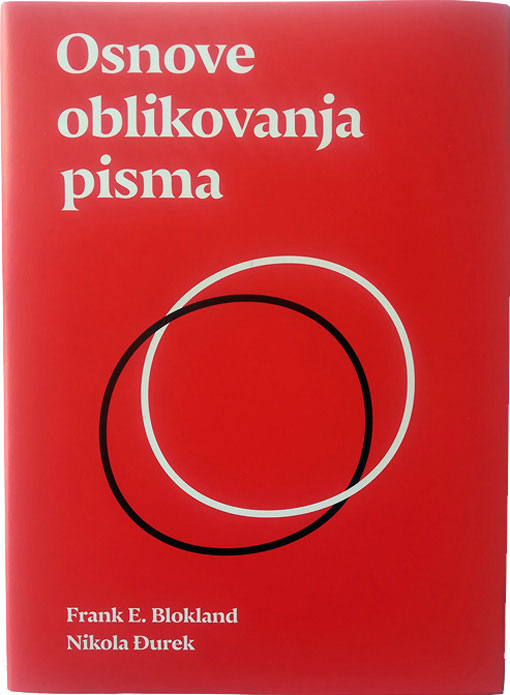
[Posted: Friday 18 May 2018]
Last week the University of Split, Croatia, published Osnove oblikovanja pisma, a book on type-design fundamentals by Dr. Nikola Djurek and Dr. Frank E. Blokland. On the one hand it combines elements of Blokland’s calligraphy course book from 1990 with his more recent research into the origins of the harmonics, patterns and dynamics in movable Latin type. On the other hand it contains information from Djurek’s PhD dissertation on the history of and conventions for Croatian diacritics with his ongoing research on the history of Croatian scripts (Glagolitic, Cyrillic, Latin).![]()
![]()
The book is especially meant for the students of the University of Split and hence the texts are in Croatian. Already there have been multiple inquiries about an English translation and this is investigated now.
This project was not the first joined one of Djurek and Blokland: they also worked together on the development of dtl Porta News.
dtl/urw++ hands-on session
at typo Labs 2018 in Berlin
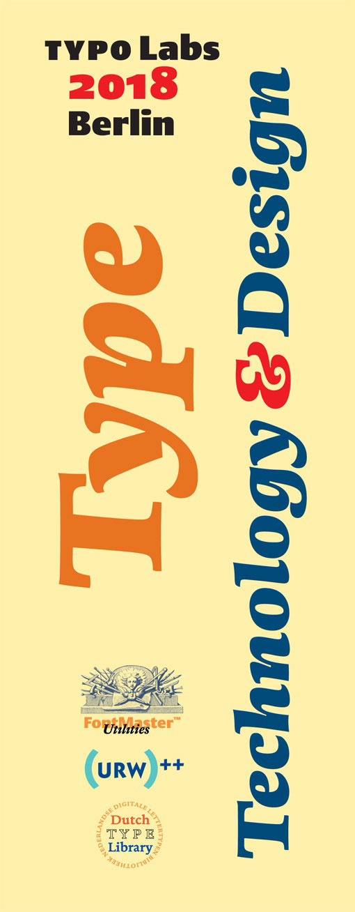
[Posted: Monday 2 April 2018]
Also this year the Dutch Type Library and urw++ Design & Development GmbH will be present (for the third time) at the typo Labs conference, which will take place in Berlin from 12 till 14 April 2018.
During the dtl/urw++ Type, Technology & Design hands-on session on Friday the 13th of April, Jürgen Willrodt and Frank E. Blokland will especially focus on the integration of OTMaster (otm) and FoundryMaster (fm2) in a workflow that is based on, for example, Glyphs or RoboFont. The idea behind this approach is that combining the unique functionality offered by different font tools can ease and speed up production matters considerably.
A new program that will be introduced at the dtl/urw++ hands-on session is GPOSMaster. As the successor of KernMaster, it combines auto-kerning with several editing options. Like otm and fm2, it will become available for macOS, Windows, and Linux.
More information can be found on the TypeDrawers forum (bottom page).
‘Digital, not industrial’
symposium in Amsterdam
[Posted: Sunday 28 January 2018]
On Saturday 10 February 2018 a symposium titled ‘Digital, not industrial’ will take place in a theatre located in the former type-foundry building of Tetterode in Amsterdam. The central theme is the type business’ change in the past roughly 50 years from a heavy industry in the times of foundry and hot-metal type into a profession for which light-weighted hardware in combination with relatively inexpensive software is sufficient. The question is whether the term ‘industry’ is appropriate for a profession that is mainly carried out in front of computers by individuals, of whom many are autodidact.
The heart of the symposium is formed by an on-stage discussion between young type designers (representing the new generation) on topics such as, for example, the creative part of type design, quality control, and the economic aspects of the profession today. The keynote speaker is Dr. Frank E. Blokland, who founded the Dutch Type Library, which was the first digital type foundry in the Netherlands back in 1990. One of the typefaces that was released in the 1990s is dtl Nobel, originally designed by Sjoerd de Roos for the Amsterdam Type foundry, which was a division of Tetterode.
In his keynote Blokland will place today’s type-design practice in an historical context. After all, one could state that the way digital type designers work is closely related to the practice of the archetypal punch cutters, who controlled the whole process from punch cutting to type casting on their own, and that the large-scale type production is typically something from the industrial era that started in the 19th century. However, the romantic idea of the historical punch cutter who put the emphasis on the eye and on manual labor is something that should be adjusted, as Blokland describes in his dissertation. Especially renowned punch cutters like, for example, Claude Garamont, Robert Granjon, and Hendrik van den Keere sophisticatedly standardized and systematized the font-production process to a large extent. This was necessary for the distribution of their type while retaining control over the justification of matrices and casting of letters by third parties elsewhere in Europe.
Comparably, present-day font production may look relatively simple at first sight because software seems to ease the type-design and font-generation process by hiding complex matter for the less technically-savvy type designers. However, to control all the technical aspects of the font-production on a professional level, more insight in the matter and also more sophisticated software is required. Also designing single fonts is something else than producing multiple type families and maintaining the related workflow, which comprises the (batch) generation of multiple font formats.
More information on the ‘Digital, not industrial’ symposium can be found here. A personal note by Blokland on formal type-design education can be found here.
dtl: Old-School Quality
& Latest Font Technology
[Posted: Friday 24 November 2017]
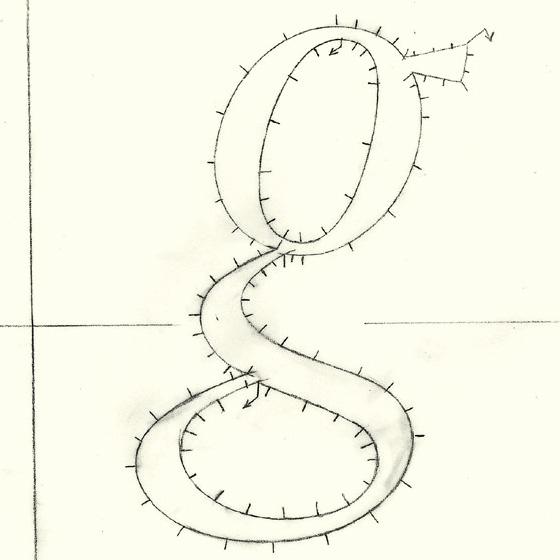
Preparations for the production of dtl fonts started in the second half of the 1980s. It will not come as a surprise that the ikarus format, in combination with manual digitizing, played an important role in the early days of the Dutch Type library. Actually, the ikarus format plays an important role at dtl still. Although times are undoubtedly changing and new technologies make other type-design and font-production methods possible, we believe that there is no better way to fine-tune the tension of curves and to control the (relation between the) quality of contours and counters, than drawing with pencil, pen, and brush. Doing things manually also makes clear that a speedy process is not always the best way to preserve the highest quality.
Drawing by hand can be the more appropriate way to define letter shapes than sculpting in Bézier format on screen, especially when making exquisite revivals. Our experience is that it is pretty easy (and tempting) to copy letter parts in Bézier format, but less easy to draw delicate differences. In, for example, dtl VandenKeere and dtl Fleischmann there are no identical serifs at all.
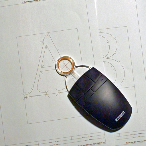
Tiny details are easy to draw by hand and to manually digitize, but much more difficult to preserve in cubic Bézier splines. Hence, at dtl we normally draw revivals on paper, or at least we start their production this way. However, also for new type designs the use of a tablet plus lens cursor is sometimes the most appropriate method. For example, Elmo van Slingerland’s beautiful dtl Dorian is the result of manually digitizing working drawings of letter forms that initially were drawn by a very skilled calligrapher on paper.![]()
![]()
The Dutch Type library does not only work with the ikarus format, it also support it in the dtl FontMaster suite –as the only software company in the world. The ikarus format was invented by Dr. Peter Karow in the 1970s and developed during the following decades at urw in Hamburg, Germany. Since 1991 dtl and urw work together and this resulted in a range of new (batch) font tools for macOS and Windows. Among these is dtl IkarusMaster, which supports a range of Wacom tablets with lens cursors.
Of course, the dtl/urw font tools support the very latest font technology, such as the OpenType Font Variations format, also. However, working with the ikarus tools preserves the old-school quality for which the exclusive typefaces of the Dutch Type Library are so much renowned for almost three decades.
dtl Flamande: for connoisseurs
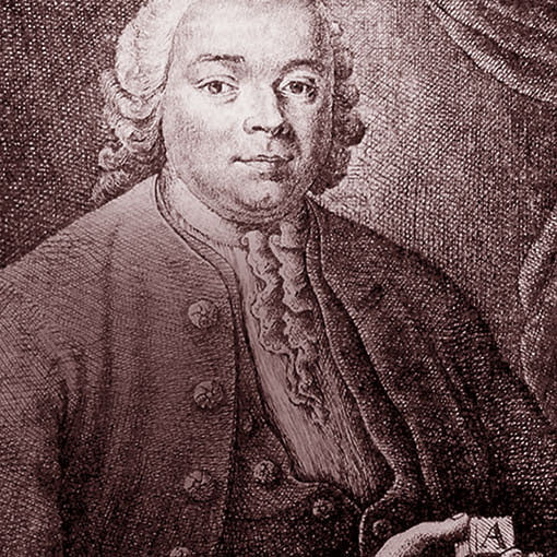
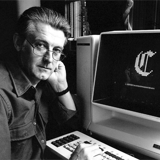
[Posted: Friday 8 September 2017]
The development of dtl Flamande started in 1992. That year the legendary American type designer Matthew Carter (photo above) and dtl’s founder Frank E. Blokland were both speakers at the Didot seminar, which was organized by urw in Hamburg. During the event Carter granted the Dutch Type Library the rights on his revival, which was named dtl Flamande then.
Roughly 25 years later the German type designer Lukas Schneider, who holds a master’s degree from the renowned kabk TypeMedia course and who successfully graduated at the Expert class Type design course in Antwerp, was invited to enhance the character set. The full story can be read in the September 2017 edition of dtl’s NewsLetterNews.![]()
![]()
Van den Keere’s textura types and this revival are as delicate and exquisite as an excellent Premier Grand Cru Classé. dtl Flamande, which matured like a top wine, is definitely a typeface for real connoisseurs. It is part of the ‘dtl Canon’ trilogy, which also contains dtl GrosCanon, based on Hendrik van den Keere’s Gros Canon Romaine from 1573 and his Canon d’Espaigne from 1574. Both revivals were created by Lukas Schneider.
dtl GrosCanon will be released October 2017 and dtl SpanishCanon will become available in November of this year.
tdc Medal for Gerard Unger
[Posted: Tuesday 25 July 2017]
On the evening of Tuesday 18 July 2017 Dr. Gerard Unger received the prestigious Type Directors Club (tdc) Medal at The Cooper Union in New York. As one can read on the tdc website, the ‘Type Directors Club is the leading international organization supporting excellence in typography, both in print and on screen.’
In the fifty-year history of the tdc Medal, Unger is the thirtieth recipient. The first medal was awarded to Hermann Zapf in 1967 to honor his enormous and diverse contributions to typography. Unger joins a prestigious list of medalists that besides Zapf, includes Matthew Carter, Erik Spiekermann, and Gerrit Noordzij.
As publisher of dtl Argo and dtl Paradox, the Dutch Type Library is very pleased and proud that Unger received the tdc Medal. dtl Argo was published exactly 25 years ago and was immediately a success. For roughly a decade it was for example the corporate identity typeface of the New York Stock Exchange and for more than two decades it is in use now by Emerson Electronics. It is also the typeface used for the signage at Keflavik International Airport in Reykjavik, Iceland. In the Netherlands dtl Argo is for example the corporate typeface of the Royal Bam Group. dtl Paradox was added to the Dutch Type Library’s collection in 2000 and is mostly used for exclusive and delicate book designs.
Especially for the tdc award ceremony a very nice video was created by Ryan Pescatore Frisk for Strange Attractors Design in Rotterdam. The image above is taken (with permission, of course) from this video. We congratulate Gerard Unger with his well-deserved medal!
dtl Valiance released!
[Posted: Thursday 22 June 2017]
The Dutch Type Library is extremely proud to present dtl Valiance, an all-round, all-purpose serifed typeface by the highly talented, award-winning Finish type designer Hanna Hakala.
The production of dtl Valiance started in 2007 when Hanna graduated from the famous TypeMedia master’s course at the Royal Academy of Art (kabk) in The Hague. After ten years of polishing, improving, testing, revising, and enhancing, dtl Valiance is –at last– available in all current font formats now.![]()
![]()
dtl Valiance is suitable for every possible typographic application: from magazine to web design and from book typography to corporate identities. This unique typeface can be used in each and every practice, i.e., from design to office environments. Its classic, timeless, sturdy yet elegant design makes dtl Valiance highly suited for use on high-resolution equipment, such as image setters, but also on relatively low-resolution devices, such as computer screens and laser printers.
The character sets covered by dtl Valiance include all Western-, Central, and Eastern-European languages, besides Cyrillic (including Bulgarian and Serbian variants).
Design and branding agencies interested in dtl Valiance may contact the Dutch Type Library for a free copy of Notes on the Design of dtl Valiance Cyrillic, which includes a concise type specimen, via e-mail. This e-mail address can also be used for further inquiries on dtl Valiance, of course.
dtl at typo Labs 2017
[Updated: Saturday 22 April 2017]
Together with our longtime (since 1991!) German partner urw++, the Dutch Type Library organized a special hands-on session focused on the production and modification of OpenType Font Variations, also known as ‘variable fonts’, at the TYPO Labs 2017 conference on the morning of Friday 7 April.
Dr. Jürgen Willrodt demonstrated how to prepare and modify already existing fonts for the production of variable fonts. He showed how to make all glyphs isomorphic for interpolation and how to create variable fonts using FoundryMaster (the successor of dtl FontMaster), and finally proofing and modifying OpenType Font Variations with OTMaster.
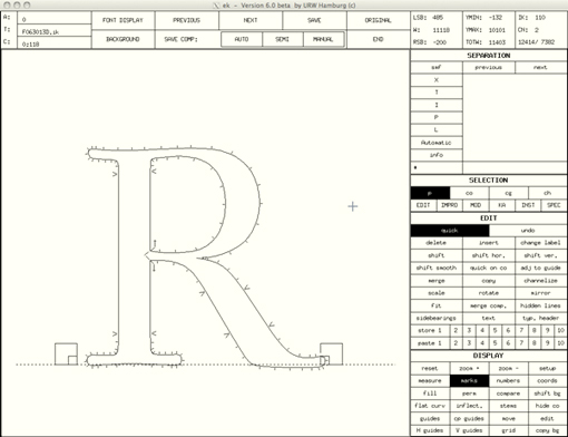
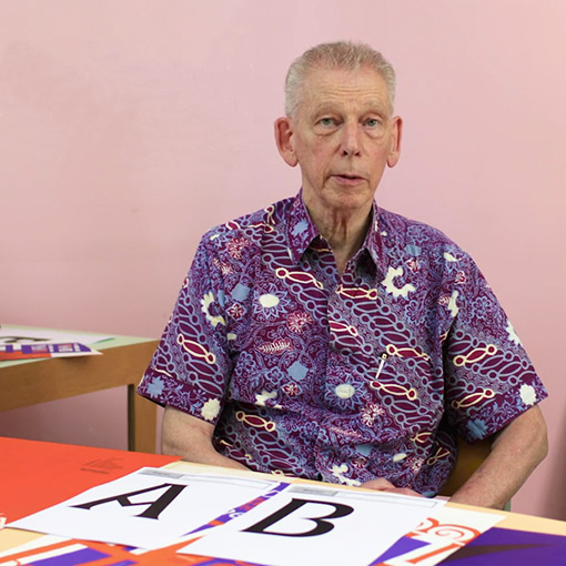
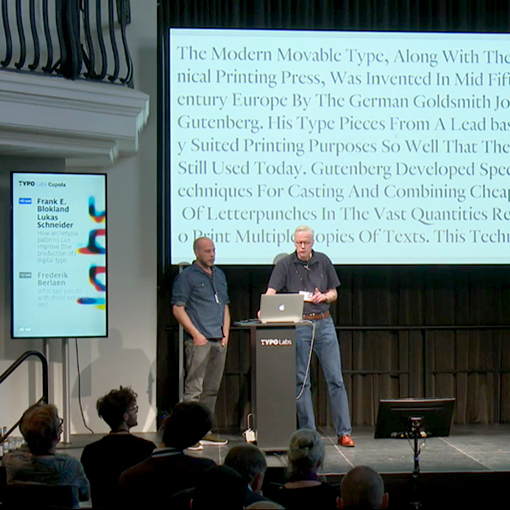
In the main conference program Dr. Frank E. Blokland addressed the question of how patterns distilled from Renaissance archetypal models can be used for the analysis and parameterization of digital type-design processes. Outcomes of Blokland’s PhD research at Leiden University have been translated into software for auto spacing, which is based on the intrinsic underlying patterning in roman and italic type.
Type designer Lukas Schneider demonstrated the ls Cadencer and the related ls Cadenculator, which are (batch) auto-spacing tools written by him in Python. This software can be used to replace optical spacing completely or it can be applied supplementally to spacing by eye.
The talk was recorded on video.
In anticipation of the undoubtedly exciting upcoming developments in the context of variable fonts, the Dutch Type Library has recently registered the‘fontvariations.com’ domain. We will keep you posted!