New Luther Bibel 2017
completely typeset in dtl fonts
[Posted: Friday 16 November 2016]
![]()
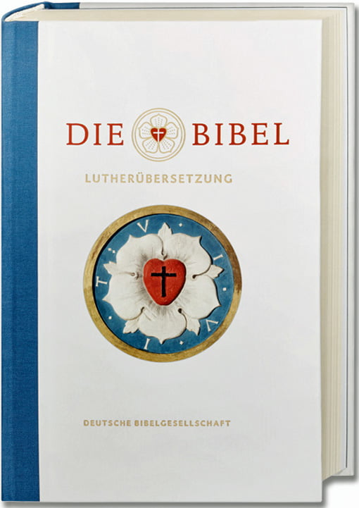
End of October 2016 the new Luther Bibel 2017 for the Evangelische Kirche in Germany, which is typeset in dtl Documenta and dtl Caspari, was published. The design is by the renowned typographers Cornelia Feyll und Friedrich Forssman. The typographic concept is described in this pdf (in German). The first print run of the Luther Bibel 2017 was 260,000 copies.
Especially for the Luther Bibel 2017 dtl Documenta was enhanced with Medium and Bold Italics (including small caps, of course). These weights/styles will become generally available end of this year.
The fact that the Luther Bible 2017 has been typeset in dtl Documenta makes it a nice example of ecumenism. After all, in 2014 3,6 million copies (1,300 pages each –all typeset in dtl Documenta) of Gotteslob, the new prayer and song book of the Catholic church in Germany and Austria, was released.
On the Origin of Patterning
in Movable Latin Type
[Posted: Friday 21 October 2016]
![]()
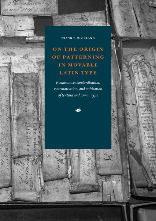
Since a couple of days a print-on-demand edition of Dr. Frank E. Blokland’s On the origin of patterning in movable Latin type: Renaissance standardisation, systematisation, and unitisation of textura and roman type is available from Lulu.com. Obviously there is a lot of interest for the subject and hence demand for the book, because already a respectable number of copies have been sold.
The a4-sized book contains 455 pages and is printed in black and white.
Public defence of PhD thesis
on Renaissance type patterning
[Updated: Thursday 13 October 2016]
![]()
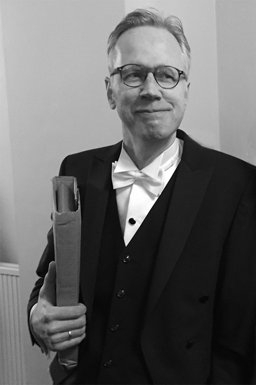
On 11 October 2016 at 11:15 a.m. dtl’s founder Frank E. Blokland successfully defended his PhD dissertation at Leiden University. Blokland’s research is conducted to test the hypothesis that Gutenberg and consorts developed a standardised and even unitised system for the production of textura type, and that this system was extrapolated for the production of roman type in Renaissance Italy.
For roman type, Humanistic handwriting was moulded into a prefixed standardised system already developed for the production of gothic type. This was possible because of the intrinsic morphologic relationship between the structures of the written textura quadrata and the Humanistic minuscule.![]()
![]()
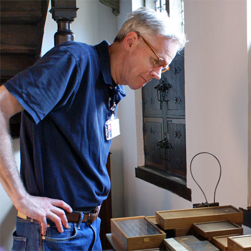
Outcomes of Blokland’s research, for which he measured intensively the French-Renaissance type foundry material from the collection of the Museum Plantin-Moretus in Antwerp, provide proof for his theory that technical matters from the Renaissance font production directly influenced the proportions and details of roman (and later italic) type.
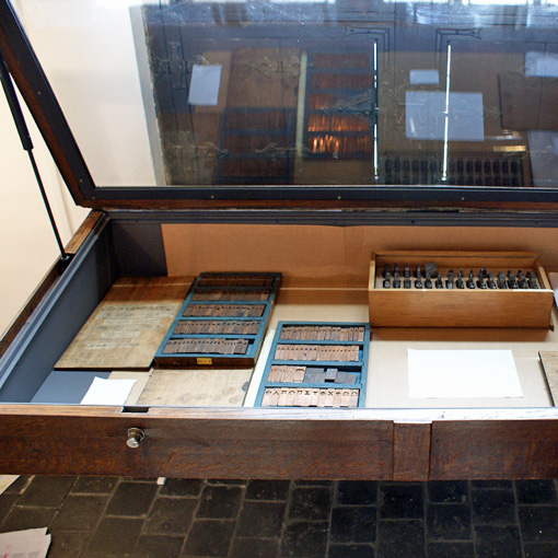
On 2 October 2016 Blokland gave a related talk at the Museum Plantin-Moretus on occasion of the re-opening of the museum. As guest curator he organized the newly arranged display of historical type-foundry material in relation to digital font technology at the museum.![]()
![]()
During his talk Blokland addressed the question: how can the patterns and structures distilled from Renaissance archetypal letter models be used for analysis, for educational purposes, and for the parameterisation of present-day type design processes?
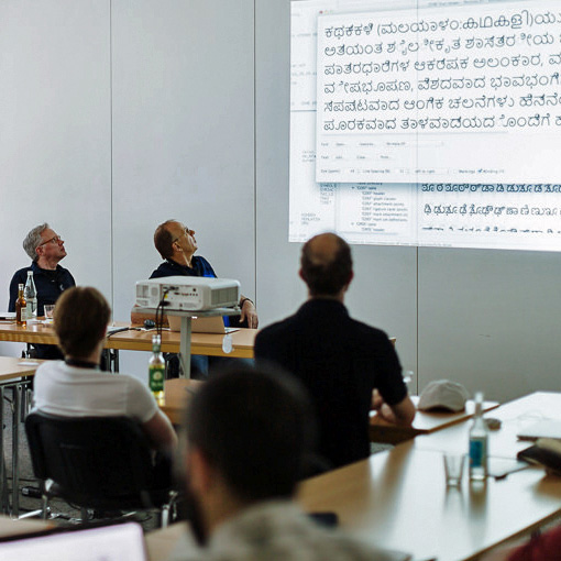
Some outcomes of Blokland’s research have been translated into software, such as dtl LetterModeller (LeMo) and the ls Cadencer, tools which he demonstrated during his talk.
typo Labs’ sessions reviewed
[Posted: Monday 16 May 2016]
The typo Labs 2016 conference in Berlin was a very nice and well-organized event. In the meantime two reviews of the dtl/urw++ session have been posted on the related web site: an article by Atilla Korap on the dtl/urw++ tools and one by Frank E. Blokland on the presentation of the ls Cadencer/ Cadenculator tools.
A few additional remarks upon the first review: actually FoundryMaster does support the export of .ufo currently and shortly it also will be possible to import this format. The internally used .be (or .ib, which has 4-byte support) format is as proprietary as the .ufo format and has been made public a couple of decades ago. And, of course, dtl OTMaster does have a sophisticated glyph editor built-in!
dtl at typo Labs 2016
[Posted: Sunday 1 May 2016]
On 10 and 11 May 2016 the first typo Labs font-technology conference, which is an offshoot of typo Berlin, will take place at Forum Factory in Berlin. The conference is advertised as an event for those who actively want to participate and to discuss technical matters with academics, technologists, and industry leaders from across the globe. Of course, the focus will be also on type-design and font-production related issues, as many of the technically oriented speakers are also highly experienced in these areas.![]()
![]()
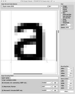
Together with its German partner urw++ the Dutch Type Library has organized a special meeting during the conference on Wednesday 11 May. During this hands-on session details on how to apply dtl OTMaster, FoundryMaster, and LetterModeller will be demonstrated and discussed simultaneously in groups.
The designers and programmers of dtl and urw++ will be joined by Lukas Schneider, who developed ls Cadencer and ls Cadenculator, a pair of nifty tools for auto-spacing. The underlying principle and algorithm for these two tools find their origin in Frank E. Blokland’s PhD research on the (effects of) systematization, standardization, and unitization in the Renaissance type-production process.
More information about the dtl/urw++ session can be found here.
dtl OTMaster 6 Released
[Posted: Thursday 3 March 2016]
Together with our German partner urw++ we are proud to present the new and even more sophisticated sixth edition of dtl OTMaster, the high-end post-production font tool for reviewing, editing, and altering font tables and glyphs of cff- and ttf-based OpenType fonts and TrueType collections fonts.
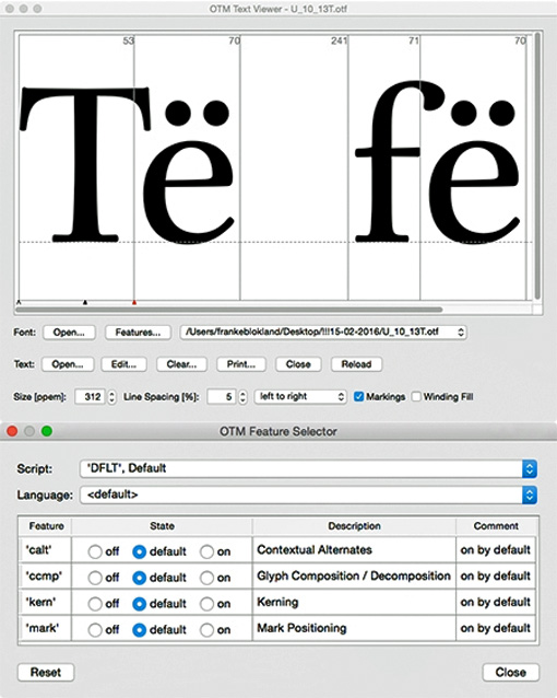
otm 6 fully supports the Retina displays now. Besides this it opens afdko-made ttc, imports and exports woff and woff2 fonts, and supports metrics editing in the advanced text viewer that integrates the cutting-edge HarfBuzz OpenType Layout engine. Furthermore, the glyph editor has been enhanced with a range of new tools. Also the features selector has been improved, as is shown in the image below.![]()
![]()
dtl OTMaster 6 is available for Mac os X 7 and newer, Windows 7 and newer, and Linux. The introduction price of otm 6 is 25% off, i.e., only € 191.25, until 1 June 2016. It can be purchased directly from dtl’s FontTools Shop. More information can be found here
The Coolest Type
[Posted: Monday 1 february 2016]
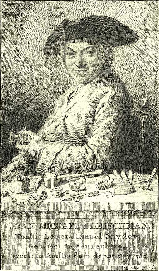
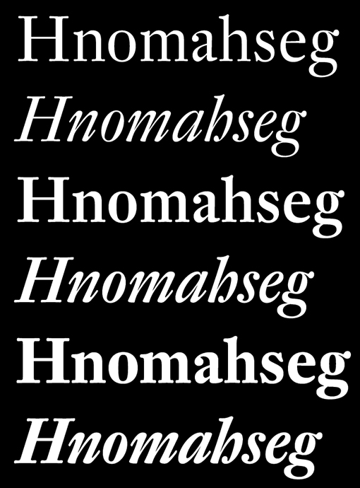
On 27 January 2016 an article on the coolest unknown type was published online by the German weekly publication Die Welt, and the brief listing includes dtl Fleischmann. The development of this marvelous type family started almost 24 years ago. It was after Frank E. Blokland’s talk at the Didot seminar, which was organized by urw (especially Dr. Karow) in Hamburg in 1992, that the development of dtl Fleischmann was discussed with Erhard Kaiser, a very talented type designer from Leipzig. At that time Kaiser was already highly experienced after a shining career at Typoart, the large and only typefoundry in the German Democratic Republic after 1948.![]()
![]()
The 18th-century German punchcutter Johann Michael Fleischmann worked for a long time in the Netherlands and in line with this, a German type designer was invited to make the digital Fleischmann revival. Roughly a month after the meeting in Hamburg, Kaiser sent Blokland the first initial drawings and that was the start of a fruitful and successful cooperation.
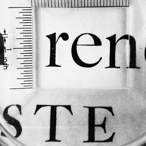
Subsequently Kaiser made drawings of all characters on a x-height of a few centimeters. These drawings were enlarged to a capital height of ten centimeters and next manually the contours were polished in pencil drawings. The pencil outlines were marked and hand digitized using a lens cursor and the ikarus system.![]()
![]()
Because the production process was largely analogously, the elegance and liveliness of the original foundry type version were preserved. This approach also prevented too much standardization, something that is easily achieved by copying and pasting of digital font data. Hence, dtl Fleischmann shows such an enormous wealth of details.
Rosart Anvers
[Posted: Monday 30 November 2015]
The Museum Plantin-Moretus in Antwerp has a truly fabulous collection of punches, matrices, foundry type, and historic prints. Not coincidently, this is the location where the Expert class Type design (EcTd) course of the Plantin Institute of Typography, led by dtl’s founder Frank E. Blokland, takes place. A very important part of the EcTd course is the exchange of knowledge and skills between the students. The yearly revival project is targeted at this; the students cooperate on a redrawing and an adaptation of historic foundry type, using material from the Museum Plantin-Moretus’ rich collection. The students encounter that the original models are not as clear as they look at first sight; there is definitely room for different interpretations and the students have to reach a consensus.![]()
![]()
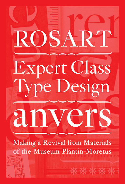
The EcTd laureates of the 2014–2015 course made booklet on their Rosart revival project, titled Rosart Anvers. They come from Poland, Ireland, Germany, Italy, France, Netherlands, and Belgium. This booklet is not just a presentation of the outcomes of the Rosart project; it is a concise manual and guide for everyone who wants to investigate historic type-foundry material and wants to produce a revival.
The Expert class Type design course is not restricted to the making of revivals, and proof of this is also presented in this booklet.![]()
![]()
The Dutch Type Library is the proud publisher of this highly interesting booklet. The texts are in English and the illustrated booklet contains 44 pages (143 × 210 mm) and 500 copies were printed on 120 and 200 grams Munken Lynx paper by Drukkerij Atlanta in Leuven, Belgium.
Rosart Anvers can be ordered via dtl’s
online bookshop.
dtl’s highest ranking ever
[Posted: Thursday 1 October 2015]
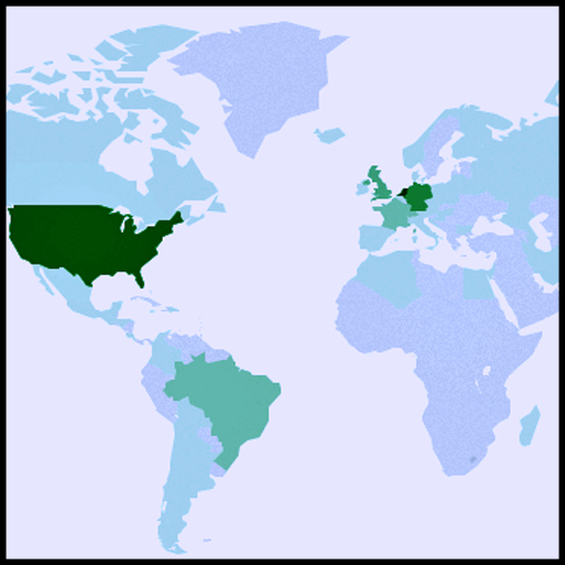
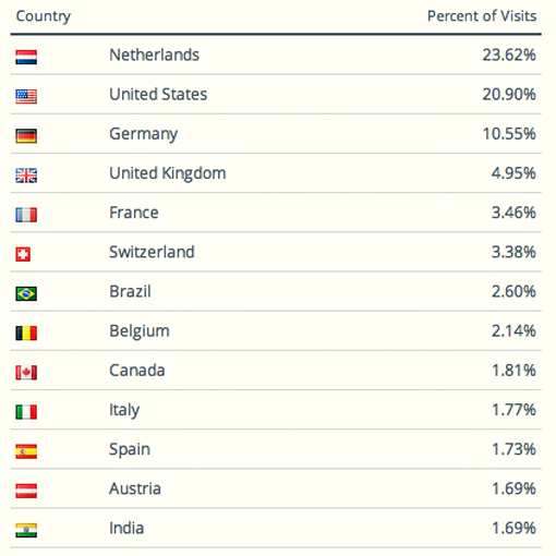
Currently the Dutch Type Library’s website is ranked by Alexa among the ±85.000 most visited ones in the world, which is dtl’s highest position ever. Most visitors come from Western Europe and the usa.
dtl’s website was launched in 1998, eight years after the Dutch Type Library formally entered the font market as the first Dutch producer and publisher of digital typefaces. At that time dtl had become a well-known company in large parts of the world already. It was highly successful in the usa, because quite some renowned branding agencies had recognized the exquisite quality of the dtl typefaces.
This culminated in corporate-identity typefaces for, among others, companies like the New York Stock Exchange (dtl Argo), Diamond Trading Company (dtl Documenta), Emerson Electronics (dtl Argo), and the European Union (dtl Albertina).![]()
![]()
Especially our markets in the Far East and South America rapidly grew after the launch of this website. November 2014 the Dutch Type Library had customers in 60 countries, as was mentioned in this column then.
At the moment the Dutch Type Library is working on two new additional websites, which will be launched next year at www.exquisitefonts.com (especially targeted at high-quality fonts for printing) and at www.webfontmaster.com (not surprisingly for dtl’s webfonts). Stay tuned!
Premier Grand Cru Classé
[Posted: Friday 15 May 2015]
Shortly after dtl was officially founded as the first digital type foundry in the Netherlands in 1990, the office and studio moved to the historic city center of ’s-Hertogenbosch (also known as Bois-le-Duc). dtl’s premises dated from the middle ages, and it was the perfect place for a company that is strongly anchored in the typographic tradition.
Here the library was extended with typefaces by highly renowned designers like Jan van Krimpen, Gerard Unger, Chris Brand, Michael Harvey, and Erhard Kaiser, combined with work from younger talents like Elmo van Slingerland and Gerard Daniëls.
Also the development of the dtl/urw++ software for the professional font production started at the studio in the city center.
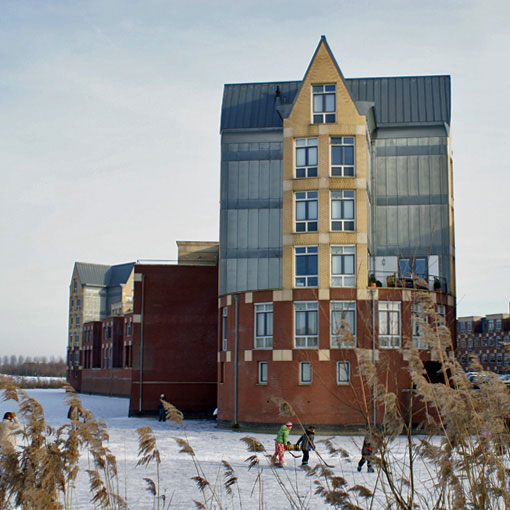
Nowadays dtl’s headquarter (the proprietary six-floor tower on the photo above) and studio (a four-floor building opposite of the tower at the other side of the surrounding golf course) are situated in the country side nearby the historic city of ’s‑Hertogenbosch.
In the rapidly changing landscape of the font business, the Dutch Type Library is a solid and constant factor. The company is praised for its meticulously produced fonts and the highly sophisticated software. dtl’s philosophy is that type has to mature like a Premier Grand Cru Classé. Modern font tools, such as the dtl FontMaster suite, make it possible to produce digital type in a mere jiffy, but a well-balanced design requires time. A lot of time. As does the refining and polishing of glyph-contours. Hence, dtl’s production process can be compared with the speed of a land turtle.
With its own font tools and slow-fonts approach, combined with absolute independence –in all meanings of the word–, the Dutch Type Library is a sort of Galapagos Island in the type industry. We very much look forward to –at least– another 25 successful years!
dtl OTMaster 5 released
[Posted: Friday 9 January 2015]
A new version of dtl OTMaster (otm), the highly sophisticated tool for reviewing, editing, and altering tables and glyphs of fonts with a sfnt-file structure, has been released. otm is a must-have for professional font developers.
To quote Adam Twardoch, product and marketing manager at Fontlab Ltd.: ‘OTMaster works with surgical precision: it will only modify the portions of the font that the developer wishes, leaving all other structures unchanged. This makes OTMaster a great companion to any font editor and an indispensable element even in the most complex OpenType font production workflow.’
Version 5.0 contains a range of new nifty functions:
— New Text Viewer, which includes Harfbuzz for the interpretation of OpenType Layout features.
— Display of all current color tables, such as cbdt, svg, sbix and colr, and glyphs.
— Updated Font Viewer, containing now a search field for glyphs, unicodes...
— Updated Side by Side Viewer, which contains among other new options, a 'Winding fill' as opposed to the standard fill option.
— Updated Glyph Editor, with improved guideline and grid functionality, improved measurement options, new clipboard with support for multiple entries , et cetera.
dtl OTMaster 5 can be ordered here.
dtl customers in 60 countries!
[Posted: Friday 28 November 2014]
January 2015 the Dutch Type Library will celebrate its 25th anniversary. The past 25 years have been highly successful and dtl delivered the corporate typefaces for many companies, publishers, banks and cities, among which the European Union, the New York Stock Exchange, Germany’s Phoenix Television Broadcasting Company and zdfkultur, the Diamond Trading Company (formely De Beers), Emerson, Taylor Nelson Sofres, Amnesty International usa, the Rijksmuseum Amsterdam, Frans Hals Museum, Teylers Museum, Museum Plantin-Moretus, the city of Amsterdam, Antwerp, Köln, Keflavik International Airport, Finland’s most popular newspaper Helsingin Sonamat, Georg Thieme Verlag, Oxford University Press, et cetera, et cetera.
Since the second half of the 1990s, dtl started together with the programmers of urw++ Design & Development GmbH the development of the dtl FontMaster modules for Mac os, Windows and Linux. The current flagship is dtl OTMaster (otm), a highly sophisticated application for reviewing, editing and altering tables and glyphs of fonts with a sfnt file structure. otm is a huge international success. A new, further enhanced edition will be released in the second half of December 2014.
Up to now, dtl has customers in 60 countries: Argentina, Australia, Austria, Bahrain, Belgium, Bermuda, Brazil, Britain, Canada, Chile, China, Colombia, Croatia, Czech Republic, Denmark, Estonia, Faro Islands, Finland, France, Germany, Greece, Guadeloupe, Hong Kong, Hungary, Iceland, India, Indonesia, Ireland, Israel, Italy, Japan, Korea, Kuwait, Lebanon, Liechtenstein, Luxembourg, Malaysia, Mexico, Netherlands, New Zealand, Norway, Philippines, Poland, Portugal, Romania, Russia, Saudi Arabia, Scotland, Singapore, South Africa, Spain, Sri Lanka, Sweden, Switzerland, Taiwan, Thailand, Turkey, United Arab Emirates, usa, and Venezuela.
Currently the Dutch Type Library’s website is ranked by Alexa among the 90.000 most visited ones of the world, which is dtl’s highest position ever.
Cutting Edge of Type Techology
[Posted: Wednesday 29 October 2014]
The Dutch Type Library is cooperating with the Hamburg, Germany based company urw++ Design und Development GmbH since 1991. Highly sophisticated font tools like the ikarus system and its siblings dtl FontMaster and dtl OTMaster are developed at urw++.
Summer 2014 the urw++Film was made and it gives insight in the (philosophy behind the) production of highly professional (global) fonts and font-development tools by our longtime friends and colleagues in Hamburg.
The very experienced experts talking in the film like Dr. Jürgen Willrodt, Head of Technology at urw++, belong to the small group of pioneers that stood at the cradle of digital type with the ikarus format in the second half of the 1970s. Together they have more than 100 years of experience in type design and type technology, as is mentioned by Peter Rosenfeld, who is Head of Sales and Marketing.
25 Years of Exquisite Quality
[Posted: Monday 1 September 2014]
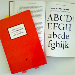
The Dutch Type Library is a pioneer of digital type, entering the computer font market in the industry’s first decade. Spring 2015 it is 25 years ago that dtl was officially founded –after many years of preparation. This occasion will be celebrated in several ways; for instance a special, highly delicate type specimen will be published (a preliminary small test edition was sold [out] at last year’s ATypI conference in Amsterdam). And for this website we are preparing a retrospective.![]()
![]()
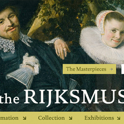
The past 25 years were highly successful. After a relatively slow start –due to the fact that besides the development from scratch of a completely new digital type library, also a hitherto not existing new niche market had to be generated and activated– the Dutch Type Library was spotted by the world's leading branding agencies, especially in the usa. This resulted in the selection of dtl typefaces for major corporate identies, like those of the New York Stock Exchange, The Diamond Trading Company (formely De Beers), Emerson, Taylor Nelson Sofres, Amnesty International usa, etcetera, etcetera. Cities like Amsterdam, Köln and Antwerp selected dtl typefaces, as also many museums like –among many others–the Rijksmuseum Amsterdam, Teylers Museum in Haarlem and the Museum Plantin-Moretus in Antwerp.
Numerous books were and are typeset in dtl typefaces and sometimes printed in very large quantities, like the recently published 3.6 million copies (1,300 pages each) of Gotteslob, the new prayer and song book of the Catholic church in Germany and Austria for which dtl Documenta was used.![]()
![Type[&]Design 2009](Images/News_27082014_3.jpg)
![]()
The original plan was to publish one typeface per year, but this goal was not reached so far. As dtl's founder Frank E. Blokland wrote in Hanna Hakala’s booklet Notes on the Design of dtl Valiance Cyrillic in 2013: ‘dtl’s philosophy is that type has to mature like a Premier Grand Cru Classé. Modern font tools, like the dtl FontMaster suite, make it possible to produce digital type in a mere jiffy, but a well-balanced design requires time. A lot of time. As does the refining and polishing of glyph contours. On dtl’s Twitter account I once jokingly compared the pace of our production process with the speed of a land turtle. With its own font tools and slow-fonts approach, the Dutch Type Library is a sort of Galapagos island in the type industry.’
The good news is that in 2015 dtl Fell and dtl Romulus will be published at last, 18 years after the production of these two exquisite typefaces started.
Together with urw++ highly professional font tools like dtl FontMaster and the sophisticated OpenType/TrueType editor dtl OTMaster are developed since the late 1990s. dtl and urw++ organized a number of related conferences at classy locations, such as Castle Maurick near ’s‑Hertogenbosch and the five-star Steigenberger hotels in Scheveningen (The Hague) and Hamburg.
In short: there is a lot to clebrate coming year!
otm Summer Promotion
[Posted: Monday 30 June 2014]
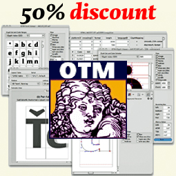
From the 1st of July till 21 September the latest edition (3.7) of dtl OTMaster will be offered with a 50% discount on the standard licensing price of €255.
Version 3.7 contains a lot of new functionality. From the import/export of Ideographic Variation Sequences (ivs) to the editing of feature parameters, and from an autohinter for edited or newly added glyphs to support for colr+cpal tables.
Some use otm for font-spelunking, other use it for Open(Type)-heart surgery. Some use it for compiling OpenType Layout features (directly in the font, or exported for proprietary workflows) by applying the elegant automatic subsetting, while others use it for instance for mark (to mark) positioning.
otm is the ultimate Swiss (or actually German/Dutch) knife for cff- and ttf-based OpenType, TrueType, and ttc (TrueType Collection) fonts.
A complete listing of the functionality in otm 3.7 can be found here. dtl OTMaster can be ordered directly at dtl’s FontTools shop and the printed manual can be ordered online here.
dtl Caspari News & Porta News
[Posted: Friday 9 May 2014]
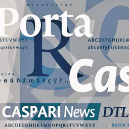
After eight years of development the Dutch Type Library has finally and proudly released the newspaper-optimized typefaces dtl Caspari News and dtl Porta News.
These two great new font families, which both comprise special text and display versions, are available now for the end-user market via dtl’s online shops. A specially printed type specimen on tabloid format, which was originally developed for the goody bag of the ATypI Amsterdam 2013 conference, is available from the Dutch Type Library on request.
More information
Silver for dtl Valiance
[Posted: Friday 25 April 2014]
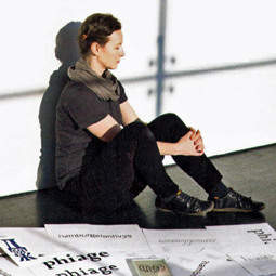
Anticipating its release this Spring, Hanna Hakala’s dtl Valiance got awarded with silver in the Finnish design competition Vuoden Huiput. This is the most important event for graphic design and advertising in Finland. The aim of this annual competition is to emphasise the importance of the work by visual-communication professionals in advertising and design. There are Golden and Silver Awards to win.
The award comes roughly half a year after dtl Valiance was for the first time officially presented in the goody-bag booklet Notes on the Design of dtl Valiance Cyrillic at the ATypI Amsterdam conference in October last year.
In Notes on the Design of dtl Valiance Cyrillic Hanna Hakala, who studied graphic design at the University of Art and Design in Helsinki and type design at kabk’s master course Type & Media, presents a collection of notes made during the design of dtl Valiance. It's directly available from dtl’s online bookshop.
It was definitely a busy Spring so far for Hanna; she was interviewed for the Finnish magazine Grafia (Grafia ry is the organization of graphic designers in Finland) about dtl Valiance and the design of another Cyrillic typeface. She was also interviewed for the Finnish magazine Image about the details of type design.
Parametrized Type Design
[Posted: Friday 18 April 2014]
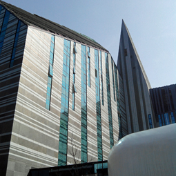
During the Libre Graphics Meeting 2014 (2–5 April) at the new Paulinum building (see photo below) of the University of Leipzig, dtl’s founder Frank E. Blokland talked about the practicle application of the outcomes of his PhD research at Leiden University (download slides). The main hypothesis for Blokland’s research is that Italian renaissance roman type was made on a standardized and unitized system that originally was developed for the production of the morphologically related Textura type in Germany.
This system not only made the design part, i.e., the cutting of punches, easier, but also the justification of the matrices, the casting of type, and the justification of text. One could state that Jenson and Italian consorts used ‘code’ developed by Gutenberg and German consorts. Maybe this was an early application of the Open-Source principle, who knows. ;-)
The second hypothesis is that present-day type design can be relatedly standardized without loss of creativity and individuality.![]()
![]()
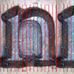
In Blokland’s talk at lgm the question how the patterns and structures distilled from the renaissance archetypes can be used for (the parametrization of) present-day type design was addressed. So far the hypothesized models and measurement outcomes were used for the development of two free software tools: LetterModeller (LeMo) and Kernagic. LeMo uses standardized, but adjustable patterns for the description of proportions and widths of roman type. It provides ways to interactively preview and apply global and local changes to horizontal metrics. Currently Kernagic provides ways to interactively preview global and local changes to the horizontal metrics.![]()
![]()
With direct support from the Open-Source community Kernagic will be further developed in the coming months. Not only will the spacing and subsequently the kerning functionality enhanced, but also the analytical part of the program, i.e., analysis of how do the horizontal and vertical proportions of the characters relate to the organically distilled ‘cadence-units’, and subsequently suggestions on how these proportions can be adjusted to this underlying pattern to improve the rhythmical structure.
The idea is that the developed technology will find its way into Open-Source font tools and also the Dutch Type Library is planning to incorporate the outcomes in some of dtl’s tools for the professional font production.
A related discussion on Blokland’s research can be found at the TypeDrawers forum.
3.6 million copies: Gotteslob
[Posted: Thursday 23 January 2014]
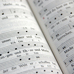
Its production took almost ten years, more than hundred people worked on the concept and realization –besides the people at the printing office. The publication has to last for at least forty years. Eight tons of red ink and roughly 3,000 tons of light-weight paper (40 grams) were needed to produce the 3.6 million copies (1,300 pages each) of Gotteslob, the new prayer and song book of the Catholic church in Germany and Austria.![]()
![]()
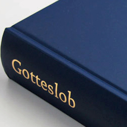
Responsible for the design of Gotteslob was Matthias Bumiller from the design agency Finken & Bumiller in Stuttgart, Germany. In 2006 he started with the design of this magnum opus, which resulted in a positively received test version in the next year. Legibility had the highest priority and factors like low light in churches in combination with the inevitable relatively small point sizes were taken into account. After testing several typefaces, Frank E. Blokland’s dtl Documenta was selected. This clean, easy to read and attractive typeface distinguishes the prayer and hymn book.![]()
![]()
In the past twenty-four years numerous books and brochures have been typeset in dtl typefaces. Sometimes in large quantities, like the daily publications of the European Union, which were typeset in eu Albertina for around ten years. Also a lot of printed material was produced by for instance the New York Stock Exchange (dtl Argo) or the Amsterdam Rijksmuseum (dtl Documenta). But 3.6 million copies of each 1,300 pages is an absolute new record!
More info (in German) and images can be found here.
Open-Source Spacing Tool
[Posted: Monday 6 January 2014]
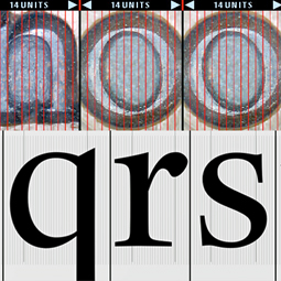
First steps have been made in the development of an Open-Source spacing and analyzing tool for ufo font data based on Frank E. Blokland’s PhD research at Leiden University on the Harmonics, Patterns, and Dynamics in Formal Typographic Representations of the Latin Script. The hypothesis is that the structure of roman type is an extrapolation of that of the morphologically related Textura type, and that Humanistic handwriting was molded into this structure.
The curved parts in roman type can be considered as overshoots of the straight strokes in Textura type. Defining the side bearings for roman type can therefore be done in the same way as for Textura type. It is quite possible that Nicolas Jenson did this for his famous archetype. Blokland distilled unitizations from Textura and roman type based on the stem interval, and this formed the basis for the development of Kernagic.
Kernagic provides ways to interactively preview global and local changes to the horizontal metrics. The program is under development and hence contains some bugs still. The cadence-table option works best at the moment.
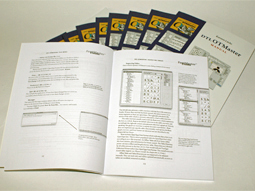
Printed otm 3.7 Manual
[Posted: Monday 2 December 2013]
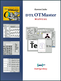
A (digitally) printed manual for dtl OTMaster version 3.7 is available from dtl’s online bookshop now.
Because otm enables one to dig deep into the binary font tables –which almost can be compared with open-heart surgery– one needs some thorough knowledge of the OpenType and TrueType specifications and recommendations before one starts editing.
Therefore this is a must-read manual by expert Karsten Lücke that provides a wealth of additional information on the OpenType cff and ttf font formats.
The paperback contains 106 pages and the text is in English.
