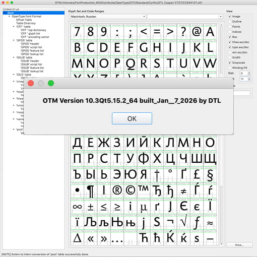
dtl OTMaster 10.3 Released
[Posted: Wednesday January 21, 2026]
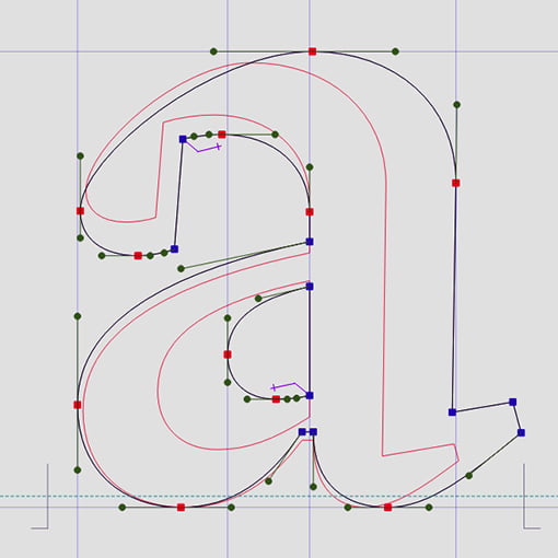
Since its first appearance, otm has been a success, particularly because it offers comparatively accessible control over highly complex technical matters. Now, after many years of additional development and iteration beyond the last retail version (8.9), otm 10.3 is finally available. This release introduces new tools and features, along with significant improvements to table editing. Moreover, ufo export has been enhanced. The release also includes several minor bug fixes.
otm 10.3 runs natively on Apple Silicon and Intel Macs (both code-signed), as well as on 64-bit Windows and Linux systems. Registered licensees who purchased a full version in 2025 or 2026 are entitled to a free upgrade, while all other registered licensees may obtain the upgrade at a reduced price.
Dutch Type Library in 2026
[Posted: Saturday January 3, 2026]
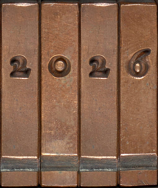
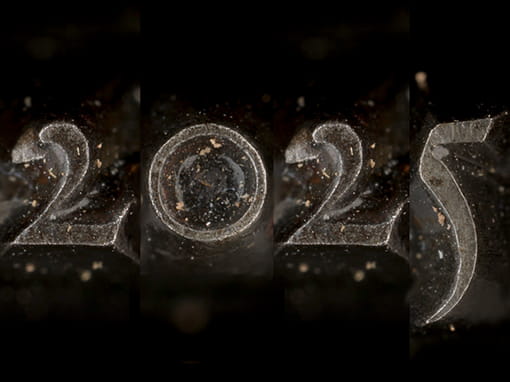
With this row of justified matrices from Reale Romaine by the Flemish punchcutter Hendrik van den Keere (ca. 1540–1580), we wish you all the best for 2026! This type model, which Van den Keere cut in 1575 and was first used by Plantin in 1576, served as the source for the roman of dtl VandenKeere some 35 years ago.
In the past year, we have further automated dtl’s font production as part of the transition of our entire OpenType library from ‘Standard’ to ‘Professional’ and ‘Expert.’ We have also laid the groundwork for variable-font production, using, of course, our own exquisite tools.
Additionally, we will be releasing several new typefaces in 2026, including dtl Romulus, which have been in development over the past three decades. Soon, we will also release version 10 of dtl OTMaster, which now natively supports Apple Silicon and is code-signed for macOS to ensure smooth installation.
Last year, we developed a new obfuscated font tester, which will eventually replace the current Exquisite Fonts website later this year. Additionally, we have created a test environment for webfonts, in preparation for the upcoming new ‘Professional’ versions we are producing specifically for the web.
Obfuscated Font Tester
[Posted: Monday November 3, 2025]
Unfortunately, fonts are often harvested and redistributed for free by third parties without the consent of the copyright holders. Fonts exposed on the web are relatively easy to collect once served in a browser. While extracting them is both unethical and legally questionable, it still occurs, including via type testers designed to benefit the graphic-design community.
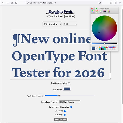
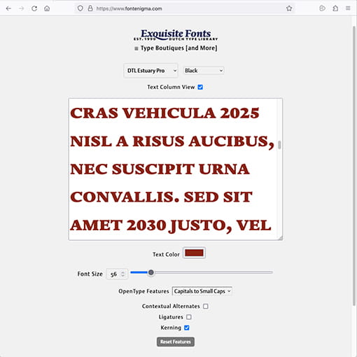
To mitigate this, we developed FontEnigma, a web environment for testing dtl fonts as securely as possible. FontEnigma applies obfuscation at both the font and browser levels: Unicode code points are scrambled, contours are simplified, and glyphs rearranged. This ensures that fonts displayed online are unusable outside the FontEnigma environment.
Additionally, served woff2 files are xor-encrypted and decrypted only in the browser. Fonts are loaded via FontFace and referenced with temporary ‘blob: urls’, which expire on page refresh or close. This makes it considerably harder to download the font files directly.![]()
![]()
The goal is to implement the new structure on the ExquisiteFonts website in about a year.
Origin of Type Frameworks
[Posted: Tuesday May 13, 2025]
It is essential that our field embraces diverse perspectives and teaching methods. Traditional type-design education often begins with drawing individual letterforms, followed by iterative spacing adjustments. This detail-first approach encourages ‘eyeballing’ and internal corrections, rather than working from broader, pattern-based structures. As a result, what could be concrete, measurable, and reproducible often becomes unnecessarily opaque.
Patterning, and the standardization it entails, has always been central to movable type. Early punchcutters relied on the intrinsic standardization in handwritten models to systematize font production, organizing letterforms within fixed-width rectangles. This method ensured consistency, efficiency, and industrial scalability –key to both design quality and industrial strength.
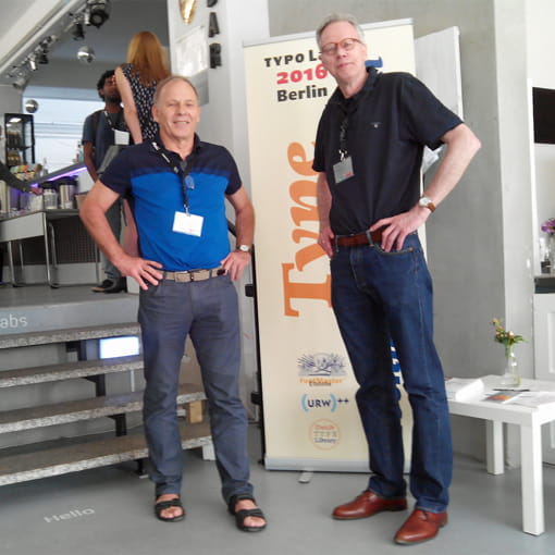
The new Origin of Type Frameworks (otf) course, taught by Dr. Frank E. Blokland and Dr. Jürgen Willrodt (see photo), builds on this foundation, advocating for a pattern-based approach not just as a historical study, but as a practical, contemporary method for designing typefaces. The associated press release (pdf) can be found here.
dtl FontDropper
[Posted: Wednesday February 27, 2025]
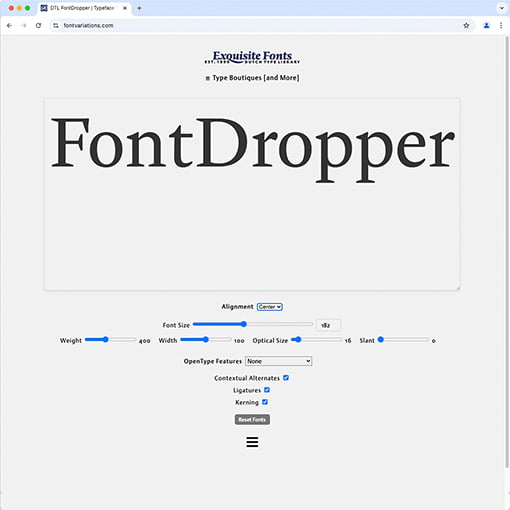
The Dutch Type Library has released a new online tool to test OpenType (variable) fonts: dtl FontDropper. The tool is intended as a service for our customers to easily check (most) functionality of dtl fonts. It is actually a spin-off of a new font tester for our websites that is currently in development and invokes font obfuscation. We use the dropper internally for some web testing alongside dtl OTMaster for more intensive font checking on the desktop.![]()
![]()
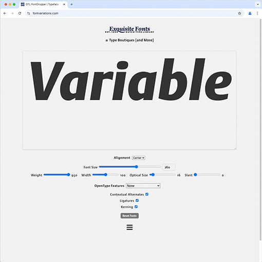
The first edition of dtl FontDropper lets one drop .otf, .ttf, .woff or .woff2 files and then test a range of OpenType Layout features (individually and simultaneously). In addition, there are four sliders for variable fonts, provided that the relevant font supports them. When one uploads a font file with an aforementioned suffix to the tool, it is temporarily stored in the browser’s memory and deleted when the page is reloaded or closed.
35 Years of Exquisite Fonts
[Posted: Wednesday January 1, 2025]
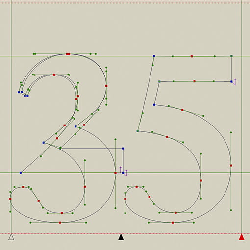
In 2025, the Dutch Type Library will celebrate its 35th anniversary in the wonderful typographic métier. Over the past three and a half decades, dtl has produced a series of iconic digital typefaces that have found their way to lighthouse clients such as the European Union, New York Stock Exchange, Emerson, Rijkmuseum Amsterdam, Keflavik Intenational Airport, Helsingin Sonamat, Oxford University Press, Georg Thieme Verlag, F. van Lanschot Bankers, and many other companies, institutes, banks, and museums worldwide. dtl’s advanced font-production software has also found its way to users all over the world. All in all, the Dutch Type Library has clients in more than 60 countries.![]()
![]()
From day one, the Dutch Type Library has been a completely independent company in every respect. Typefaces are produced in-house and the worldwide distribution of fonts and software is handled exclusively by dtl itself. This has resulted in a unique niche market for typographic connoisseurs. For these experts, the Dutch Type Library will release a series of new fonts and new editions of its software in 2025. Moreover, dtl will publish a number of booklets in honor of its 35th annivesary, including one on the standardization of different body sizes made by the 15th-century punchcutter Hendrik van den Keere. In addition, the Dutch Type Library will organize a Type[&]Design conference in the city of Haarlem in the fall.
We wish you a *TypoMagical* 2025!
Renaissance Technology
[Posted: Friday November 15, 2024]
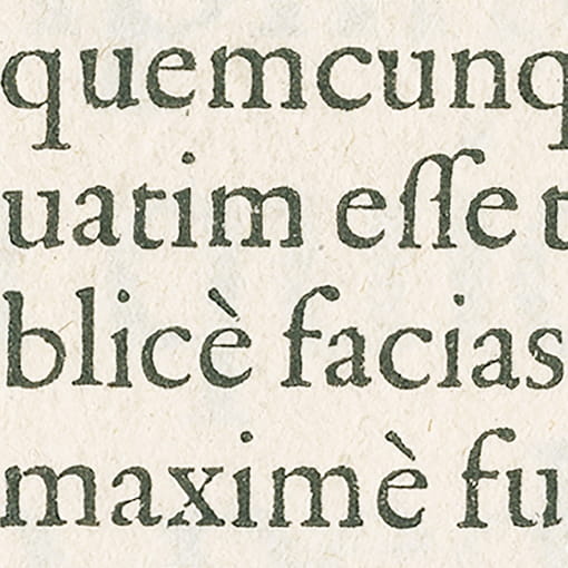
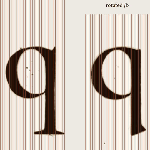
About 30 years after the first release of the typeface, work is underway on the text version of dtl VandenKeere. This version is a bit bolder and has a slightly lower contrast than the display version. Although the regular text version has been available in PostScript Type1 format since the first half of the 1990s, the corresponding italic and bold versions have never been released. In the meantime, dtl founder Frank E. Blokland completed his PhD research at Leiden University into the origins of patterning in movable Latin type. This changed the idea about the methods of the relevant French Renaissance punchcutters Hendrik van den Keere (ca.1540–1580) and François Guyot (ca.1505–1570). Therefore, this new insight is taken into account in the updated and improved text versions of dtl VandenKeere.![]()
![]()
The research into the underlying framework of the Reale Romaine (1575) of Van den Keere, which was the source model of the roman of dtl VandenKeere, shows an interesting systematization. This resembles what can be inferred from, for example, the roman-type models of Claude Garamont (ca.1480–1561) –which is not surprising: after all, as Blokland argues, the archetypal punchcutters copied established frameworks from each other that had proven their functionality over time. In this way, they were sure that their letters would perform well in terms of usability, that is to say both technically and ergonomically (think of typesetting and legibility respetively). Moreover, they could put their idiom on top of it, which was, however, probably not always the result of craftsmanship and insight, but in some cases also of the lack thereof.
We will certainly keep you informed of the further development of dtl VandenKeere.
Melting Metal
[Posted: Thursday March 21, 2024]
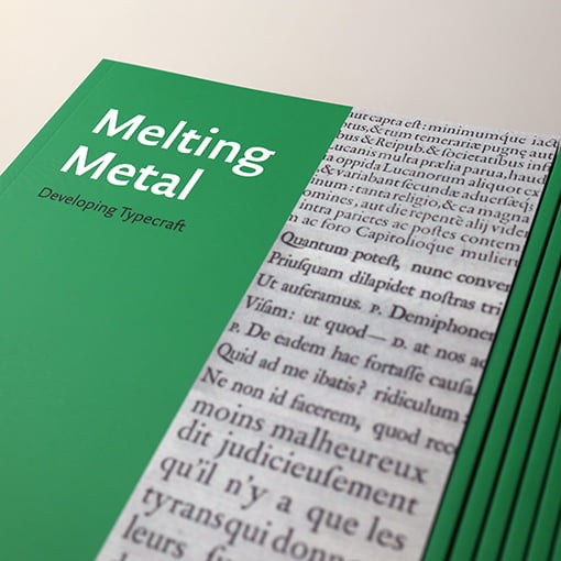
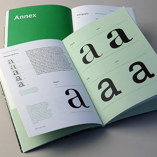
Melting Metal; Developing Typecraft is a booklet written and designed by the graduates of the Expert class Type design 2022–2023 (Antwerp) course. It is the result of a thorough investigation into the (reuse of) patterns recorded in frameworks during the Renaissance, Baroque, and Neoclassicism. Superimposed on these patterns are the ‘hands’ of punchcutters.![]()
![]()
The publication describes the relationship between established Renaissance, Baroque, and Neoclassicism font-production frameworks and punchcutters’ idioms. It contains an overview of digital interpretations made during the course based on the work of four illustrious punchcutters from the aforementioned style periods. This overview is combined with a detailed account of the processes that led to these revivals.
Melting Metal; Developing Typecraft is typeset in dtl Documenta Sans, which was originally designed in the second of half of the 1990s by the graduates’ tutor. For the occasion Blokland created a bolder weight for the cover and the chapter titles. The first edition of the booklet was digitally printed in black and green and is now available in dtl’s exclusive book boutique.
A TypoMagical 2024!
[Posted: Thursday December 21, 2023]
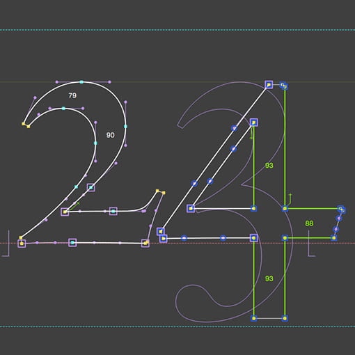
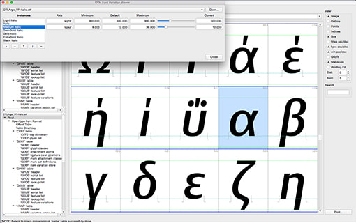
At the end of 2023 we can conclude that dtl’s 33rd year in the type industry was interesting and successful. Interesting, because of the production of new fonts that will be released in 2024, and also because of the continued development of dtl’s proprietary font tools. We are already using Apple-Silicon native editions of OTMaster and FoundryMaster in our studio, and are looking at what still can be improved before we release next year. Successful, because the fonts and software we independently produce based on our main believe that they add unique value to the typographical profession, find their way to clients with the same mindset.![]()
![]()
In addition to releasing new fonts and upgraded software, we planned to publish several new booklets on typography and type specimens. Moreover, we are planning a Type[&]Design conference in the fall of 2024, 15 years after the first edition. It takes place in the auditorium of Teylers Museum in Haarlem, where dtl Haarlemmer and dtl Documenta are used for the corporate identity. If all goes according to plan, the Dr. Peter Karow Award for Font Technology and Digital Typography will be presented then. The last time this happened was in 2013 when Donald Knuth received the award and this booklet was presented.
We wish you all a TypoMagical 2024!
La Plus Grande Romaine
manually digitized
[Posted: Monday June 26, 2023]
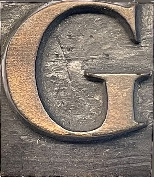
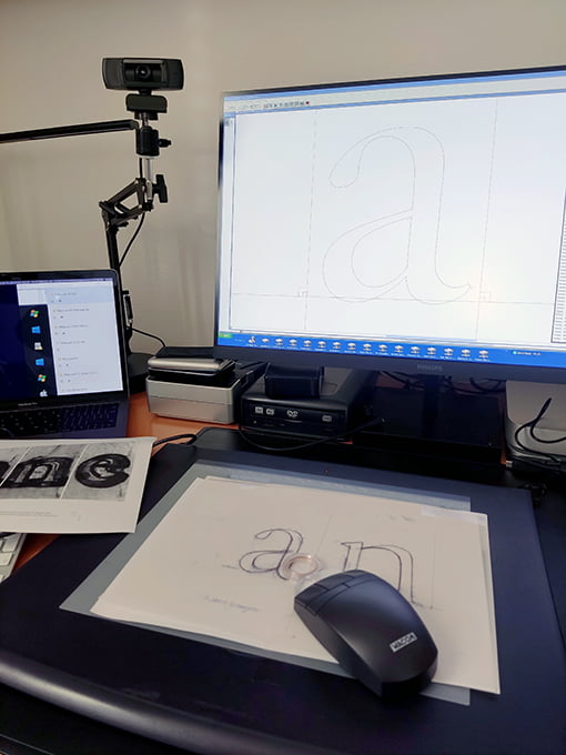
Preparations have started for dtl PlusGrande, a revival of La Plus Grande Romaine by the Flemish punchcutter Hendrik van den Keere (ca.1540–1580). This wood-carved display type from 1575 is related to VdK’s Gros Canon Romain from 1573, which formed the basis for dtl GrosCanon. Handmade working drawings of enlarged images of the source model are manually digitized in ikarus format using a lens cursor. Unlike a mouse, the latter has an absolute position relative to an associated tablet and is used for entering contour points. The ikarus system marked the beginning of digital typography in the 1970s and is still supported by dtl’s proprietary font tools.![]()
![]()
![]()
The fact that drawing on paper has become less and less common in the type designer’s profession may be due to a lack of training and thus to the specific skills needed for analog drawing. However, the requirements for a type-design job should dictate what the best digitizing tool is. In some cases, drawing on paper may be more suitable than sculpting outlines on screen, for example, to draw small and delicate details. This is especially applicable to preserve the vibrancy in the source models when creating revivals of historical type.
The reasoning behind the analogous approach is further described in the chapter on type-design education in the booklet Reflections on Type and Typography [Related Matters].
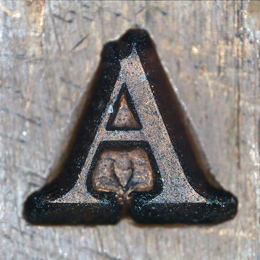
Critical Approaches to
Typography
[Posted: Monday May 1, 2023]
From 21 to 25 August 2023, the third edition of the Typography Summer School will take place in the beautiful surroundings of the historic campus of the University of Antwerp. The Critical Approaches to Typography course offers a perfect opportunity to zoom in on the fascinating world of typography –with or without any prior knowledge. Explore the finesse of historical and digital type and investigate the conventions that govern typography and how to challenge them through research.![]()
![]()
The main course program was written by dtl’s founder Dr. Frank E. Blokland and is based on five elementary keywords: ‘Perception’, ‘History’, ‘Convention’, ‘Technology’, and ‘Legibility’. These keywords are largely covered in the booklet Reflections on Type and Typography […], which was written with the Typography Summer School in mind and is essentially intended as basis for further discussion. In addition to theoretical angles to better understand the historical and cultural context of typography, matters are also practically investigated. For example, artifacts from the illustrious type-foundry collection of Museum Plantin-Moretus are scrutinized.
More information can be found on the university website. Applications must be submitted before July 14, 2023.
Revival of a Punchcutter
[Posted: Friday February 3, 2023]
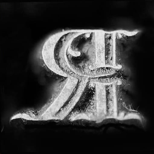
Between 1740 and 1759, the punchcutter Jacques-François Rosart lived in the city of Haarlem. There he mainly worked for the type foundry of Johannes and Izaak Enschedé. Unfortunately, while he created many sophisticated and attractive type models, he was not highly regarded in his own time. In the exhibition Rosart: Revival of a Punchcutter, contemporary type designers and researchers look again at Rosart’s œuvre and come to a revaluation.![]()
![]()
New research led to a better understanding of this gifted autodidact, as well as digital revivals of various type models –originally more than 250 years old. The outcomes can be seen in the Janskerk, the public center of the Noord-Hollands Archief, at Jansstraat 40 in Haarlem. The exhibition runs until June 30, 2023 and is open from Monday to Friday from 09:00 to 17:00 and every third Saturday of the month from 09:00 to 16:00. Entrance is free. More information about the Rosart Project can be found here.
A TypoMagical 2023!
[Posted: Sunday January 1, 2023]
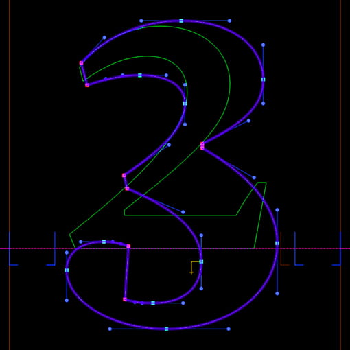
In an exclusive métier, as always, the Dutch Type Library looks forward to the new year. It will undoubtedly be exciting when it comes to producing new dtl typefaces and releasing fonts that have been in development for decades. For example, for dtl Romulus and dtl Sheldon, part of the Van Krimpen Project, it is definitely time for the finishing touch. In addition, related to historical type, there will be a lot of scope for research on their technical frameworks.![]()
![]()
No doubt 2023 will be challenging from a technical point of view. In recent months, many longtime dtl customers have upgraded their PostScript Type1 fonts to OpenType format. Some of them bought the Type1 fonts as far back as the 1990s. After all, the Dutch Type Library has been active in the type business for 32 years. In 2023, dtl will release a series of OpenType Pro fonts and its first variable fonts. Additional support for more scripts, such as Cyrillic and Greek, is also planned for the new year.
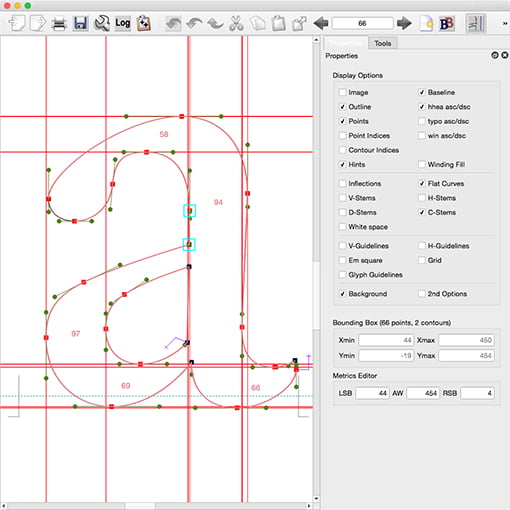
Moreover, the Dutch Type Library will further expand its exquisite range of sophisticated proprietary ikarus-based font tools, starting with its flagship dtl OTMaster. These applications are primarily developed for internal use. In 2022, however, many copies of otm found their way around the world. The plan is to formally release a number of other font tools currently in development at the second dtl Type[&]Design conference, to be held in the city of Haarlem this fall.
dtl OpenType Upgrade Program
[Reposted: Friday August 12, 2022]
As announced by Adobe, support for PostScript Type1 fonts in Creative Cloud applications will end completely in 2023, to start Photoshop last year. One of the first preparations leading up to the establishment of the Dutch Type Library in the late 1980s, was designing the colorful Mac OS icons for the three components that include Type1. Those were the days. These vintage icons now form small markers of changing technological times.![]()
![]()
![]()
With PostScript Type1 being phased out, registered users of dtl fonts in this legacy format can upgrade to OpenType through a special program. The same goes for licensees of single-byte TrueType variants. A relatively low fee is charged for upgrading. The dtl OpenType Boutique can be used to check the availability of OpenType versions.
otm 8.9 exclusively available
from the Dutch Type Library
[Posted: Monday March 7, 2022]
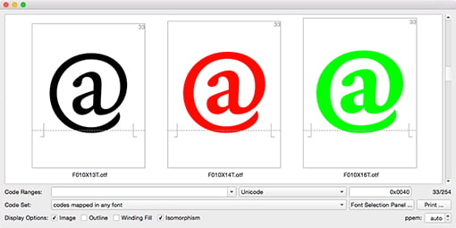
In the past 32 years that the Dutch Type Library has been active on the font market, the profession has changed considerably. Until the early 1990s, proprietary font formats of the traditional typesetting-machine manufacturers gave way to the ‘universal’ PostScript and TrueType formats, and eventually the OpenType format. The development of new typefaces has been largely done by independent type foundries ever since. New sophisticated tools for the (post) production of fonts also came onto market: dtl OTMaster is one of them.![]()
![]()
With the expanding font market came distribution by specialized third parties. Contrary to this development, however, the Dutch Type Library now centralizes the distribution of its unique products via its online boutiques. For example, the Dutch Type Library is the only distributor of its exquisite fonts. In line with this, dtl OTMaster 8.9 will be available exclusively from dtl from Monday 21 March 2022.
Customers who purchased otm 7.9 from a third party before this date, are entitled to a free upgrade to version 8.9. Please contact the Dutch Type Library via otm[at]dtl.nl.

dtl Estuary by Stijn Cremers
[Posted: Monday September 7, 2020]
It is an absolute privilege to work with highly talented next-generation type designers such as Stijn Cremers (photo), who has spent approximately ten years developing the contemporary and refined dtl Estuary. The result of this long process is a contemporary serif typeface, which is suitable for book, magazine, as well as newspaper typography.![]()
![]()
Stijn Cremers has a keen eye for details. If one looks, for example, at the finishing of the serifs, the very subtle counters of the capital letters, and the playful but delicate combination of round and sharp elements in the terminals, one can find ample proof of this. Despite the carefully worked out details, however, in principle dtl Estuary is suitable for all kinds of typographic purposes, in both display and text sizes.
This remarkable typeface is now available as OpenType ‘Standard’ and ‘Pro’ fonts in dtl’s online OpenType Boutique.