•Try dtl’s New Exquisite Website!
| Home | Search | Site index | About | Contact |
A revival is an adaptation of historical type model for the current typesetting technique. Many of the typefaces in use today are interpretations of sixteenth-century (for example dtl VandenKeere), seventeenth-century (dtl Elzevir), and eighteenth-century (for example dtl Fleischmann) models
The production of revivals requires knowledge and understanding of the punchcutting and typecasting processes. Only careful determination and interpretation of type-foundry artifacts, i.e., punches, matrices, and prints, will enable successful interpretation. Insight is needed into the influence of (constraints of) technical resources in the past. Moreover, to understand the punchcutters’ idioms, thorough insight into the different style periods is also a necessity.
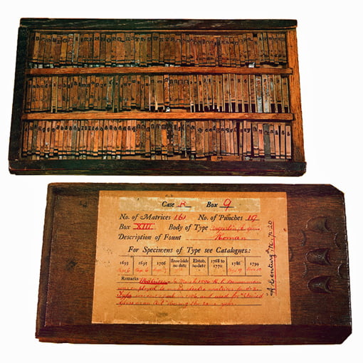

Matrices of the English Roman in the oup collection.
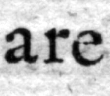
Modern typesetting and printing techniques require adjustments to foundry type. Letterpress printing pushes the ink around each letter, resulting in a halo effect: the inksquash. This emboldening was due to pressure, but was, for example, also influenced by the quality of the (whether or not damped) paper used. This effect does not occur with offset printing: consequently, when creating digital interpretations, the halo effect must be subtly incorporated into the contours to prevent that the letterforms become too light.
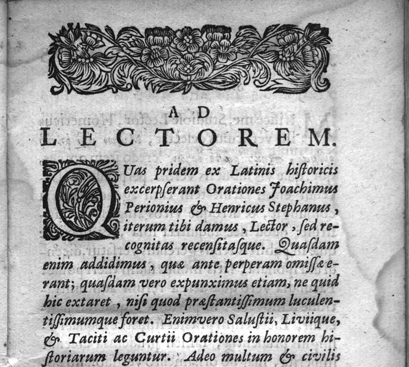
Title page from 1678 showing ‘Fell types’ (dtl collection).
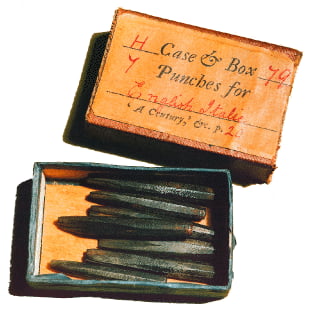
Punches of the English Roman.
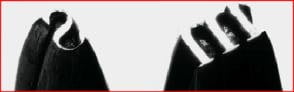
The ink squashes were discounted by the punchcutters and a study of punches and related smoke proofs is very useful to get a clear image of the source model. However, prints are useful for ultimately assessing the weight of movable type. The difficulty is that the halos are not pure black, because the smeared ink contains halftones.
Photographically enlarged letterpress prints look somewhat rough because of the ink squashes. This blurring of the contours has to be interpreted and a decision has to be made to what extent it should be preserved in the digital version. The smaller the point size of the original type, the greater the effect of the halo will be. Because digital type is not physically limited to a particular point size, the revival can be used at any size. Therefore, literally copying the ink squashes can result in a blurry image of the digital letters when applied to display sizes.
Ink squashes: loss of sharpness.
Publication (detail) from Daniël Elsevier from 1672 (dtl collection).
The Dutch Type Library produces its revivals with the greatest care: nature and weight of the original foundry type are preserved as much as possible. At the same time the revivals are optimized for digital processing. In the best tradition of foundry type, for which often adapted models were cut for different point sizes, the Dutch Type Library produces special versions of its revival for text and display purposes. This was, for example, done for the dtl Fleischmann and dtl Romulus type families.
Search | Site index | Contact | Terms of use | Trademarks | Acknowledgements
Last update: 20 December 2023. Copyright © Dutch Type Library, 1998–2023. All rights reserved
dtl Headquarters | Zwaenenstede 49 | 5221 kc ’s-Hertogenbosch | The Netherlands
dtl Studio | Daliënwaerd 71 | 5221 ke ’s-Hertogenbosch | The Netherlands
phone: +31 (0)73 614 95 36 | fax: +31 (0)73 613 98 23 | e-mail: info@dutchtypelibrary.com
![]()
![]()
![]()