
dtl Estuary by Stijn Cremers
[Posted: Monday 7 September 2020]
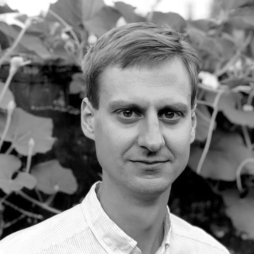
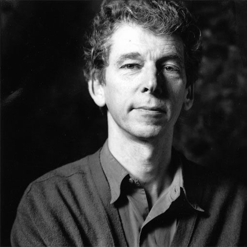
It is an absolute privilege to work with highly talented next-generation type designers such as Stijn Cremers (photo), who has spent approximately ten years developing the contemporary and refined dtl Estuary. The result of this long process is a contemporary serif typeface, which is suitable for book, magazine, as well as newspaper typography.![]()
![]()
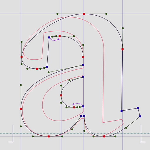
Stijn Cremers has a keen eye for details. If one looks, for example, at the finishing of the serifs, the very subtle counters of the capital letters, and the playful but delicate combination of round and sharp elements in the terminals, one can find ample proof of this. Despite the carefully worked out details, however, in principle dtl Estuary is suitable for all kinds of typographic purposes, in both display and text sizes.
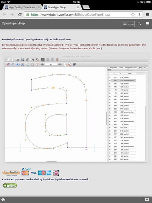
This remarkable typeface is now available as OpenType ‘Standard’ and ‘Pro’ fonts in dtl’s online OpenType Boutique.
dtl [Gros] Canon Project
[Posted: Monday 20 April 2020]
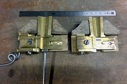
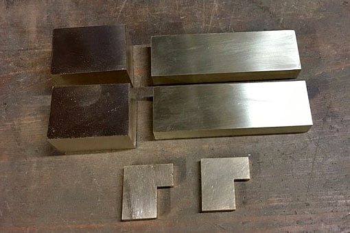
dtl’s [Gros] Canon Project continues with the reproduction of the Giet Instrument 48 by expert Hugh Macfarlane. The ‘gi48’ (photo above) is probably the oldest surviving type mould dating from around the second half of the 16th century. It is part of the illustrious collection of Renaissance type-foundry material in the Museum Plantin-Moretus, Antwerp.
The gi48 replica will be equipped with movable registers, while the original has fixed ones. The work on the mould is progressing well: the guides are now finished and will be pinned to the carriage after the machine marks are polished out. The registers will need a slot machined into them, so they can be adjusted.![]()
![]()
The first part of the dtl [Gros] Canon Project included the digitization of three types by the Flemish Renaissance punchcutter Hendrik van den Keere (ca.1540–1580): Gros Canon Flamande (textura type, 1571), Gros Canon Romain (roman type, 1573), and Canon d’Espaigne (rotunda type, 1574). The latter is almost ready for release, which will complete then the first part of the project.
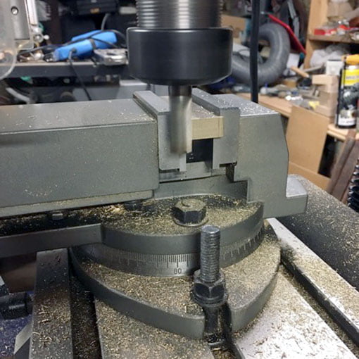
The reproduction of the historical type mould is the second part of the project, along with master punchcutter Stan Nelson crafting a small number of punches (based on dtl’s aforementioned digital revivals) and striking related matrices. The matrices will be adapted by Nelson to the constraints of the mould.![]()
![]()
The goal is to use the gi48 replica for casting the type from the matrices, and to distribute the foundry type to the customers who have bought one of the three digital revivals of dtl’s [Gros] Canon Project.
Reflections on Type and
Typography [Related Matters]
[Posted: Wednesday 15 January 2020]
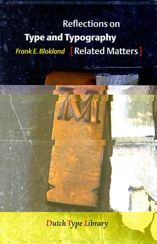
A booklet by dtl’s founder Dr. Frank E. Blokland that was written with the Typography Summer School 2019 at the University of Antwerp in mind. On this course the value of research for typography was investigated and discussed. The five keywords of the course were: ‘Perception’, ‘Convention’, ‘Legibility’, ‘Technology’, and ‘History’. These subjects are largely covered in this concise publication. Reflections on Type and Typography [Related Matters] is meant as basis for further discussion and was used as such at the summer school.
Perhaps some will consider the booklet’s content (slightly) heretical, or even that it befogs the readers’ minds. After all, it contains statements such as: ‘However, one can apply legibility research on type in use today, but it is very unlikely that Jenson and Griffo in particular did any legibility research before they developed their archetypal models for roman type.’ And: ‘Instead, type designers seem to rely purely on the eye, but, […], what they see is the result of conditioning. One can simply conclude that conditioning is based on conventions, and conditioning preserves conventions. Thus the snake bites its own tail; to rely on the eye, one has to be trained to look at type in a certain way.’ And so on…![]()
![]()
In the last two, somewhat more personal, chapters of the booklet Blokland reflects on the more recent changes in the type business, which he joined in the early 1980s. For example, in the Licensing Exclusivity chapter, he explains that the production of high-quality fonts requires a major investment of efforts and resources. In these volatile times it sometimes looks like not everyone in the graphic-design métier is fully aware of this. After all, not all fonts are for ‘free’, quality comes at a price, and paying for a product or service is the foundation of the profession of the graphic designer.
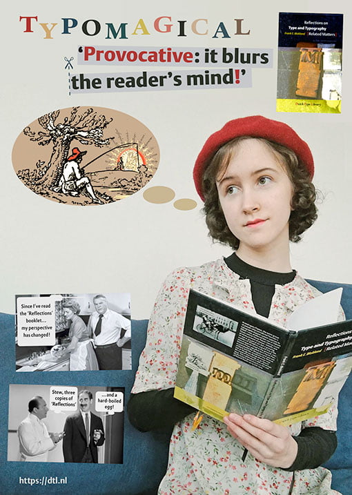
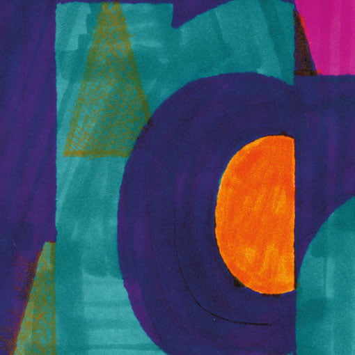
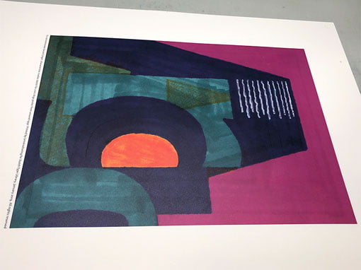
One of the two of promotional posters in a1 format for the booklet, with the young Eleonora Auguste (who holds her father's ‘provocative’ publication in her hands) in the lead, is shown at the top. The booklet costs €12.50 and is available via dtl’s online bookshop.
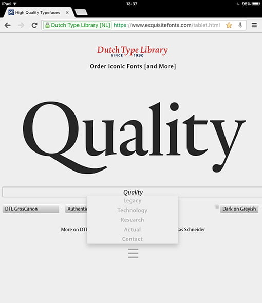
New responsive website
[Posted: Wednesday 16 October 2019]
The blending of the new responsive website and this vintage website is taking shape now. The new website functions nicely on mobile phones and tablets too. The html5-code of the desktop editions will validate perfectly and the same is the case for the xhtml code applied in the mobile-phone and tablet editions.
The website in front of you dates back from 1998. Originally it was setup as the equivalent of the a4 paper size, but it was extended in vertical direction when computer monitors became larger and, consequently, their resolution enhanced. After all, the versatile framework of the website was specifically developed to be easily adapted to the inevitable ongoing innovation of computer technology.
The next step, a couple of years later, was adding a column to the left. The ‘triptych’ was eventually completed by adding another column to the right. Also the navigation changed and improved over time.![]()
![]()
For the extension in vertical and horizontal directions, frames were used. In the course of time in general frames became less preferred by website developers; however, we consider it perfectly fine still. Although technically the frame-based structure becomes quite complex sometimes, we will continue to maintain the ‘triptych’ for another decade or so, if only because it contains a wealth of information on type and its development.
After all, the Dutch Type Library is the oldest digital type foundry in the Low Countries, celebrating its 30th anniversary in 2020!
Gerard Unger commemorated
[Posted: Friday 1 February 2019]
On the evening of Wednesday 23 January 2019 a special event to commemorate Gerard Unger took place in Amsterdam. It was a well-attended session, in which the multiple qualities of Gerard were illuminated. The talks and presentations were in Dutch, except for the Skype session with Erik Spiekermann. A video with a live-streaming recording was posted on YouTube a day later.
As former colleague, but above all as publisher of two of Gerard’s typefaces: dtl Argo (1992) and dtl Paradox (2000), Frank E. Blokland was the closing speaker. The main focus in his brief presentation was on the origin, design, and production of dtl Argo, which was expanded by the dtl Studio with two additional weights/styles and small caps in the course of time, and for which Frank personally made the Cyrillic and Greek versions roughly eight years ago. For those who do not understand Dutch, a summary in English of Frank’s talk is available.![]()
![]()
Especially for the evening in Pakhuis de Zwijger an A1-sized poster based on a marker sketch (a5) that Gerard made for dtl around 1992. The poster was nicely printed for the Dutch Type Library by Lenoirschuring in Amsterdam in the week prior to the event. Every attendee received a free copy in a cardboard tube. The poster is available via dtl’s online bookshop and costs €10
Gerard Unger 1942–2018
[Posted: Monday 26 November 2018]
On the 23rd of November Gerard Unger passed away. Gerard was an incredibly prolific and successful designer, whose typefaces were and are in use all over the world: in numerous newspapers, on all forms of signage, for corporate identities, et cetera. This success does not come as a surprise, knowing that Gerard had a unique, highly recognizable hand, which will remain to stand out like the idioms of famous precursors as, for example, Jenson, Griffo, Garamont, Granjon, Fleischmann, Van Krimpen, to name a few.
Also his publications on type and typography have reached a worldwide audience and have been translated in many different languages.![]()
![]()
The professional cooperation between Gerard and the Dutch Type Library dates from 1991, when dtl started to work together with urw in Hamburg. The production of dtl Argo began when Gerard was working for Hell still, but it was continued for urw. Eventually the sanse serif ended up at the Dutch Type Library.
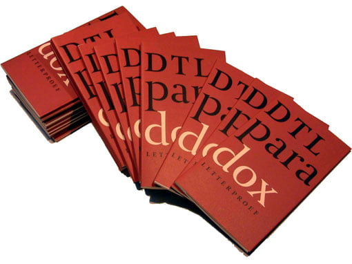
Roughly eight years later dtl Paradox was taken into production. Gerard was investigating the work of especially François-Ambroise Didot and his punchcutter Louis Vafflard back then. Although the design of Paradox obviously contains 18th-century characteristics, Gerard’s extremely recognizable idiom is clearly visible everywhere. Hence, Paradox is not a revival –if only because Gerard, in line with, for example, Jan van Krimpen, did not like revivals at all. A booklet on Paradox, for which Frank E. Blokland wrote the introductory text, was published by dtl in 2002.
Gerard will be missed dearly by all who knew him as friend, colleague, and tutor.