
New responsive website
[Posted: Wednesday 16 October 2019]
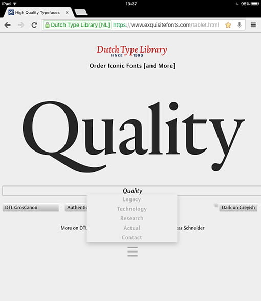
The blending of the new responsive website and this vintage website is taking shape now. The new website functions nicely on mobile phones and tablets too. The html5-code of the desktop editions will validate perfectly and the same is the case for the xhtml code applied in the mobile-phone and tablet editions.
The website in front of you dates back from 1998. Originally it was setup as the equivalent of the a4 paper size, but it was extended in vertical direction when computer monitors became larger and, consequently, their resolution enhanced. After all, the versatile framework of the website was specifically developed to be easily adapted to the inevitable ongoing innovation of computer technology.
The next step, a couple of years later, was adding a column to the left. The ‘triptych’ was eventually completed by adding another column to the right. Also the navigation changed and improved over time.![]()
![]()
For the extension in vertical and horizontal directions, frames were used. In the course of time in general frames became less preferred by website developers; however, we consider it perfectly fine still. Although technically the frame-based structure becomes quite complex sometimes, we will continue to maintain the ‘triptych’ for another decade or so, if only because it contains a wealth of information on type and its development.
After all, the Dutch Type Library is the oldest digital type foundry in the Low Countries, celebrating its 30th anniversary in 2020!
Gerard Unger commemorated
[Posted: Friday 1 February 2019]
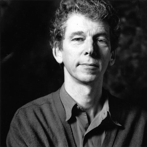
On the evening of Wednesday 23 January 2019 a special event to commemorate Gerard Unger took place in Amsterdam. It was a well-attended session, in which the multiple qualities of Gerard were illuminated. The talks and presentations were in Dutch, except for the Skype session with Erik Spiekermann. A video with a live-streaming recording was posted on YouTube a day later.
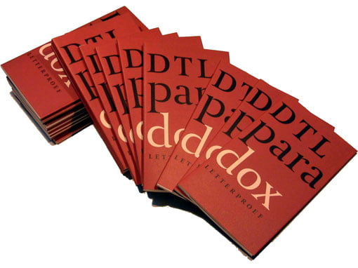
As former colleague, but above all as publisher of two of Gerard’s typefaces: dtl Argo (1992) and dtl Paradox (2000), Frank E. Blokland was the closing speaker. The main focus in his brief presentation was on the origin, design, and production of dtl Argo, which was expanded by the dtl Studio with two additional weights/styles and small caps in the course of time, and for which Frank personally made the Cyrillic and Greek versions roughly eight years ago. For those who do not understand Dutch, a summary in English of Frank’s talk is available.![]()
![]()
Especially for the evening in Pakhuis de Zwijger an A1-sized poster based on a marker sketch (a5) that Gerard made for dtl around 1992. The poster was nicely printed for the Dutch Type Library by Lenoirschuring in Amsterdam in the week prior to the event. Every attendee received a copy in a cardboard tube.
Gerard Unger 1942–2018
[Posted: Monday 26 November 2018]
On the 23rd of November Gerard Unger passed away. Gerard was an incredibly prolific and successful designer, whose typefaces were and are in use all over the world: in numerous newspapers, on all forms of signage, for corporate identities, et cetera. This success does not come as a surprise, knowing that Gerard had a unique, highly recognizable hand, which will remain to stand out like the idioms of famous precursors as, for example, Jenson, Griffo, Garamont, Granjon, Fleischmann, Van Krimpen, to name a few.
Also his publications on type and typography have reached a worldwide audience and have been translated in many different languages.![]()
![]()
The professional cooperation between Gerard and the Dutch Type Library dates from 1991, when dtl started to work together with urw in Hamburg. The production of dtl Argo began when Gerard was working for Hell still, but it was continued for urw. Eventually the sanse serif ended up at the Dutch Type Library.
Roughly eight years later dtl Paradox was taken into production. Gerard was investigating the work of especially François-Ambroise Didot and his punchcutter Louis Vafflard back then. Although the design of Paradox obviously contains 18th-century characteristics, Gerard’s extremely recognizable idiom is clearly visible everywhere. Hence, Paradox is not a revival –if only because Gerard, in line with, for example, Jan van Krimpen, did not like revivals at all. A booklet on Paradox, for which Frank E. Blokland wrote the introductory text, was published by dtl in 2002.
Gerard will be missed dearly by all who knew him as friend, colleague, and tutor.
New: Dutch edition of
The Elements of Typographic Style
[Posted: Monday 1 October 2018]
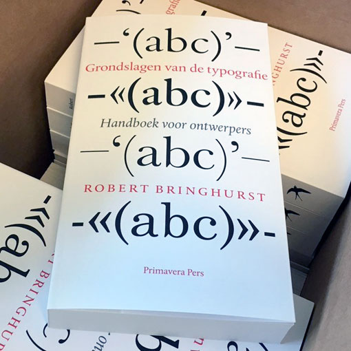
The production took quite some years, if only because it is a highly complex book to translate, but finally the Dutch translation of Robert Bringhurst’s worldwide bestseller The Elements of Typographic Style has become available. Literally translated the title Grondslagen van de typografie, means ‘The basics of typography’.
In the course of time Bringhurst’s bestseller has proven to be indispensable for professional graphic designers and typographers, as well as for anyone else who is interested in type and typography. The renowned German type designer Hermann Zapf described the book as ‘a must for everybody in the graphic arts’ and concluded that ‘all desktop typographers should study this book… I wish to see this book become the Typographer’s Bible.’ It has.![]()
![]()
The Dutch edition was designed by Titus Schulz, who selected dtl Albertina for the body text and cover and combined this with dtl Documenta Sans for the (extensive) captions. The book contains two forewords: one by Martin Majoor and one by dtl’s founder Frank E. Blokland.
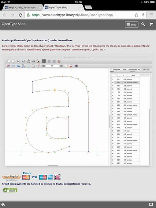
New font-tools website
[Posted: Wednesday 5 September 2018]
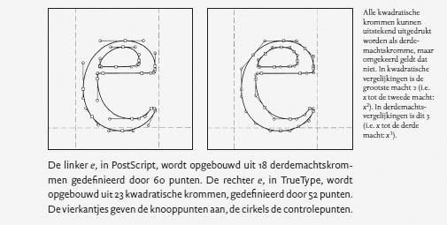
In anticipation of new dtl/urw software releases this autumn, an updated version of our font-tools website was launched recently. The site contains information on dtl OTMaster, FoundryMaster, CompareMaster, and LetterModeller. Not mentioned on the site yet, but actually planned to be released around the end of this year, is GPOSMaster, which is the successor of dtl KernMaster. Besides the option to auto-kern OpenType cff and ttf fonts, it includes an advanced environment for editing the kern.fea files that it produces or that have been produced with another tool.![]()
![]()
The dtl/urw font tools are siblings of the very first font-production tool that made the digitization of resolution-independent contours possible back in the 1970s: the ikarus system. The ikarus file structure was developed with the handling of large amounts of font data in mind. Hence, it was highly suitable for batch-processing, which was controlled via unix scripts since the mid-1980s. The dtl/urw font tools have the ikarus technology under the hood still and their history is described on the site.
The new website also contains a forum, a link to the legacy website, and even entertainment: ‘Technical Trivial Facts’!
Festschrift zum 550. Todestag
Johannes Gutenbergs
[Posted: Friday 6 July 2018]
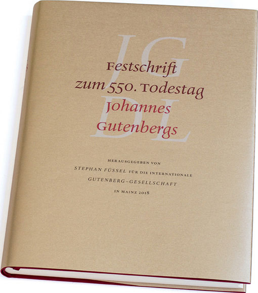
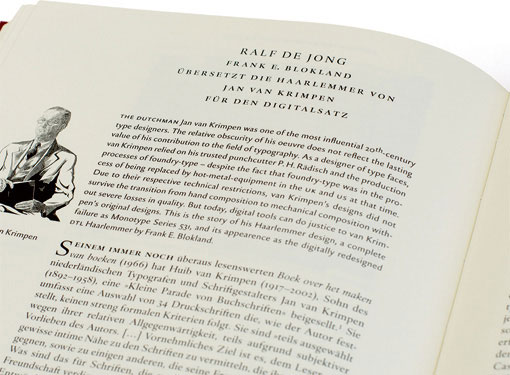
On Saturday 23 June 2018 the Festschrift zum 550. Todestag Johannes Gutenbergs was presented at the town hall of the city of Mainz. This beautiful commemorative publication is a tribute to… Johannes Gensfleisch zur Laden zum Gutenberg, who died in 1468. The book is designed by the famous typographer Ralf de Jong, who is professor at the Folkwang Universität der Künste in Essen and well know for the books Detailtypografie (2002) and Schriftwechsel (2008).![]()
![]()
The ‘Festschrift’ is excellently typeset in dtl Haarlemmer (including the sans-serif variant). It contains an extensive article by De Jong on this typeface, Jan van Krimpen, and Frank E. Blokland. In 1995 Blokland started the design of dtl Haarlemmer and the first fonts were presented at the Van Krimpen exhibition that took place at the Museum Meermanno that year. At the request of Museum Boijmans Van Beuningen, which used dtl Haarlemmer for three corporate identity for roughly a decade, he added a completely new sans serif a couple of years later. This low-contrast variant was especially meant for the texts on the walls, similar to the use of dtl Documenta Sans at the Municipal Museum The Hague around that time.![]()
![]()
The basis for the digital Haarlemmer was the set of Jan van Krimpen’s nine original drawings from 1938, which were purchased by the Dutch Type Library in 1992.
Type-design fundamentals
[Posted: Friday 18 May 2018]
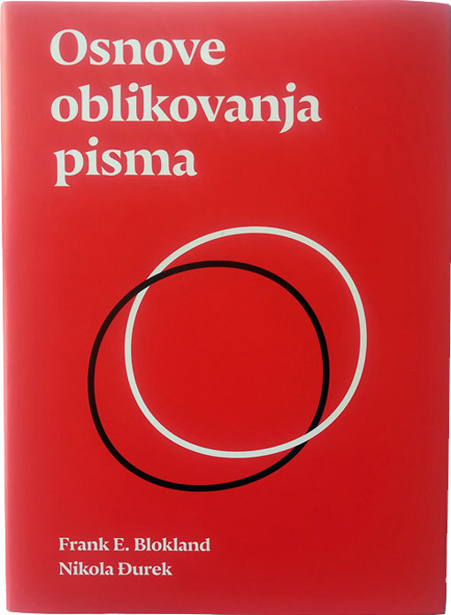
Last week the University of Split, Croatia, published Osnove oblikovanja pisma, a book on type-design fundamentals by Dr. Nikola Djurek and Dr. Frank E. Blokland. On the one hand it combines elements of Blokland’s calligraphy course book from 1990 with his more recent research into the origins of the harmonics, patterns and dynamics in movable Latin type. On the other hand it contains information from Djurek’s PhD dissertation on the history of and conventions for Croatian diacritics with his ongoing research on the history of Croatian scripts (Glagolitic, Cyrillic, Latin).![]()
![]()
The book is especially meant for the students of the University of Split and hence the texts are in Croatian. Already there have been multiple inquiries about an English translation and this is investigated now.
This project was not the first joined one of Djurek and Blokland: they also worked together on the development of dtl Porta News.
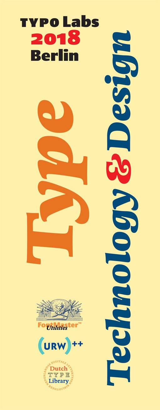
dtl/urw++ hands-on session
at typo Labs 2018 in Berlin
[Posted: Monday 2 April 2018]
Also this year the Dutch Type Library and urw++ Design & Development GmbH will be present (for the third time) at the typo Labs conference, which will take place in Berlin from 12 till 14 April 2018.
During the dtl/urw++ Type, Technology & Design hands-on session on Friday the 13th of April, Jürgen Willrodt and Frank E. Blokland will especially focus on the integration of OTMaster (otm) and FoundryMaster (fm2) in a workflow that is based on, for example, Glyphs or RoboFont. The idea behind this approach is that combining the unique functionality offered by different font tools can ease and speed up production matters considerably.
A new program that will be introduced at the dtl/urw++ hands-on session is GPOSMaster. As the successor of KernMaster, it combines auto-kerning with several editing options. Like otm and fm2, it will become available for macOS, Windows, and Linux.
More information can be found on the TypeDrawers forum (bottom page).