|
|
DTL Valiance is suitable for every possible typographic application: from magazine to web design and from book typography to corporate identities. This unique typeface can be used in each and every practice, i.e., from design to office environments. Its classic, timeless, sturdy yet elegant design makes DTL Valiance highly suited for use on high-resolution equipment, such as image setters, but also on relatively low-resolution devices, such as computer screens and laser printers.
The character sets covered by DTL Valiance include all Western-, Central, and Eastern-European languages, besides Cyrillic (including Bulgarian and Serbian variants).
|
|
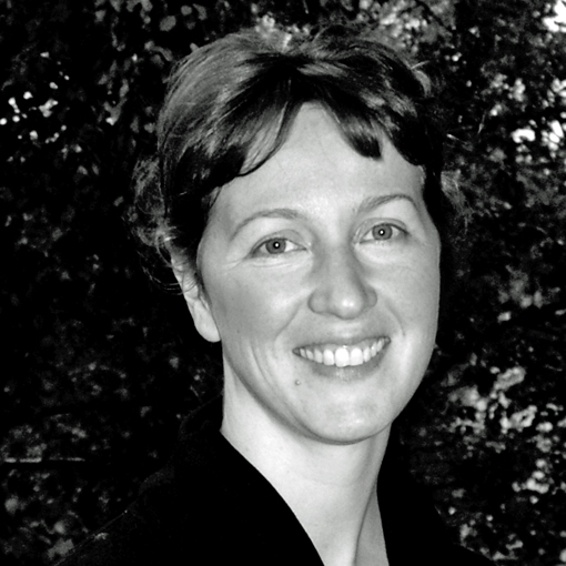
|  | | Hanna Hakala |
|
|
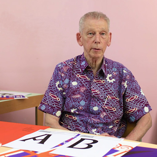
 | | Dr. Gerard Unger |
|
|
| TDC Medal for Gerard UngerOn the evening of Tuesday 18 July 2017 Dr. Gerard Unger received the prestigious Type Directors Club (TDC) Medal at The Cooper Union in New York. As one can read on the TDC website, the ‘Type Directors Club is the leading international organization supporting excellence in typography, both in print and on screen.’
In the fifty-year history of the TDC Medal, Unger is the thirtieth recipient. The first medal was awarded to Hermann Zapf in 1967 to honor his enormous and diverse contributions to typography. Unger joins an impressive list of medalists that besides Zapf, includes Matthew Carter, Erik Spiekermann, and Gerrit Noordzij.
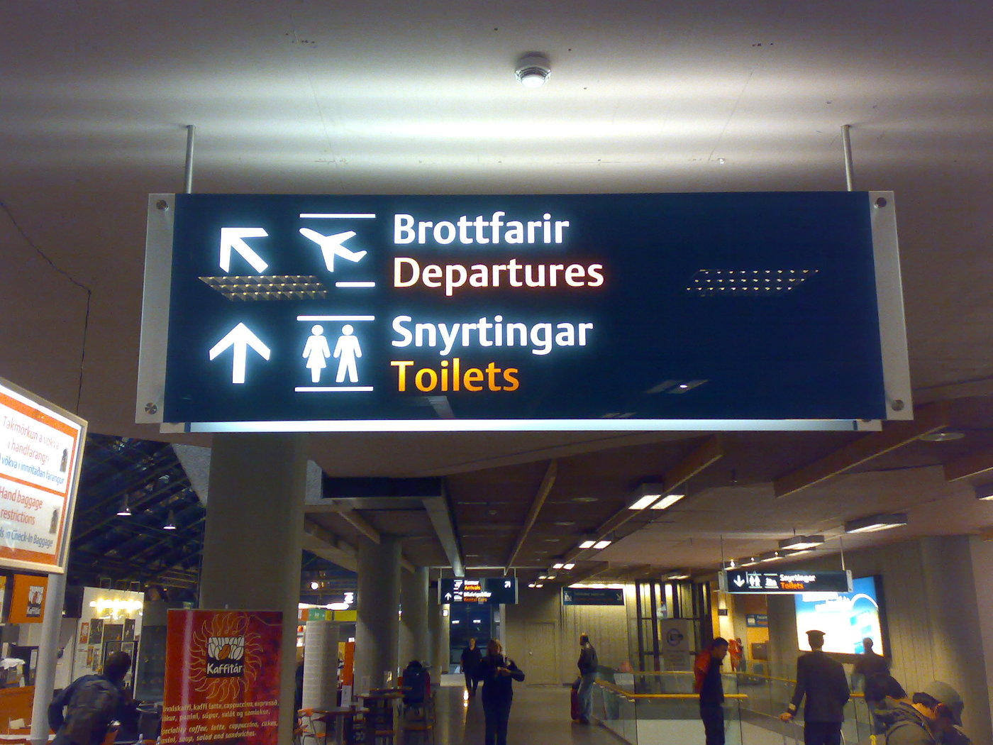
As publisher of DTL Argo and DTL Paradox, the Dutch Type Library is very pleased and proud that Unger received the TDC Medal. DTL Argo was published exactly 25 years ago and was immediately a success. For roughly a decade it was, for example, the corporate identity typeface of the New York Stock Exchange and for more than two decades it is in use now by Emerson Electronics. It is also the typeface for the signage at Keflavik International Airport in Reykjavik, Iceland. In the Netherlands DTL Argo is the corporate typeface of the Royal Bam Group.
DTL Paradox was added to the Dutch Type Library’s exquisite collection in 2000 and is mostly used for exclusive and delicate book designs. |
|
 | Keflavik International Airport, Reykjavick |
|
DTL Flamande: digital Renaissance masterpieceThe development of DTL Flamande started in 1992. That year the legendary American type designer Matthew Carter and DTL’s founder Frank E. Blokland were both speakers at the Didot seminar, which was organized by URW in Hamburg. During the event Carter showed Blokland a revival he had just started, which was based on textura types by the Flemish Renaissance punchcutter Hendrik van den Keere (ca. 1540–1580). Carter modeled his revival after the Gros Canon Flamande and the Parangonne Flamande, which both date from 1571. In 1992 Blokland was working on DTL VandenKeere based on the famous punchcutter’s Parangonne Romain from 1575. After a nice short talk Carter granted the Dutch Type Library the rights on his revival, which was named DTL Flamande.
In 1992 DTL’s collection of typefaces was quite small still and there was a certain risk that DTL Flamande would make the overall impression of the type library a bit archaic. Roughly two decades later there were more than a dozen DTL typefaces and the time was right for publishing the revival. However, DTL Flamande was incomplete and Blokland wanted to enhance it with roman capitals. After all, Plantin combined Van den Keere’s ‘Grasses capitales de 3 regles mediane’ with the lowercase of the Canon Flamand in his Psalterium from 1571.
For completing the character set of DTL Flamande and for adding the capitals, a type designer with the same delicate handling of curves and details as Carter was required. Lukas Schneider, who holds a master’s degree from the renowned KABK TypeMedia course and who successfully graduated at the Expert class Type design course in Antwerp, was invited to do the job. Schneider was already familiar with French-Renaissance font-production processes, because he developed the LS Cadencer application using Blokland’s archetypal spacing algorithms.
Schneider did a wonderful job and DTL Flamande is available now in all its (historical) glory. A short video on YouTube shows the OpenType Layout features that especially were developed for DTL Flamande. |
|
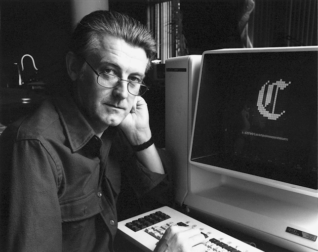
 | Dr.h.c. Matthew Carter in front of an early version of DTL Flamande |
|
October 2016 Dutch type designer, software developer, researcher, Senior Lecturer, and founder of the Dutch Type Library, Frank E. Blokland (1959) successfully defended his PhD dissertation at Leiden University. This revolutionary and controversial study is available now as print-on-demand book for graphic-design students, type designers, typographers, scholars, and everyone who loves type.
Dr. Blokland’s research was conducted to test the hypothesis that Gutenberg and his peers developed a standardised and unitised system for the production of textura type and that this system was extrapolated for roman type. Humanistic handwriting was simply moulded into a fixed system already developed for the production of gothic type. Renaissance typographic patterns were partly determined by requirements for the type production. Hence, today’s typographic conventions are not only the result of optical preferences predating movable type but at least as much the result of standardisation that eased the Renaissance type production. |
|
| |
|