
Open-Source Spacing Tool
[Posted: Monday 6 January 2014]
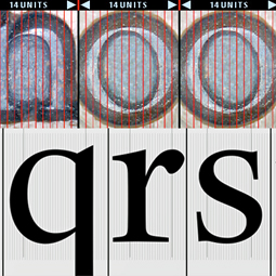
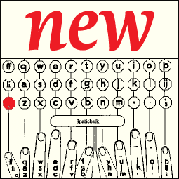
First steps have been made in the development of an Open-Source spacing and analyzing tool for ufo font data based on Frank E. Blokland’s PhD research at Leiden University on the Harmonics, Patterns, and Dynamics in Formal Typographic Representations of the Latin Script. The hypothesis is that the structure of roman type is an extrapolation of that of the morphologically related Textura type, and that Humanistic handwriting was molded into this structure.
The curved parts in roman type can be considered as overshoots of the straight strokes in Textura type. Defining the side bearings for roman type can therefore be done in the same way as for Textura type. It is quite possible that Nicolas Jenson did this for his famous archetype. Blokland distilled unitizations from Textura and roman type based on the stem interval, and this formed the basis for the development of Kernagic.
Kernagic provides ways to interactively preview global and local changes to the horizontal metrics. The program is under development and hence contains some bugs still. The cadence-table option works best at the moment.
Printed OTM 3.7 Manual
[Posted: Monday 2 December 2013]
A (digitally) printed manual for dtl OTMaster version 3.7 is available from dtl’s online bookshop now.
Because otm enables one to dig deep into the binary font tables –which almost can be compared with open-heart surgery– one needs some thorough knowledge of the OpenType and TrueType specifications and recommendations before one starts editing.
Therefore this is a must-read manual by expert Karsten Lücke that provides a wealth of additional information on the OpenType cff and ttf font formats.
The paperback contains 106 pages and the text is in English.
DTL OTMaster 3.7 released
[Posted: Saturday 9 November 2013]
Immediately after its initial release dtl OTMaster (otm) was hailed as very practical stand-alone application for reviewing and editing tables of fonts with a sfnt file structure. otm’s big advantage is that it allows editing of tables in a graphical user interface. As Dr. Ken Lunde, Sr. Computer Scientist at Adobe Systems, stated in 2009: ‘As someone who works with OpenType fonts on an every-day basis, and with the tools that are used to build and check them, I would like to state here that dtl OTMaster is a fabulous tool. The best way for me to characterize it is that it gives me the power of some existing command-line tools, wrapped up in nice gui. It handles cjk fonts well, including those with a large number of glyphs. I especially appreciate that there is a Mac os X version.’
The new otm edition has version number 3.7, while the previous one was numbered ‘2.4’. In the past two and a half years the functionality of otm was enhanced and extended, hence the ascending numbering. The new edition is for that reason a major upgrade, containing a lot of new functionality. From the import/export of Ideographic Variation Sequences (ivs) to the editing of Feature Parameters, and from an autohinter for edited or newly added glyphs to support for colr+cpal tables.
Some use otm for font-spelunking, other use it Open(Type)-heart surgery. Some use it for compiling OpenType Layout features, applying the elegant automatic subsetting, others use it for mark positioning. otm is the Swiss knife for cff- and ttf-based OpenType, TrueType, and ttc (TrueType Collection) fonts.
A listing of the new functionality in otm 3.7 can be found here. dtl OTMaster can be ordered directly here.
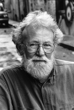
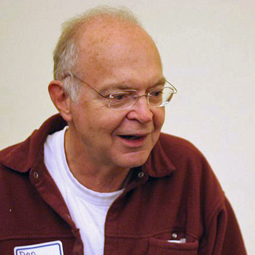
Michael Harvey, 1931–2013
[Posted: Friday 25 October 2013]
On 18 October 2013 Michael Harvey sadly passed away. Harvey was a master in every letters-related aspect; he was an eminent calligrapher, lettering artist, stone and wood carver, and type designer. He designed numerous book jackets, lectured at several institutes, among which the University of Reading, and wrote a range of books on calligraphy, letter carving, lettering, and (digital) type design.
The cooperation between the Dutch Type Library and Michael Harvey dates back to 1996, when Frank E. Blokland approached him with a request for a new type design for dtl at the ATypI conference in The Hague. A year later at the ATypI conference in Reading the deal was settled and a start was made with the development of dtl Unico, named after the Dutch composer Count Unico Wilhelm van Wassenaer (1692–1766). Also the name of the typeface refers to the Unicode encoding system, which was becoming more and more important in the mid 1990s.
On Twitter resigning ATypI president John D. Berry described Harvey as ‘a wonderful, talented, unpretentious man.’ We fully endorse this, and we also learned to know him as a very kind and modest person.
A short biography of Michael Harvey can be found here.
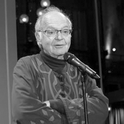
PKA 2013 presentation at ATypI
[Posted: Monday 21 October 2013]
On Saturday evening 12 October 2013, the ATypI conference diner took place at the atmospheric Winter Garden restaurant of Grand Hotel Krasnapolsky in Amsterdam. More than 300 attendees enjoyed the excellent buffet, sponsored by Adobe. Highlight of the evening was the presentation of the 3rd Dr. Peter Karow Award for Font Technology & Digital Typography (in short pka) to Dr. Donald E. Knuth. Read more …
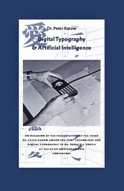
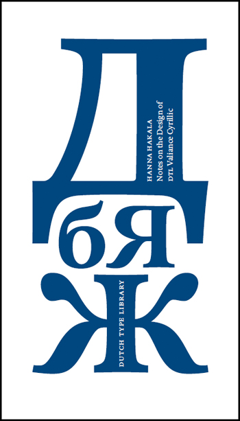
Two new DTL publications
[Posted: Monday 21 October 2013]
At the ATypI conference in Amsterdam, which took place at Hotel Krasnapolsky from 9 till 13 October 2013, two new dtl publications were presented. Digital Typography & Artificial Intelligence by Dr. Peter Karow (published in cooperation with Adobe) and Notes on the Design of dtl Valiance Cyrillic by Hanna Hakala. Both booklets are available from dtl’s online bookshop now.![]()
![]()
In Digital Typography & Artificial Intelligence font-software pioneer Dr. Peter Karow, who founded with Rubow and Weber the company urw Software & Type GmbH in the early 1970s and who is especially renowned for the ikarus program, describes how digital typography transpired in type design and text layout. It has changed font production and text composition in their entirety. Modern text composition was mostly influenced by programs such as WordStar, Word, PageMaker, QuarkXPress, and FrameMaker, which replaced writing, typesetting and printing in both office and at home.
Dr. Karow was involved in many of the demands for digital typefaces which came into existence from 1972 through 1997. These issues included formats, variations, interpolation, rasterizing, hinting, autotracing, grayscaling, and element separation.![]()
![]()
In Notes on the Design of dtl Valiance Cyrillic Hanna Hakala, who studied graphic design at the University of Art and Design in Helsinki and type design at kabk’s master course Type & Media, presents a collection of notes made during the design of dtl Valiance.
Starting from the dawn of the Cyrillic script, the booklet goes through the reform of Tsar Peter i of Russia and gives some insight in the alternative and regional letterforms. The concise publication provides type designers also with clear guides for designing Cyrillic characters.
Dr. Donald E. Knuth Awarded
[Posted: Wednesday 18 September 2013]
The Dutch Type Library, in partnership with Adobe, is pleased to announce that Dr. Donald E. Knuth has been named the recipient of the third Dr. Peter Karow Award for Font Technology & Digital Typography.
The Dr. Peter Karow Award is presented once per five years to a person who makes an exceptional and innovative contribution to the development of digital type and typography related technology. The first Dr. Peter Karow Award was presented to Dr. Peter Karow himself at the third dtl FontMaster Conference at Castle Maurick in 2003. In 2009 (a year later than planned, due to circumstances) the award was presented to Thomas Milo for the development of the ace layout engine (the heart of the Tasmeem plugin for InDesign me) for Arabic text setting.
This year's jury (Dr. Peter Karow, Thomas Milo [DecoType], David Lemon [Adobe], Dr. Jürgen Willrodt [urw++], Peter Rosenfeld [urw++], and Frank E. Blokland [dtl]) unanimously selected Dr. Knuth for the 2013 award.
The award will be presented during the Special Event Diner of the coming ATypI conference in Amsterdam on Saturday 12 October 2013 in the Winter Garden at the Hotel Krasnapolsky.
Dr. Knuth will make the long journey from Palo Alto to Amsterdam to accept the award. While at the conference, Dr. Knuth hopes to catch a few of the talks while he catches up with old friends—and makes new ones!
On Adobe’s Tyblography extensive information on the third Dr. Peter Karow Award has been posted. More information on the previous Dr. Peter Karow Award winner Thomas Milo can be found here and here in the fm news archives.
ATypI Amsterdam Program
[Posted: Monday 22 July 2013]
The program for the ATypI conference in Amsterdam on 9-13 October 2013 has been published. This years theme is Point Counter Point, referring to counterpoint in music. As one can read on the ATypI web site, the conference program reflects the polyphony in music by a ‘[…] diversity of ideas, not only delving into the history of type and typography in the world’s languages but grappling with the problems and opportunities of the constantly evolving technology of communication.’
The Dutch Type Library has sponsored the majority of ATypI conferences since the late 1990s and is also a sponsor this year. dtl’s founder Frank E. Blokland will give a talk on his (digitized) calligraphy for HM Queen Beatrix’s Abdication Act 2013 on Saturday 12 October.
At the conference also the third Dr. Peter Karow Award for Font Technology & Digital Typography will be presented. The Dr. Peter Karow Award is granted once per five years to a person who makes an exceptional and innovative contribution to the development of digital type and typography related technology. The first Dr. Peter Karow Award was presented to Dr. Karow himself at the third dtl FontMaster Conference at Castle Maurick in 2003. The second one was awarded to Thomas Milo for the development of the ace layout engine (the heart of the Tasmeem plugin for InDesign me) for Arabic text setting in 2009.
More info on the third Dr. Peter Karow Award will be published here shortly.
DTL’s website: 15th anniversary
[Posted: Wednesday 10 July 2013]
In 1998 dtl’s website was launched, eight years after the Dutch Type Library formally entered the font market as the first Dutch producer and publisher of digital typefaces. At that time dtl had become a well-known company in large parts of the world. It was already very successful in the usa, because quite some renowned branding agencies had recognized the exquisite quality of the dtl fonts. This culminated in corporate-identity typefaces for, among others, companies like the New York Stock Exchange, Diamond Trading Company, and Emerson.
The new website was an immediate success and offering fonts online enhanced the business. Especially our markets in the Far East and South America rapidly enlarged. The dtl site was featured in publications on quality web sites in the 1990s. April 2011 dtl had customers in 50+ countries, as was mentioned in this column then.
In 1998 the computer screens were not as large as they are nowadays, but it was obvious that size and resolution would be enlarged and enhanced in the course of time. Subsequently we decided to let the website relatedly grow, if possible.
The original page size was a4, so the information on the site was easy to print. When the screens became larger, a second frame, half the size of the main one, was added. Later the frames were stretched in vertical direction and finally a third frame was added to the left. Like an altarpiece for type it became a diptych and now it has become a triptych.
In the 23 years that dtl is active on the font market, the business has clearly changed. Like everything else in our society developments are accelerated and new foundries and fonts emerge like mushrooms. In contrast, the Dutch Type Library is probably the slowest font producing company in the world. Most of the dtl typefaces are for a large part drawn on paper and manually digitized in the ikarus format (using dtl FontMaster) still. And we are never in a hurry; for instance the development of dtl Romulus and dtl Fell started back in 1997 and is going on still.
In line with this, the dtl website is handcrafted on a design that has become almost vintage by now. But we are fond of the site, although we know that not all of our customers are a fan of its structure. At least we apply our own web fonts on our site.
And, as we stated recently on Twitter, our website is like Dutch v.s.o.p. cheese. A bit difficult to cut, but oh man, what an exquisite flavor: slow food and slow fonts!
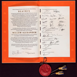
Abdication Act 2013 and DTL
[Posted: Sunday 12 May 2013]
On 30 April 2013 at 10:07 hrs. H.M. Queen Beatrix signed her Abdication Act. The firm Joh. Enschede Amsterdam was commissioned by the Ministry of the Interior and Kingdom Relations to produce the document, as well as the accompanying storage cassette. The overall design was by Jaap Drupsteen, famous for the last generation of Dutch (guilders) banknotes and the current Dutch passports.
The letters on the act, in Humanistic Minuscule and Italic hands, with all their contextual letter-variants, were written by dtl’s founder Frank E. Blokland and transferred by himself into digital fonts: Abdicatie Regular and Abdicatie Italic using the dtl FontMaster tools. The text was subsequently silkscreened on parchment.
The application of forenamed fonts was a one-time event. The names of the Queen and the new King were typeset in John Hudson’s Constantia and gilded by heraldist Trudie Demoed.
A detailed view of H.M. Queen Beatrix's Abdication Act can be found at the website of the National Archive. The Act will be exhibited together with the three previous ones from 1840, 1948 and 1980 as part of the exhibition Inaugurated! in the Nieuwe Kerk (‘New Church’) in Amsterdam from 11 May until 18 August 2013.
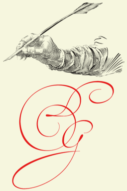
DTL VandenVelde at ATypI
[Posted: Friday 1 March 2013]
The Association Typographique Internationale (ATypI) 2013 conference is officially planned now for 9–13 October 2013. This will be the first ATypI conference in the Netherlands since 1996, when it was organized by the Royal Academy of Art (aka kabk) in The Hague. Although information on the organizers and venue are not released yet, rumors say that the University of Amsterdam is the driving force.
The Dutch Type Library will be present in Amsterdam, of course. Not only because dtl’s founder Frank E. Blokland is ATypI’s Country Delegate for the Netherlands, but because dtl has been a major supporter and sponsor of these conferences for more than a decade now.
The Dutch Type Library is planning to present a range of new typefaces at the conference, including dtl Fell, dtl Romulus (both under development since 1997) and a brand new script: dtl VandenVelde, inspired on the work of the famous calligrapher Jan Van den Velde (Antwerp, 1568 / Haarlem, 1623).
Van den Velde’s incredible handwritten letters are revived by the Dutch designer Jeroen Koning. The illustrations shown here are not reproductions from Spieghel der schrijfkonste, but completely redrawn digital-contour versions by Koning. A range of illustrations will be released as a separate font.
One million daily newspapers
[Posted: Sunday 10 February 2013]
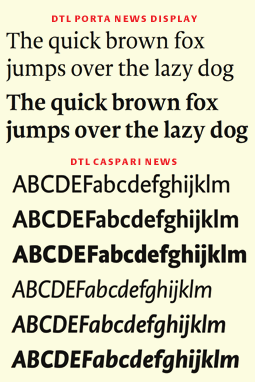
Since Tuesday 5 February 2013 on, seven redesigned Dutch regional tabloid-sized newspapers with a circulation of roughly one million copies in total per day are typeset in freshly-designed versions of dtl Caspari News and dtl Porta News.
A special task force led by graphic designer Erik Gigengack and advised by newspaper-specialist Mark Porter worked over the past three-quarters of a year on the redesign of the Wegener gazettes, which were first published at tabloid-size back in 2006. At that time dtl Caspari News and dtl Porta News were already in use for the restyling, but only in relatively limited sets for text purposes and small headlines. Both type families are enhanced now with larger sets for text and complete new extensive series for display sizes.
The first reactions on the new dtl ‘News’ typefaces from both the readers and the producers of the Wegener newspapers are very positive. The fonts in question will become available for the end-user market in April this year.
Autohinters compared
[Posted: Friday 11 January 2013]
Vernon Adams published a highly interesting in-depth comparison of the stand-alone Open Source ttfautohint tool and the ikarus-based autohinter in dtl Bezier- and IkarusMaster. ttfautohint is programmed by Werner Lemberg, wellknown for his work on the FreeType project.
For a number of illustrations in the document Vernon Adams used dtl OTMaster , which includes the FreeType rasterizer. The outcome of the comparison shows that the quality of both ttfautohint and dtl’s autohinter are comparible, the former somewhat stronger for lighter weights, the latter somewhat better for bolder weights.
Based on Vernon Adam’s research, both autohinters will be further improved.
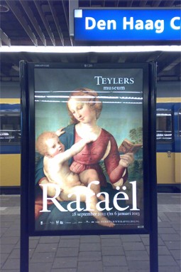
Rafaël & DTL Haarlemmer
[Posted: Thursday 3 January 2013]
Since the end of September last year, travelers in the Netherlands could hardly overlook the posters for the Rafaël exhibition at Teylers Museum, Haarlem, which were posted in significant quantities at railway stations and bus shelters. The large posters show a ‘Madonna with child’ by the Renaissance mæstro (1483–1520) combined with dtl Haarlemmer. The exhibition ends within in a couple of days, so those who are interested have to hurry!
The Teylers Museum in Haarlem is first and oldest museum in the Netherlands. It was founded in the eighteenth century. Since a couple of years dtl Haarlemmer is the corporate identity typeface of the museum.
Some info on Teylers Museum’s use of dtl Haarlemmer can be found at the Fonts In Use website.
New DTL newspaper fonts
[Posted: Friday 2 November 2012]
Daily roughly 1 million copies of in total seven regional newspapers are published by the Dutch company Koninklijke Wegener (‘Royal Wegener’) . This includes newspapers like Brabants Dagblad, Eindhovens Dagblad, DeStem en de Gelderlander. Since 2006 all seven titles are typeset in typefaces especially developed for newspaper printing: dtl Albertina News, dtl Caspari News and dtl Porta News.
As part of a redesign currently new versions of dtl Caspari News and dtl Porta News are under development at the Dutch Type Library. Both type families get additional display versions for the headlines. The famous art director and experienced specialist on newspaper design Mark Porter advises the Wegener team led by Erik Gigengack.
The new redesigned editions will be released Spring 2013. The dtl newspaper fonts will become available for the enduser market also then.
Global Font Conference
[Posted: Friday 12 October 2012]
dtl’s (long term) German partner urw++ Design und Development has put information online concerning the urw++ Global Fonts Konferenz. The subtitle of the conference is Schriftdesign und Fonttechnik für globale Projekte. Experts in the field of global and corporate fonts, i.e. designers, programmers and type marketeers, will speak about the design aspects, technical requirements and the appliance of global fonts. The talks will be in German.
The conference will take place at the East Hotel Hamburg on 22 November 2012. Attending the conference is without any costs and the lunch and beverages are for free. The number of seats is limited though, so a reservation by e-mail or fax is requested. Details can be found on forenamed conference web page.
New DTL TypeTester
[Posted: Monday 1 October 2012]
After years of faithful service, we replaced the good old Flash-based dtl TypeTester with a new one that directly shows TrueType font files. With the old one basically only the ascii set could be typed, and above all it did not work under Apple’s iOS due to the lack of Flash support.
The new dtl TypeTester makes use of the TypeShow software and hence, as mentioned, of actual TrueType font files. Using the appropiate keyboard drivers, also Eastern European, Cyrillic, and Greek character sets can be typed when available. We made a start with uploading these font variants
Academic Licenses
[Posted: Saturday 15 September 2012]
Over time the Dutch Type Library got quite a number of inquiries concerning academic discounts on our font tools, like dtl OTMaster, FontMaster, and CompareMaster. We have updated the dtl FontTools Shop with special education pricing now.
The academic discount amounts 50% on the standard end user price of all dtl font tools. What makes these academic licenses special, is that they are valid for an unlimited period. This basically implies that after students graduate the licenses will be valid still. If there are updates during the study period, academic licensees are entitled to receive these for free. However, please note that the update price for former students is higher than the standard one, so that the difference in pricing with ‘regular’ licenses will be equalized at the end when the tools will be applied professionally.
Because especially our flagship product dtl OTMaster is such a useful addition to any font production tool for professionals and students –if only because of the subsetting of OpenType Layout features– lecturers can obtain an otm (full version) license for a testing period of half a year for free.
For inquiries please contact us via e-mail.
DTL: new on social media
[Posted: Wednesday 27 June 2012]
To serve the roughly 5000 dtl customers in more than 50 countries all over the world even better, the Dutch Type Library has just entered the social media universe. Information on dtl can be found on facebook and Twitter, and also via an rss feed now. Obviously the icons on top of this column form the links.
The orange at sign on a dark royal blue, which makes the special dtl icon used on the social media, is part of the new branding labelled @ExquisiteFonts. This branding underlines even more the ultimate exclusivity of the dtl typefaces for either corporate design, book design, or web design. The domain ‘exquisitefonts.com’ has been recently registered by the Dutch Type Library.
Awarded CD booklets
[Posted: Monday 11 June 2012]
Since 1926 in the Netherlands every year a contest is organized under the name Best Verzorgde Boeken, which can be translated as ‘Best Prepared Books’. As one can read on the related web site, during the evaluation the emphasis is not by definition placed purely on the design: ‘Each well-made book is a meeting between content and material, the result of a cooperation between a commissioner (mostly a publisher), a designer and the graphic industry.’
From a submission of usually more than 400 books a selection is made of 33 books at maximum. The formation varies per year, but basically the five-member jury is a mixture of publishers, designers, people from the graphic industry, and someone from more outside the field, like a book historian, or a museum curator.
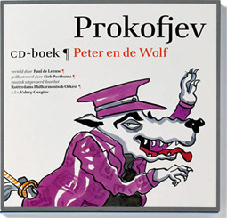
From the 1990’s, every year one or more of the awarded books are typeset in a dtl typeface. The recently published selection for the year 2011 is no exception. A beautiful series of booklets accompanying cd’s, on which classical music is combined with storytelling, has been awarded. The design is by the Amsterdam-based studio bockting ontwerpers and different illustrators and authors worked on the (still ongoing) project. The applied typeface is dtl Antares.
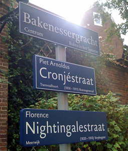
DTL Haarlemmer street signs
[Posted: Monday 11 June 2012]
Since a couple of years new street signs are placed in the city of Haarlem for which dtl Haarlemmer is used. The design agency Bureau Arjan Karssen selected the seriffed version for the street signs in the historic city, and the accompanying sans serif is used on two different signs for the pre and post World War ii parts of the city.
The new designs are an attempt to halt the proliferation of street sign variants in Haarlem. Arjan Karssen worked on this project together with Bas van Vuurde, who is a former student of the Royal Academy of Art in The Hague. Both designers brought dtl Haarlemmer back to the city where the typeface originally was designed by Jan van Krimpen (1892–1958), who worked and lived in the city of Haarlem.
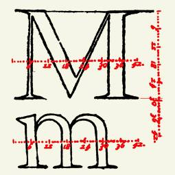
Harmonics, Patterns, Dynamics
[Posted: Wednesday 28 March 2012]
There is a new blog providing information related to (dtl’s founder) Frank E. Blokland’s PhD research at Leiden University, of which the title is Harmonics, Patterns, and Dynamics in Formal Typographic Representations of the Latin Script | The regularization, standardization, systematization, and unitization of roman type since its Renaissance origin until the Romain du Roi. The blog contains fragments of this research, mostly presented as ‘notes on’.
The question on which Blokland’s research is meant to find an answer, is whether –and if so, to which extent– the harmonics, patterns, and dynamics of formal grapheme systems in use to represent the Latin script since the invention of movable type, are the result of standardizations and systematizations of the production process of Renaissance printing type (centuries before documented regularizations were applied on the Romain du Roi).
This research comprises some controversial aspects, because it questions for instance the mythical ‘eye’ of the type designer. The skills of type designers have been mystified since the early days of punch-cutting. For instance Pierre Simon Fournier emphasized the role of the ‘eye’ in his Manuel Typographique from 1764–1766, when he criticized the attempts of Jaugeon and his colleagues to standardize the design of the Romain du Roi: ‘These gentlemen would have been well advised to a single rule which they established, which is chiefly to be guided by the eye, the supreme judge […].’
But Blokland’s measurements of French Renaissance type from the inventory of the Museum Plantin-Moretus in Antwerp seem to provide ample proof for the hypothesis that the structures and patterns of roman type find their origin for a large part in standardizations of the production process of movable type during the early days of typography.
Blokland’s research also questions to which extent handwritten letters played a role in the development of roman type. Is it possible that the writing models currently in use to educate the basics of type design, which are often related to Edward Johnston's Foundational hand, and used to prove that roman type finds its origin in the patterns and structures of writing, actually show a standardization that was the result of the production process of the archetypes by Nicolas Jenson and Francesco Griffo? If this turns out to be the case, then the writing models are used for circular logic.
Announcing KM 2012
[Posted: Wednesday 30 November 2011]
A new version of dtl KernMaster (km) for Mac os X, Windows, and Linux is in its final stage of development. The programmers at urw++ in Hamburg, Germany, are working hard to finish the production, and the release of KernMaster 2012 is scheduled for Spring next year.
The ‘old’ KernMaster was tailored for a dtl FontMaster based font production, hence it only supports be (Bézier) and ik (ikarus) files. The new km 2012 works directly with OpenType fonts also, and it is very much features-file oriented. The resulting kerning can be merged with the original OpenType font data directly.
The general idea behind km is that the kerning generation should be controlled via parametrization, and that the outcomes should be (almost) completely reproducible. Besides kerning also spacing can be generated with km 2012.
On the Typophile forum there was a discussion on the functionality of dtl KernMaster recently.
‘Wine-wrapped’ version of FM
[Posted: Wednesday 30 November 2011]
A ‘Wine-wrapped’ version of dtl FontMaster (fm) Light 2.7.0 is now available for Mac os X as a free download.
Wine is an open source program which uses Win16- and Win32- api’s for running applications written for Windows under other operating systems. Currently there is only a Windows version of fm, but an installer has been generated for Intel Macs running Mac os 10.5, 10.6, and 10.7, which installs FM Light 2.7.0 for Windows directly in the Mac os Applications folder. Because the stuff is ‘Wine-wrapped’ one does not need to install any additional software, or to start up the X Windows System first.
Besides a few minor issues, which are described in the Read Me file, the wrapped version seems to run pretty stable and fast. The only downside of the wrapping is the hefty 330 mb, which is used by the application on the hard disk.
As a bonus, the included dtl TraceMaster version is fully functional.
DTL @ 2011 Reykjavik: update
[Posted: Tuesday 4 October 2011]
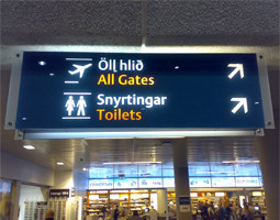
Arriving at the Keflavík International Airport is for dtl people a bit like coming home, because the signage there is typeset in dtl Argo. Gerard Unger’s wonderful sans serif is in use at the Icelandic airport for roughly a decade now. It was interesting to see that the signage was intensively photographed also by other visitors of the ATypI conference in Reykjavik.
The talks by Dr. Jürgen Willrodt on the two new dtl/urw++ positional editors, which are currently under development, and on dtl OTMaster were well attended, as were the talks by Frank Steitiya (who replaced Peter Rosenfeld) on global fonts and by Frank E. Blokland on parametrized type design. Also Blokland’s talk in the main conference program on The mythical eye of the type designer was very successful.
On Thursday 15 September 2011 Fontlab Ltd.’s Adam Twardoch gave a talk titled OpenType Mastering, in which he described how dtl OTMaster can be incorporated in a Fontographer or FontLab Studio workflow. This was described as follows in the conference program guide: ‘Fontographer is a bit like the guitar or piano of a type designer – it focuses on the creative aspects of making fonts. FontLab Studio offers creative tools and a fair bit of engineering gear. But dtl OTMaster is a true font engineering tool that allows you to control the final quality of your digital font files. In this talk, Adam will show how these three applications can play hand in hand.’
A more detailed report on the Reykjavik conference will be published shortly on the main news page.
PI Expert Class Exhibition
[Posted: Monday 29 August 2011]
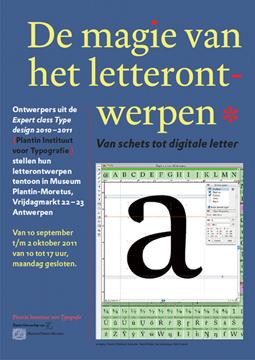
From 10 September until 2 October 2011, Expert class Type design (EcTd) 2010–2011 students of the Plantin Institute for Typography will show their work at the famous Museum Plantin-Moretus in Antwerp. The title of the exhibition is De magie van het letterontwerpen | Van schets tot digitale letter (The magic of type design | From sketch to digital type).
The students’ work is presented and explained on large panels, printed by Agfa. Also original sheets showing different stages of the design processes are displayed in showcases.
The EcTd course takes place at the Museum Plantin-Moretus yearly. It spans ten teaching days spread over roughly eight months. In between the lessons the students have to work at home on their projects. The lecturer is dtl’s founder Frank E. Blokland.
As one can read at the website of the Plantin Society:‘The Expert class Type Design given by the Plantin Institute of Typography examines the “secrets” of contemporary representations of the Latin script (capital, roman and cursive) in detail. The underlying harmonic, proportional and rhythmic structures of characters and the typographical conventions and rules derived from them are analyzed and dissected.’
The exhibition is sponsored by (in alphabetical order) Agfa, Dutch Type Library, and the Museum Plantin-Moretus.
On Typophile some more information can be found here.
New: DTL OTMaster 2.4
[Posted: Tuesday 28 June 2011]
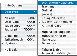
A new version of otm has become available. The new functionality comprises improved export of OpenType layout features, a couple of enhancements in the otf Consistency Checker and the options to change the table version numbers in the ‘post’ and ‘gasp’ headers.
In otm 2.4 the interpretation of the OpenType layout tables has been much improved; checking and editing of exported features files is not required anymore. The exported files can be read-in directly without any alterations now. And although the way the exported features are listed could be different (due to the inevitable interpretation of the binary tables) from the features-description that was used for generating the font originally, the functionality should be completely identical.
The otf Consistency Checker in otm 2.4 contains a new, extensive, ‘Language’ section, which can be used to list and print the (missing) glyphs that a font supports for a specific language.
The ‘post’ table version can be changed now from version 2 to 3 and vice versa, and the ‘gasp’ table version from version 0 to 1 and vice versa.
There is an introduction discount of 30% on the standard price (€ 255) until the first of September in the FontTools Shop.
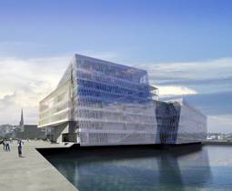
DTL @ 2011 Reykjavik
[Posted: Friday 17 June 2011]
The Dutch Type Library and German partner urw++ Design & Development will be present at the coming ATypI conference, which will take place in Reykjavik, Iceland, from 14 to 18 September 2011. The event is scheduled at the new Harpa Concert Hall, located by the old harbor (see photo).
The five days conference will start with two days of seminars and workshops arranged in two tracks. On Thursday 15 September the morning sessions are filled in with talks by urw++’s Peter Rosenfeld and Dr. Jürgen Willrodt, presenting talks on global fonts, OpenType and two new dtl/urw++ positioning editors, and a talk by Dutch Type Library’s founder Frank E. Blokland on parametrized type design. Additionally Finnish type designer Hanna Hakala will give a presentation on the designing of Cyrillic characters, and she will show her new typeface dtl Valiance.
On Friday 16 September Frank E. Blokland will open the main ATypI conference program with a heretic talk on the patterns and structures in type, and the relation between grapheme systems and perception, titled The mythical eye of the type designer.

ZDF kultur Nobel
[Posted: Tuesday 9 May 2011]
On the 7th of May 2011 the German public broadcaster zdf launched the new digital channel zdf.kultur.
The corporate identity of this cultural channel, which is a relaunch of the zdftheaterkanal, was created by the Munich based design agency Luxlotusliner.
The typeface selected by Luxlotusliner for the zdf.kultur channel is an adaptation of dtl Nobel especially made by the Dutch Type Library according to the specifications of the Munich design agency: zdf kultur Nobel.
DTL in 50+ countries
[Updated: Tuesday 19 April 2011]
The fonts of the Dutch Type Library are successfully applied all over the world. Since 1990 the Dutch Type Library has directly delivered the exclusive dtl fonts to numorous customers in more than fifty countries now:
Argentina, Australia, Austria, Bahrain, Belgium, Brazil, Canada, China, Colombia, Croatia, Czech Republic, Denmark, Estonia, Faro Islands, Finland, France, Germany, Great Britain, Greece, Guadeloupe, Hong Kong, Hungary, Iceland, India, Indonesia, Ireland, Israel, Italy, Japan, Korea, Kuwait, Lebanon, Liechtenstein, Luxembourg, Malaysia, Mexico, Netherlands, New Zealand, Norway, Philippines, Poland, Portugal, Russia, Saudi Arabia, Scotland, Singapore, South Africa, Spain, Sri Lanka, Sweden, Switzerland, Taiwan, Turkey, United Arab Emirates, United States, and Venezuela.
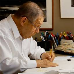
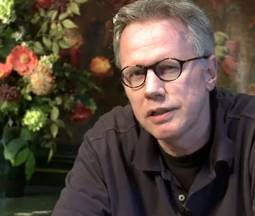
Doyald Young, 1926–2011
[Posted: Monday 7 March 2011]
On the 28th of February the eminent lettering artist and (logo)type designer Doyald Young passed away at the age of 84. Young was renowned for his elaborate craftsmanship and his elegant and characteristic ‘dangerous’ curves.
In 2008 Doyald Young published the book Dangerous Curves, which he described as an attempt ‘to show both emerging and expert designers how, in an age of computer-dominated design, the designer can turn to their very own hands for both inspiration and solution’. This book was preceded by Logotypes & Letterforms (1993) and Fonts & Logos (1999). In this publications Young described his vision on lettering and type design, showing his own and other’s typefaces and the numerous successful logo’s he made for companies, packaging and events.
Besides a prolific designer, Doyald Young also was a lecturer for more than 30 years at the Art Center College of Design in Pasadena, California. He was awarded by the American Institute of Graphic Arts (aiga) with the Medal for Lifetime Achievement in 2009 and with the 2010 sota Typography award by the Society of Typographic Aficionados: ‘Recognized for demonstrating the power of a lifelong love of the craft of calligraphy, type and graphic design, for his contributions as an author and for his dedication as an educator’.
In 2010 a very nice tributing documentary was made by lynda.com about Young’s life and work. The picture above is a (part of a) still from this film.
The people who had the privilege to have met and known him, will remember Doyald Young not only as a tremendously skilled craftsman, prolific designer, and a highly inspiring lecturer, but also as a very kind person, a real gentleman.

@font-face is here!
[Posted: Thursday 2 December 2010]
Recently the typography of this site has been improved using @font-face bundles (ttf, eot, woff, svg) of dtl Argo stw (sans serif) and dtl Antares stw (serif) and doing so, we also removed some deprecated xhtml elements. The perfectly crafted dtl fonts appear as harmonically and rhythmically strong on screen as they do in print. Of course, the dtl fonts make typographic refinements on the web possible, such as the appliance of old style figures and small caps.
The recent editions of most modern browsers, including Safari, Firefox and Chrome, support the @font-face style property. Unfortunately Internet Explorer 8 doesn’t handle the applicable css3 code correctly (a comma-delimited list of fonts is not supported) and ie 8 only supports the eot format, so Windows users who want to see this web site in full glory should use Firefox, or will have to wait for the official release of Internet Explorer 9. Alternatively the latest platform preview of ie 9 could be installed. Internet Explorer 9 seems to support the @font-face rule properly and on top of that also supports the woff format.
If the new fonts don’t show up immediately in Safari or Chrome by the way, clearing the caches should help (its is a good thing to do this on a regular basis anyway, to ensure that the browsers are working at optimal speed).
The Dutch Type Library is convinced that webfonts especially will become an important part of corporate identities and that the nearing browser-wide support of the @font-face rule will generate a break-thru for webfonts. Of course, the currently partly limited support of the @font-face rule can be circumvented by applying for instance the Cufón format, which is also available from dtl.
More info on the dtl webfonts can be found here.
FontLab Ltd. & DTL OTMaster
[Posted: Monday 18 October 2010]
Fontlab Ltd. announces the availability of dtl OTMaster 2.3 for Mac os X and Windows on fontlab.com, the leading online store for font-related software products.
Ted Harrison, President of Fontlab Ltd.: ‘We are thrilled to add dtl OTMaster to our product offering on fontlab.com. This release marks the beginning of our collaboration with Dutch Type Library and urw++. Dutch Type Library is renowned for their excellent high-quality dtl typefaces, while urw++ has pioneered the field of font technology with the development of Ikarus, the world’s first digital outline font editor, in 1975, and has continued to develop high-quality fonts and font-related products ever since. On the other hand, Fontlab Ltd. is the home of FontLab Studio, Fontographer, TypeTool and TransType, which today rank amongst the most popular font-related products worldwide. We believe that our combined expertise will contribute to improving the overall quality of fonts and typography, and we are looking forward to further collaboration with dtl and urw++.’
The Dutch Type Library and urw++ Design & Development are highly pleased that FontLab Ltd. added dtl OTMaster to its product offering and very much welcome this cooperation, which definitely will lead to further innovation in the world of fonts and font tools.
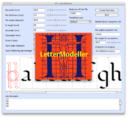
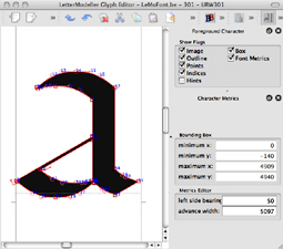
DTL LetterModeller 3.0.1
[Posted: Monday 20 September 2010]
A new version (3.0.1) of dtl LetterModeller is available for free downloading now. LeMo is a first step towards the automation of type design processes, based on the underlying models for grapheme systems. Sliders can be used for parameterizing the letterforms. Modified letters can be saved in the .be and .ik formats and further processed with dtl Bezier- and IkarusMaster (Light) or exported in the eps and svg formats.
From the moment on that the invention of movable type was introduced in Renaissance Italy and the subsequent fixation, formalization, sublimation and standardization of letterforms –which found their origin in the chirographic practice–, all formal letterforms developed for the purpose of text setting have always been derivatives in one way or another from the early fixated models, i.e., archetypes, by Nicolas Jenson and Francesco Griffo. Subsequently the ‘rules’ for the derivatives, i.e., the conventions, are set by the harmonics, patterns and dynamics of the archetypes. Deviations (in shape, contrast, contrast flow and contrast sort) from these rules can only be explained and described or even judged, using clear descriptions of the harmonics, patterns, etc.
Script related rules for harmony and rhythm are not universal, but culturally bound and defined matters. Subsequently matters like conventions and even legibility are directly related and restricted to the underlying models and can only be judged against the models themselves. Specialist software developed with this hypothesis in mind, can make the judging and mapping easier.
Part of the new functionality in LeMo 3.0.1. is the support for skeleton, i.e. heart line fonts. The construction of the Humanistic minuscule, of which the primary harmonic model (phm) for the minuscule part (‘lower case’) is a stripped version, i.e. the superfluous elements are removed, is the result of Mediaeval canalization/formalization by the broad nib (determined by friction and preferred contrast-flow) of repetitive movements, which date back to the time of the Romans. The capitals however, find their origin in the heart line construction applied by the Greeks, which were adapted for writing with a flat brush by the Romans without significant changes in their construction. Hence the basis of these capitals can’t be formed by a model comparable with the phm.
The Pen thickness parameter is supported now. Auto spacing based on the rhythmic system is automatically applied on the letters from the primary harmonic model.
Stained glass & lettering
[Posted: Friday 6 August 2010]
As part of the restoration of the Pieterskerk at Leyden, The Netherlands, the stained glass windows, which date back to the former restoration of the 1950’s are replaced by new ones. A relatively large number of these new windows get a stained glass lettering by dtl’s founder Frank E. Blokland. To sponsor the restoration one can buy the placement of ones name (or somebody else’s) in the windows. For this purpose Blokland designed a special version of dtl Haarlemmer, of which the letter-angle is adjusted to the lead lines which hold the small pieces of stained glass together.
On YouTube a short film (Dutch spoken) is placed, which shows the restoration of the church and the design and production of the lettering.
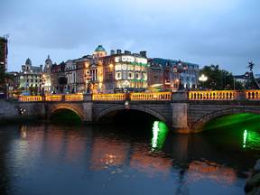
FM Track at Dublin
[Posted: Friday 6 August 2010]
The program for the fm Track at the ATypI conference at dublin (8–12 September 2010) is available here as pdf for downloading.
The focus in this years fm Track will be on the dtl font tools and workshops will be varied with presentations. New (versions of the) dtl applications will be presented, including a sneak preview of GPOSMaster and OTMaster version 2.1. At the end of the day there will be a reception to celebrate the 20th anniversary of the Dutch Type Library.
(Photo by Hans-Peter Bock [licensed under cc-by])
OTM in AFDKO
[Posted: Wednesday 9 June 2010]
Information about and a link to dtl OTMaster, the internationally praised application for reviewing, editing and altering tables and contours of fonts with a sfnt file structure, will be part of the coming release of the Adobe Font Developers Kit for OpenType (afdko).
Both dtl FontMaster and dtl OTMaster contain a modified version of (the latest build of) the afdko, which make batch processing of OpenType Layout features possible.
DTL Prokyon & phones
[Posted: Wednesday 9 June 2010]
The New Zealand based phone company Two Degrees Mobile Limited (better known as 2degrees) has selected dtl Prokyon for their corporate identity. 2degrees is New Zealand’s newest mobile company, but, as can be read on the 2degreesweb site, the company has been active for some time: ‘we’ve been around a little while, and we’ve been busy. Over the last few years we’ve spent over usd 250 million constructing a brand new mobile network in New Zealand’.
DTL OpenType upgrades
[Posted: Tuesday 8 June 2010]
Since it became available a couple of years ago, the dtl OpenType Upgrade Program is a success. Over the past decade the Dutch Type Library has been working on the conversion of the dtl type library to the OpenType format and the development of specialized highly professional font tools, such as dtl FontMaster and dtl OTMaster for this purpose.
The focus has been especially on the production of Eastern and Central European, Turkish, Cyrillic and Greek character sets, to make all dtl fonts conform the wgl4 character range.

New BAM download page
[Posted: Tuesday 8 June 2010]
dtl Argo has been the corporate identity typeface for the Royal bam Group since many years. Companies belonging to the group, subsidiaries and design agencies working for bam have access to a proprietary download page, from which –under strict conditions– selected weights and styles of dtl Argo can be downloaded in different font formats. Recently the download page was updated and moved to a different web address.
To have access to the dtl Argo downloads for bam, please contact the Dutch Type Library.
DTL at ATypI conference
[Posted: Tuesday 11 May 2010]
From 8 to 12 September 2010 the yearly ATypI conference will take place in Dublin, Ireland under the title ‘The Word’. The main conference will be preceded by two days of (technical) workshops, seminars and meetings (‘Preface’).
On wednesday 8 September the Dutch Type Library and urw++ Design & Development will organize a so called fmTrack, where the focus will be on the dtl font tools and in which workshops will be varied with presentations. New (versions of) the dtl font tools will be presented, including the premiere of GPOSMaster, OTMaster 2.1 and version 3.0 of LetterModeller. At the end of the day there will be a reception to celebrate the 20th anniversary of the Dutch Type Library.
In previous years dtl organized fmTracks during the ATypI conferences in Lisbon (2006), Brighton (2007) and St. Petersburg (2008).
Also like in previous years, the Dutch Type Library sponsors the event.
DTL typefaces for the web
[Posted: Monday 10 May 2010]
From this date on, all dtl typefaces can be acquired in four special font formats for the web, namely eot (Embedded OpenType), woff (Web Open Font Format), Cufón and sifr.
Embedding of these formats on web pages is allowed by the dtl End User License Agreement, in contrast with the ‘standard’ font formats, such as OpenType and TrueType (see also the dtl eula).
Licensing of the named font formats for the web is possible against fixed prices, irrespective the number of visitors on the web and for an unlimited period.
For details, pricing and options, please contact the dtl sales department.
Shortly more information on this subject can be found on this web site.
Expertclasses Type design
[Posted: Friday 7 May 2010]
From the end of September 2010 on at the Plantin Society in Antwerp, Expertclasses on type design will be given by Frank E. Blokland, dtl founder and Senior Lecturer ‘Letters’ at the Royal Academy of Art (kabk), The Hague.
Blokland will unravel the secrets behind the actual typographic representations of the Latin Script. The underlying harmonic, proportional and rhythmic structures of the capital, roman and italic letters and the forthcoming typographic conventions and rules will be analyzed and decomposed.
The lessons are divided into two modules; for the first module no specific entry level is required, for attending the second module, the first one has to be successfully completed.
More info can be found at the PG website.

Coming soon: FM 3.0
[Posted: Wednesday 5 May 2010]
A new version (3.0) of fm is on the brink of release. The main new functionality is the support of the latest build of the Adobe Font Developers Kit for OpenType (afdko) version 2.5.
It is a well known fact that the at urw++ rewritten Hatch Open Type (hot) tool makes batch processing of OpenType Layout features generation fairly simple in the fm modules by enabling the use of features files that don’t have to cover the character sets of the OpenType fonts to generate.
The programming has been done, but the manual has to be updated still. Those fm users who really can’t wait for the official release may contact the fm Team in the meantime.